


| Amicus | |
| Customised Main Screen Layout | |
| See Also Submit feedback on this topic | |
| Getting Started > Getting Around > Main Screen > Customised Main Screen Layout |
Glossary Item Box
Introduction
The main Amicus screen is shown when Amicus first starts. From here, you will be able to access all other functionality, provided that you have enough security privileges to do so. the main screen consists of the Menu bar along the top, a dynamic layout in the middle, and a status bar along the bottom of the window. The menu bar and status bar are fixed and may not be removed or modified; the blank space in between these elements can include a number of dynamic elements to improve accessibility and improve support for touch displays. A layout may also be given images to display when logged in and out to allow for the display of branding and aid in grouping items together. The system may contain many customised layouts designed to suit various branding and functionality requirements, with each individual till having the ability to use a different layout, or share a common layout.
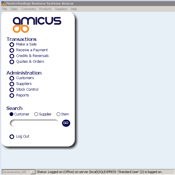
Figure : Default Main Screen layout, showing the 'logged in' Left Navigation Panel
-
Left Navigation Panel - Although the Left Navigation Panel is fixed in size, it can be repositioned on the Main Screen, or hidden completely from view. There is only one of these navigation panel permitted per main screen layout record.
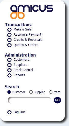
Figure : Left Navigation Panel, 'Logged In'
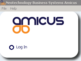
Figure : Left Navigation Panel, 'Logged Out', also showing the standard Menu Bar options when 'Logged Out'
-
Button - The button control type allows the user to perform an action from the main screen. Buttons may then be assigned to a keymap, which will be executed when the button is pressed. For example a button may be assigned to log in or out, or open the sale screen. Buttons can optionally show a textual label on them and can be assigned a colour or a background image. When the system is in a 'logged out' state, all buttons will be hidden, with the exception of buttons providing log-in functionality.
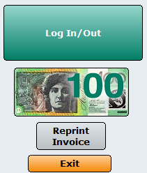
Figure : Examples of some dynamic buttons on the main screen
-
Label - The label control is a simple static label that will display text on the main screen. Labels may only be given text and a colour. If a label is not given a colour then it will be shown without a background. These are typically used in conjunction with Information Controls, or to place commonly used information on the main screen for ready access by staff members (I.e. to display commonly used phone numbers/extensions etc.).
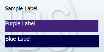
Figure : Examples of some dynamic labels on the main screen, against a background image
-
Information Control - The information control allows the display of some information retrieved from Amicus. Currently there are four type of information that may be displayed by an information control. These are:
-
Display the number of sales completed today
-
Display the cash total for sales today
-
Display the logged in staff member's name
-
Display the leading sales person (by number of sales) today
-
How To Access This Screen
By Default, this will be the standard screen that appears when you first start Amicus. If your machine is configured to open another screen on startup, or you have opened one of the full screen dialogs, then you may not be able to see this screen. Presuming you have sufficient security rights to do so, you can simply close these other screens to return to the main screen at any time. Refer to the section on Managing Roles for more information.
How To Use This Screen
Please read through the following articles to learn how to use this screen.
-
Menu Bar - Refer to the Main Screen article for more information on how to use this area.
-
Left Navigation Menu - Refer to the Main Screen article for more information on how to use this area.
-
Status Bar - Refer to the Main Screen article for more information on how to use this area.
-
Dynamic elements - Simply click on a button to perform its assigned action. Information controls can also be clicked, which will refresh the information they are displaying. Labels are 'static (non-changing) in nature and cannot be interacted with. For non touch-screen environments, holding the cursor (hovering) over any control, will expose a tool tip if one has been assigned.
Configuration Requirements
In order to use the additional dynamic control types, a screen layout must be created and assigned. Main menu layouts are assigned on a per-till basis. To create a new screen layout or alter an existing one, go to File -> Preferences -> This Register..., Screen Layouts tab. To change the layout, choose one from the drop-down list, or click the Manage Menu Screen Layouts button to modify and create layouts. Please note that while the edit layout screen is active, Amicus menus will be disabled.
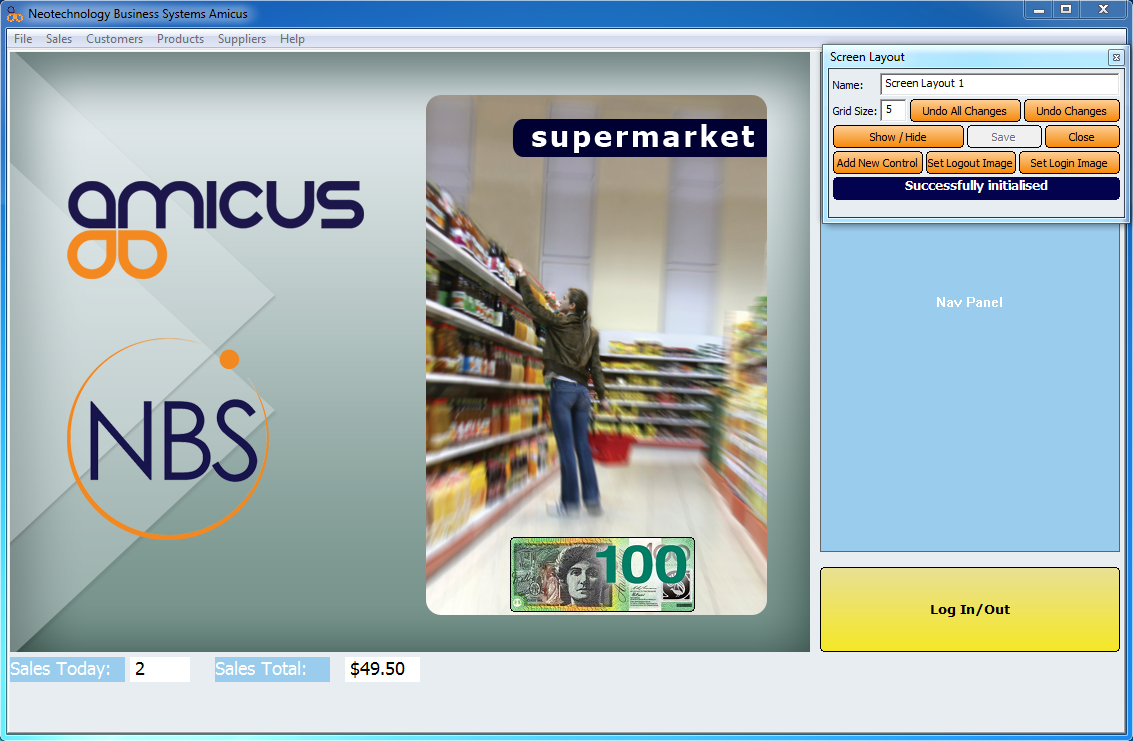
Figure : A main menu screen layout being edited with an example of each control type and a background image
The edit layout screen consists of a work area where controls are drawn, which is the same size as the Amicus window. A moveable toolbar allows you to edit the layout. All layouts must have a name, and new layouts must be saved first before controls can be added (this will be done for you if you have filled in a name).
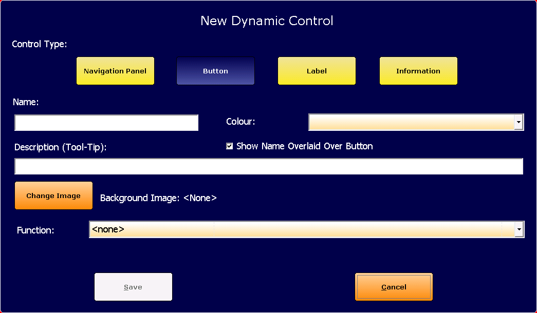
Figure : The new dynamic control popup panel
Additional Preferences / Information
-
It is Possible to assign a keyboard shortcut that gets fired automatically on startup away from this screen. Refer to the section on Keyboard Settings for more information.
- It is possible to restrict user access to leave certain screens (such as the sales screen), which, when used in conjunction with the above, will restrict all access to this screen for specified users or user groups. Refer to the section on Managing Roles for more information.
- When in Redundancy mode, all customised layouts will be ignored and the primary background colour will change to orange. Some functionality may also be restricted.