An area chart emphasizes the magnitude of change over time. By displaying the sum of the plotted values, an area chart also shows the relationship of parts to a whole.
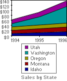
In this example, an area chart emphasizes increased sales in Washington and illustrates the contribution of each state to total sales.
 Column
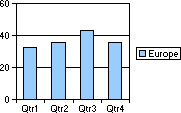
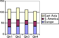
A column chart shows data changes over a period of time or illustrates comparisons among items. To emphasize variation over time, categories are organized horizontally and values are organized vertically.
Stacked column charts show the relationship of individual items to the whole.
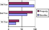
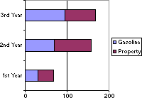
A bar chart illustrates comparisons between individual items. To focus on comparing values and to place less emphasis on time, categories are organized vertically and values are organized horizontally.
Stacked bar charts show the relationship of individual items to the whole.
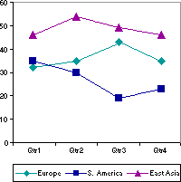
A line chart shows trends in data at equal intervals.
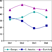
A smooth line chart shows trends in data at equal intervals, smoothed to show the estimated data between intervals.
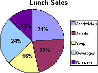
A pie chart shows the proportional size of items that make up a data series to the sum of the items. It always shows only one data series and is useful when you want to emphasize a significant element.
You can also create a stacked pie chart, which is a pie chart with more than one series.
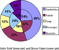
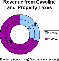
Like a pie chart, a doughnut chart shows the relationship of parts to a whole, but a doughnut chart consists of rings and can contain more than one data series. Each ring of the doughnut chart represents a data series.
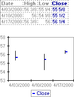
Two stock chart types are often used to illustrate stock prices: open-high-low-close and high-low-close. These charts can also be used for scientific data
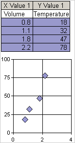
An xy (scatter) chart either shows the relationships among the numeric values in several data series or plots two groups of numbers as one series of xy coordinates. This chart shows uneven intervals
When you arrange your data, place the x values in one row or column with corresponding y values in the adjacent row or column in an x-y x-y arrangement.
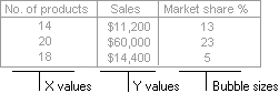
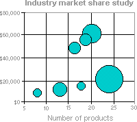
A bubble chart is a type of xy (scatter) chart. The size of the data marker indicates the value of a third variable.
To arrange your data, place the x values in one row or column and then enter the corresponding y values and bubble sizes in the adjacent rows or columns.
In a radar chart, each category has its own value axis that radiates from the center point. Lines connect all the values in the same data series.
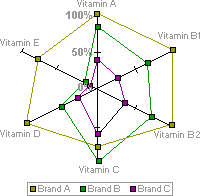
A radar chart compares the aggregate values of several data series. In this chart, the data series that covers the most area, Brand A, represents the brand with the highest vitamin content.
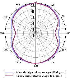
A polar chart compares the relationship of angles and distances. The chart in this example illustrates elevation angles for two heights of a radio antenna.