 Filter field
 Row fields
 Column fields
 Field drop-down arrow
 Detail field
 Expand indicators
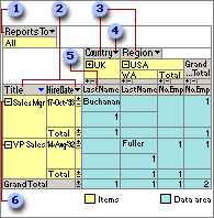
Each field corresponds to a column of data and can summarize multiple rows of information. Types of fields include row fields, column fields, detail fields, and filter fields.
A unique element of data within a field. Items of data in row and column fields are listed down rows and across columns. The cell where a row and column intersect displays summarized data for the items listed at the top of the column and the left side of the row. When a lower level of items is available for display, an expand indicator  appears beside the item. The items at the lowest level don't display the expand indicator. The expand indicators ( and
  boxes) to the right of an item indicate that detail data is available for that item.
A field in the row area. In the above PivotTable view, Title and Hire Date are row fields. Items in row fields are listed down the left side of the view. Title is the outer row field, and Hire Date is the inner row field.
A field in the column area. Items in column fields are listed across the top of the view. In the above PivotTable view, Country and Region are column fields, where Country is the outer column field and Region is the inner column field.
A field in the filter area that you can use to display data for specific items. In the above PivotTable view, Reports To is a filter field that you can use to display data for all managers or only selected managers.
A field in the detail area that displays all of the rows, or records, from the underlying record source. You can display detail rows and summarized data simultaneously.
The arrow  at the right side of each field. Click this arrow to display a list from which you can select the items to display and hide. Date and time fields and fields with custom groups provide different levels in all types of source data. For example, clicking the arrow next to a Year field might display the following:
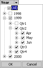
The cleared check box next to 1998 indicates that the year 1998 is hidden. The shaded check box next to 1999 indicates that the year 1999 is currently selected for display but some of the items under 1999 are not selected for display. Within 1999, Qtr1 is hidden. The selected check box next to 2000 indicates that the year 2000 is selected for display. Selecting (All) selects all items at all levels for display.
 Series, categories, and data representation
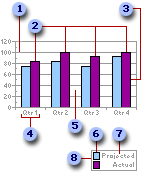
Gridline
Data series
Data marker
Category
Plot area
Legend key
 Series name
 Legend
Gridlines Lines you can add to a chart that make it easier to view and evaluate data. Gridlines extend from the tick marks on an axis and then continue across the plot area.
Data series, series name (legend entry) A group of related data points plotted in a chart. Each data series has a unique color or pattern and is represented in the legend by the legend key and series name (legend entry). In the preceding chart example, Projected and Actual are data series. You can plot one or more data series in most charts.
Data marker Used to represent a data point, which is an individual value plotted in a chart. Related data points constitute a data series. Examples of data markers include bars, dots, and slices.
Category A group of related data points made up of one data point from each data series in the chart. For most charts, categories are plotted along the category (x) axis, which is usually horizontal. However, in some charts the category (x) axis is vertical, as in a bar chart. In the preceding chart example, Qtr1, Qtr2, Qtr3, and Qtr4 are categories, each made up of one point from the Projected series and one point from the Actual series.
Plot area The area in a chart that's bounded by the axes and includes all the data series.
Legend key Images in a legend that show the patterns and colors assigned to the data series or categories in a chart. Legend keys appear to the left of legend entries.
Legend A key to the patterns or colors assigned to the data series or categories in a chart.
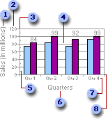
Value (y) axis title
Value (y) axis tick mark labels
Value (y) axis
Gridline
Minor tick mark
Category (x) axis title
Category (x) axis tick mark labels
Category (x) axis
Value (y) axis title A title that is usually used to describe what the value axis measures.
Value (y) axis tick mark labels Also known as value axis labels. These labels describe the values of measurement on the value axis.
Value (y) axis A line that borders one side of the plot area, providing a frame of reference for measurement or comparison in a chart. For most charts, data values are plotted along the value (y) axis, which is usually vertical. However, in some charts the value (y) axis is horizontal, as in a bar chart. Some charts have data values plotted on both axes, as in an xy (scatter) chart.
Gridline Lines you can add to a chart that make it easier to view and evaluate data. Gridlines extend from the tick marks on an axis and then continue across the plot area.
Major and minor tick marks Small lines of measurement that intersect an axis, similar to divisions on a ruler. Major tick marks appear at each major unit of measure on the axis scale, and minor tick marks appear at each minor unit of measure. Both types can be positioned inside or outside of the axis, or they can be positioned to cross the axis.
Category (x) axis title A title that is usually used to describe what is plotted on the category axis.
Category (x) axis tick mark labels Also known as category labels. These labels show the names of the categories on the category axis.
Category (x) axis A line that borders one side of the plot area, providing a frame of reference for measurement or comparison in a chart. Categories are groups of data points made up of one data point from each data series in the chart. For most charts, categories are plotted along the category (x) axis, which is usually horizontal. However, in some charts the category (x) axis is vertical, as in a bar chart. Some charts do not have a category (x) axis, as in an xy (scatter) chart.
Chart workspace title (title for all charts in workspace)
Chart title (title for single charts)
Value axis title
Category axis title
Category label
Data label
Value axis label
Chart workspace legend (legend for all charts in workspace)
 Chart legend (legend for single chart)
Chart workspace title A title that describes all charts when you have multiple charts in the workspace. This title can be positioned above, below, to the left, or to the right of the chart workspace.
Chart title The title that describes a single chart. This title can be positioned above, below, to the left, or to the right of the chart.
Value axis title A title that is usually used to describe what the value axis measures.
Category axis title A title that is usually used to describe what is plotted on the category axis.
Category label Also known as a tick mark label. These labels show the names of categories on the category axis. A category is a group of related data points, made up of one data point from each data series in the chart.
Data label A label that provides additional information about a data marker, which represents a single data point or value. Depending on the chart type, data labels can show values, names of data series or categories, percentages, or a combination of these.
Value axis label Also known as a tick mark label. These labels describe the values of measurement on the value axis.
Chart workspace legend A key to the patterns or colors assigned to the data series or categories in all charts in a multiple-chart workspace.
Chart legend A key to the patterns or colors assigned to the data series or categories in a single chart.
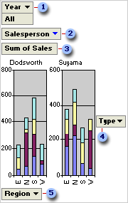
Filter field
MultiChart field
Data field
Series field
Category field
Filter field A field that you use to filter data by specific items. In the previous example, the Year filter field displays data for all years for which there are records. To display data for a single year, you can click the arrow next to Year and select the year.
MultiChart field A field you use to display separate charts for each item in the field. In the example, the Salesperson field is filtered to show two salespeople: Dodsworth and Suyama. Because the field is in the MultiChart area, a separate chart is displayed for each.
Data field A field from the underlying source data that provides values to compare or measure. In the example, Sum of Sales is a data field that summarizes sales in each region for each type of product. The first category data marker in the chart for Dodsworth (E) reaches a little over 200 on the value (y) axis. This amount is the sum of Dodsworth's sales for products in the East region. Depending on the source data you use for the report, you can change the summary function from Sum to Average, Max, Min, or another calculation.
Series field A field that you assign to a series orientation in a chart. The items in the field provide the individual data series. In the example, Type is a series field.
Category field A field from the source data that is assigned to a category orientation in a chart. A category field provides the individual categories for which data points are charted. In the example, Region is a category field.