You can control how the data is presented in a PivotTable view by customizing the layout. A different layout lets you calculate and compare summarized values for different elements in your data, or display summaries for a subset of the data.
You change the layout by moving the fields to predefined drop areas within the PivotTable view workspace.
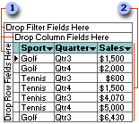
 Drop areas
 Detail area
After you move fields to the drop areas so that the drop area captions are covered up, you can still drag additional fields to the areas.
 Moving fields to the row or column areas
When you move a field to the row area, the unique items of data within the field are displayed down the rows of the PivotTable view. When you move a field to the column area, the unique items of data are displayed across the columns.
 Moving fields to the detail area
To view total or detail data from the underlying record source, move fields to the detail area.
 Moving fields to the filter area
Filter fields allow you to confine the view to a particular part of the available data. For example, when you move a Product field to the filter area, you can display data for one product at a time.
 Moving row or column fields to a higher or lower level
When a view has multiple row and column fields, the fields that are closest to the detail data are referred to as inner fields. The other fields are outer fields. You can switch the inner and outer fields.
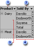
 Outer row field
 Inner row field
 Outer field items
 Items for the inner field are repeated for each item in the outer field.
The layout of a PivotTable view does not have to include all of the fields that are available from the underlying record source. You can also remove fields that you no longer want to see from the PivotTable view layout.
 Customizing the layout of a PivotChart view
You change the layout of a chart by moving the fields to predefined drop areas within the chart workspace. To do this, drop areas must be shown in the chart.
Drop areas are displayed differently depending on the chart type. For example, a series drop area is not displayed for a pie chart because pie charts consist of only one series. If you plot multiple charts, you will see a drop area for multi-chart fields. This type of drop area is not displayed for single charts.
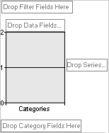
After you move fields to the drop areas so that the drop area captions are covered up, you can still drag additional fields to the areas.
 Moving fields to the category and series areas
When you move a field to the series area, the unique items of data within the field are displayed as data series in the chart. These series are represented by colored data markers, and their names appear in the chart legend.
When you move a field to the category area, the unique items of data are displayed as categories, or related groups of data. Each category consists of one point from each data series. Category labels usually appear across the x axis of the chart, although this can vary depending on the type of chart you are using.
 Moving fields to the data area
Data fields provide the values to be summarized in the chart. When you move a field to the data area, the values from the field are used as the data that is measured in the chart.
 Moving fields to the filter area
A filter field is similar to a page field in a Microsoft Excel PivotTable report. Filter fields allow you to confine the view to a particular part of the available data. For example, when you move a Product field to the filter area, you can have the chart display category and series values for one product at a time.
 Moving fields to the MultiChart area
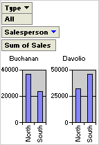
When you move a field to the MultiChart area, items in that field become separate charts. For example, if you move the Salesperson field to the MultiChart area, a chart is created based on data for each salesperson in that field. In the following example, the Salesperson field is in the MultiChart area, but it's filtered so it displays individual charts for Buchanan and Davolio.
 Moving the category or series fields to inner or outer levels
When a chart contains multiple series or category fields, the fields that are closest to the data are referred to as inner fields. The other fields are outer fields. In the following example, Year is the outer field and Salesperson is the inner field. The inner field items are displayed as salespeople's names, and the outer field items are displayed as the years 1997 and 1998.
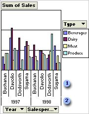
 Inner field items
 Outer field items
You can expand and collapse multiple fields to show more or less information in a particular field. For example, you can collapse the outer field (Year) in the example so that the inner field items are no longer displayed.
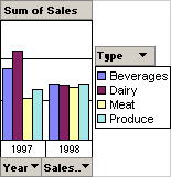
The layout of a chart does not have to include all fields that are available from the source data. If more data is available, you can add fields to the chart. For example, if the chart summarizes sales revenue, and the source data also includes sales quantities, you might add the Quantity field as a data field to summarize both revenue and quantity of products sold. You can also remove fields from the chart layout that you no longer want to see.
 Impact of changing layout on filtering
Filter settings are retained when you move or remove a field. This means that when you move a series or category field to the filter area and back, previously hidden items are again hidden. If you remove a field and later add the field back to the layout, the same items are again hidden.
When you design a chart for other users, you can restrict the user's ability to change the layout of the chart by preventing fields from being added and moved.