About combination charts
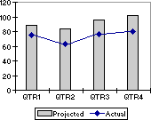
Combination charts A combination chart uses two or more chart types to emphasize that the chart contains different kinds of information. The chart in the example shows one data series (Projected) as a column chart type and the other (Actual) as a line. To create this kind of overlay effect, select a custom chart type in Step 1 of the Chart Wizard when you create a chart. This example uses the Line – Column chart type. You can change an existing chart to a combination chart by selecting the data series you want to change and then changing the chart type for that series.
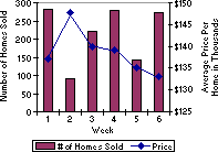
Secondary axis When the range of values for different data series varies widely, or when you have mixed types of data, you can plot one or more data series on a secondary value (y) axis. The scale of the secondary axis reflects the values for the associated series. The chart in the example shows the number of homes sold on the left y-axis and the average price on the right y-axis.