You can create a chart on its own sheet or as an embedded object on a worksheet. You can also publish a chart on a Web page. To create a chart, you must first enter the data for the chart on the worksheet. Then select that data and use the Chart Wizard to step through the process of choosing the chart type and the various chart options, or use the Chart toolbar to create a basic chart that you can format later.
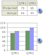
 Worksheet data
 Chart created from worksheet data
A PivotChart report is an interactive summary of data in a chart format. It is created differently than regular Microsoft Excel charts. After you create a PivotChart report, you can view different levels of detail or reorganize the layout of the chart by dragging its fields and items.
 How worksheet data is represented in a chart
A chart is linked to the worksheet data it's created from and is updated automatically when you change the worksheet data.
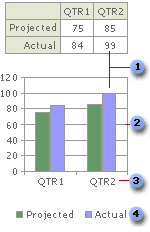
Data Marker
Major gridline
 Category names
 Chart data series names
Data marker Each data marker represents one number from the worksheet. Data markers with the same pattern represent one data series. In the example above, the rightmost data marker represents the Qtr2 Actual value of 99.
Major gridline Microsoft Excel creates axis values from the worksheet data. Note that the axis values in the example above range from 0 to 120, which encompasses the range of values on the worksheet. Major gridlines mark the major intervals on the axis. You can also display minor gridlines on a chart, which mark the intervals between the major intervals.
Category names Excel uses column or row headings in the worksheet data for category axis names. In the example above, the worksheet row headings QTR1 and QTR2 appear as category axis names.
Chart data series names Excel also uses column or row headings in the worksheet data for series names. Series names appear in the chart legend. In the example above, the row headings Projected and Actual appear as series names.
Chart Tips When you rest your pointer over a chart item, a chart tip containing the name of the item appears. For example, when you rest the pointer over a legend, a chart tip that contains the word Legend appears.
Embedded charts and chart sheets
You can create a chart on its own chart sheet or as an embedded chart on a worksheet. Either way, the chart is linked to the source data on the worksheet, which means the chart is updated when you update the worksheet data.
Embedded charts An embedded chart is considered a graphic object and is saved as part of the worksheet on which it is created. Use embedded charts when you want to display or print one or more charts with your worksheet data.
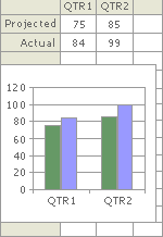
Chart sheets A chart sheet is a separate sheet within your workbook that has its own sheet name. Use a chart sheet when you want to view or edit large or complex charts separately from the worksheet data or when you want to preserve screen space as you work on the worksheet.