PivotChart reports have some specialized elements in addition to the series, categories, data markers, and axes of regular Microsoft Excel charts.
 Page field
 Data field
 Series field
 Items
Items
 Category field
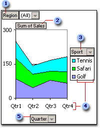
Page field A field that you use to filter data by specific items. In the example, the Region page field displays data for all regions. To display data for a single region, you can click the drop-down arrow next to (All) and select the region.
Data field A field from the underlying source data that provides values to compare or measure. In the example, Sum of Sales is a data field that summarizes quarterly sales in each region for each sport. The first category data marker (Qtr1) reaches nearly 250 on the value (y) axis. This amount is the sum of Tennis, Safari, and Golf sales in the first quarter. Depending on the source data you use for the report, you can change the summary function to Average, Count, Product, or another calculation.
Series field A field that you assign to a series orientation in a PivotChart report. The items in the field provide the individual data series. In the example, Sport is a series field with three items: Tennis, Safari, and Golf.
Item Items represent the unique entries in a field, and appear in the drop-down lists for page fields, category fields, and series fields. In the example, Qtr1, Qtr2, Qtr3, and Qtr4 are items in the Quarter category field, while Tennis, Safari, and Golf are items in the Sport series field.
Category field A field from the source data that is assigned to a category orientation in a PivotChart report. A category field provides the individual categories for which data points are charted. In the example, Quarter is a category field.
 How a PivotChart report represents data
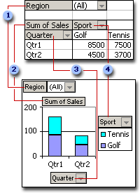
A PivotChart report always has an associated PivotTable report. Both reports have fields that correspond to each other. When you change the position of a field in one report, the corresponding field in the other report also moves.
The following example shows the correspondence between the fields in each type of report:
Page fields
Data fields
Row field, corresponds to category field
Column field, corresponds to series field
When you create a PivotChart report from a PivotTable report, the layout of the PivotChart report
Differences between PivotChart reports and regular, noninteractive charts
With regular charts, you create one chart for each view of the data that you want to see. With PivotChart reports, you can create a single chart and view the data in different ways by changing the report layout or the detail displayed.
If you are familiar with regular charts, you will find that most operations are the same in PivotChart reports. However, there are some differences:
Chart types The default chart type for a regular chart is a clustered column chart, which compares values across categories. The default chart type for a PivotChart report is a stacked column chart, which compares the contribution of each value to a total across categories. You can change a PivotChart report to any type except xy (scatter), stock, or bubble.
Chart location Regular charts are embedded on worksheets by default. PivotChart reports are created on chart sheets by default. Once created, you can relocate a PivotChart report to a worksheet.
Creating the chart To create a regular chart in Microsoft Excel, you use the Chart Wizard. To create a PivotChart report, you can use the Chart Wizard, or you can use the PivotTable and PivotChart Wizard if you already have a PivotTable report to serve as the source data for the PivotChart report.
Source data Regular charts are linked directly to worksheet cells. PivotChart reports can be based on several different types of data, including Excel lists and databases, multiple data ranges that you want to consolidate, and external sources, such as Microsoft Access databases and OLAP databases.
Chart elements PivotChart reports contain the same elements as regular charts but also contain fields and items that can be added to, rotated, or removed to display different views of your data. Categories, series, and data in regular charts are category fields, series fields, and data fields in PivotChart reports. PivotChart reports can also contain page fields. Each of these fields contains items, which in regular charts are displayed as category labels or series names in legends. You can hide the field buttons and drop area outlines for printing or publishing to the Web.
Formatting Some types of formatting are lost after you change the layout or refresh a PivotChart report. These types of formatting include trendlines and error bars, changes to data labels, and changes to data series. Regular charts do not lose this formatting once applied.
Moving or resizing items In a PivotChart report, you cannot move or resize the plot area, legend, chart titles, or axis titles, though you can select one of several preset positions for the legend and you can change the font size of titles. In a regular chart, you can move and resize all of these elements.
Starting with a PivotTable report Make sure your PivotTable report has at least one row field, to become the category field in the PivotChart report, and a column field to become the series field. If your PivotTable report is in indented format, move at least one field to the column area before you create the chart.
Starting from scratch In the PivotTable and PivotChart Wizard, you specify the type of source data you want to use, and set options for how the data is used. You then lay out the PivotChart report in a manner similar to a PivotTable report. If your workbook doesn't contain a PivotTable report, Microsoft Excel creates one when you create the PivotChart report. When you change the PivotChart report, its associated PivotTable report changes, and vice versa.
Customizing the report You then change the chart type and other options
When to use page fields Using page fields is a convenient way to summarize and quickly focus on a subset of data without having to modify your series and category information. For instance, if you're giving a presentation, you can click (All) in the Year page field to show sales for all years, and then focus on specific years by clicking one year at a time. Each page of your chart has the same category and series layout for different years, so the data for each year can be easily compared. Also, by allowing you to retrieve one page at a time from a large set of data, page fields can conserve memory when your chart uses external source data.