- Click the chart in which you want to display or hide axes, axes labels, and tick marks.
- On the Chart menu, click Chart Options, and then click the Axes tab.
- Select or clear the check boxes for the axes you want to display or hide.
- Click the chart to which you want to add a title.
- On the Chart menu, click Chart Options, and then click the Titles tab.
-
Click in the appropriate box for each axis title you want to add (for example, to add a title to the category axis, click in the Category (X) axis box), and then type the text you want.
To insert a line break in an axis title, click the text on the chart, click where you want to insert the line break, and then press ENTER.
 Align or rotate text on an axis

- Click the axis title you want to align.
- Click Selected Axis Title on the Format menu.
- Click the Alignment tab.
If you don't see the Alignment tab, click Cancel, click outside of the text you want to format, and then repeat the process.
- Select the options you want.
To quickly change the horizontal alignment of selected chart titles and text boxes, click Align Left
 , Center
 , or Align Right
 on the Formatting toolbar.
If you change the number formatting in a chart, the number formatting is no longer linked to the worksheet cells.
- Double-click the appropriate axis.
- On the Number tab, select the options you want.
 Change tick mark appearance and label placement on an axis

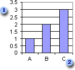
 Major and minor tick marks and tick mark labels on value axis
 Major tick marks and tick mark labels on category axis
- Click the axis with the tick marks you want to change.
- On the Format menu, click Selected Axis, and then click the Patterns tab.
- Under Tick mark type and Tick mark labels, select the options you want.
To hide major or minor tick marks, or to hide both types of tick marks, click None.
 Link an axis title to a worksheet cell
-
Click the axis title you want to link.
- In the formula bar, type an equal sign (=).
- Select the worksheet cell that contains the data or text you want shown in your chart.
You can also type the reference to the worksheet cell. Include the sheet name, followed by an exclamation point; for example:
Sheet1!F2
- Press ENTER.
 Reverse the plotting order of categories, values, or series
You can reverse the plotting order of categories or values for most charts, as well as of data series for 3-D charts with a third axis. You cannot reverse the plotting order of values in a radar chart.
- Click the axis for the categories, values, or series whose plotting order you want to change.
- On the Format menu, click Selected Axis, and then click the Scale tab.
- To reverse the plotting order, do one of the following:
- For categories, select the Categories in reverse order check box.
-
For values, select the Values in reverse order check box.
-
For series in 3-D charts, select the Series in reverse order check box.
When the range of values for different data series in a 2-D chart varies widely, or when you have mixed types of data (such as price and volume), you can plot one or more data series on a secondary value (y) axis. The scale of the secondary axis reflects the values for the associated series.
- Click the data series you want to plot along a secondary value axis.
- On the Format menu, click Selected Data Series, and then click the Axis tab.
- Click Secondary axis.
- Click the value axis you want to change.
- On the Format menu, click Selected Axis, and then click the Scale tab.
- Do one of the following:
 Change the number at which the value axis starts and ends
Enter a different number in the Minimum box or the Maximum box.
 Change the interval of tick marks and gridlines
Enter a different number in the Major unit box or Minor unit box.
 Change the units displayed on the value axis
If your chart values consist of large numbers, you can make the axis text shorter and more readable by changing the display unit of the axis. For example, if the chart values range from 1,000,000 to 50,000,000, you can display the numbers as 1 to 50 on the axis and show a label that indicates that the units express millions.
- In the Display units list, click the units you want or type a numeric value.
- To show a label that describes the units expressed, select the Show display units label on chart check box.
 Change the value axis to logarithmic
Select the Logarithmic scale check box.
To reverse values so that you can flip bars or columns or other data markers, select the Values in reverse order check box.
 Change where the category (x) axis crosses the value axis
Do one of the following:
To have the category (x) axis cross at a number on the value axis that you specify, enter the number in the Category X crosses at box.
To have the x-axis cross the value axis at the highest value, select the Category (X) axis crosses at maximum value check box. When selected, the Category (X) axis crosses at maximum value check box overrides the setting in the Category X crosses at box.
 Change the number of categories between labels or tick marks on the category axis

- Click the category axis with the labels and tick marks you want to change.
- On the Format menu, click Selected Axis, and then click the Scale tab.
- Do one or both of the following:
- Specify the frequency at which you want categories on the category (x) axis to be labeled
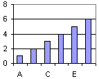
In the Number of categories between tick-mark labels box, type 1 to label every category, type 2 to label every other category, type 3 to label every third category, and so on.
- Specify the number of categories you want between each pair of tick marks on the category (x) axis
Type a number in the Number of categories between tick marks box.
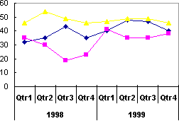
Note When you have more than one line of category axis labels, you cannot change the number of categories between tick mark labels or the number of categories between tick marks.
- Specify the frequency at which you want categories on the category (x) axis to be labeled
 Change where the value (y) axis crosses the category (x) axis
- Click the category axis you want to change.
- On the Format menu, click Selected Axis, and then click the Scale tab.
- Do one of the following:
 Specify the category number where you want the value (y) axis to cross the category (x) axis
- Type the number in the Value (Y) axis crosses at category number box.
- Select the Value (Y) axis crosses between categories box to have the value (y) axis cross the category (x) axis at the edge of the category indicated in the Value (Y) axis crosses at category number box.
If this box is selected, data points are plotted between tick marks; if this box is cleared, points are plotted at the tick-mark positions.
- To have the edges of an area chart meet the edges of the plot area, clear the Value (Y) axis crosses between categories box.
 Specify that the value (y) axis cross the category (x) axis after the last category on the x-axis
Select the Value (Y) axis crosses at maximum category box. This option overrides the Value (Y) axis crosses at category number value.
Note When you have more than one line of category axis labels or when you are working with a 3-D chart, you cannot change where the value (y) axis crosses between categories.
 Change the alignment and spacing of multiple-level category labels

When you have multiple-level category labels in your chart, you can change the alignment of all but the first level of labels. You can also change the amount of space between each level of labels.
- Click the category axis you want to change.
- On the Format menu, click Selected Axis, and then click the Alignment tab.
- To change the label alignment, click the position you want in the Alignment box.
To change the spacing between the levels, select a value in the Offset box. The higher the value, the more space between each level.
 Change chart category axis labels
- Click the cell that contains the label name you want to change.
- Type the new name, and then press ENTER.
- Click the chart, and then click Source Data on the Chart menu.
- In the Category axis labels box on the Series tab, specify the worksheet range you want to use as category axis labels. You can also type the labels you want to use, separated by commas, for example:
Division A, Division B, Division C
If you type the label text in the Category axis labels box, the category axis text is no longer linked to a worksheet cell.