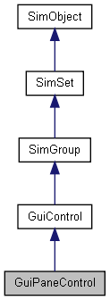
|
|
|
GuiPaneControl Class Reference
[Container Controls]
A collapsable pane control. More...

Public Member Functions | |
| void | setCollapsed (bool collapse) |
| Collapse or un-collapse the control. | |
Public Attributes | |
Pane | |
| bool | barBehindText |
| Whether to draw the bitmapped pane bar behind the header text, too. | |
| string | caption |
| Text label to display as the pane header. | |
| string | captionID |
| String table text ID to use as caption string (overrides 'caption'). | |
| bool | collapsable |
| Whether the pane can be collapsed by clicking its header. | |
Detailed Description
A collapsable pane control.
This class wraps a single child control and displays a header with caption above it. If you click the header it will collapse or expand (if collapsable is enabled). The control resizes itself based on its collapsed/expanded size.
In the GUI editor, if you just want the header you can make collapsable false. The caption field lets you set the caption; it expects a bitmap (from the GuiControlProfile) that contains two images - the first is displayed when the control is expanded and the second is displayed when it is collapsed. The header is sized based on the first image.
- Example:
new GuiPaneControl()
{
   caption = "Example Pane";
   collapsable = "1";
   barBehindText = "1";
   //Properties not specific to this control have been omitted from this example.
};
Member Function Documentation
| void GuiPaneControl::setCollapsed | ( | bool | collapse | ) |
Collapse or un-collapse the control.
- Parameters:
-
collapse True to collapse the control, false to un-collapse it
Member Data Documentation
Whether to draw the bitmapped pane bar behind the header text, too.
| string GuiPaneControl::caption |
Text label to display as the pane header.
| string GuiPaneControl::captionID |
String table text ID to use as caption string (overrides 'caption').
Whether the pane can be collapsed by clicking its header.