5.3 Customize a Chart
You customize your chart using the options in the dialog box that you select from the menu.
Tip
To reduce the amount of customizing you need to do, you should specify the defaults that you would like used for a new chart. To do this, select the Output Options command in the Query menu. The defaults you can set are identical to the options described here.
To adjust the current chart, from a Chart window, select the Options command from the Chart menu on the menu bar.
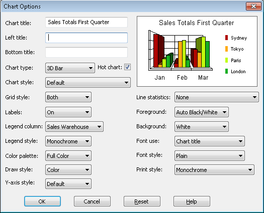
In the right hand corner of the dialog box is a sample of the chart style you have chosen. As you select the options you require, they are immediately reflected in the sample.
Chart Title
You should give your chart a meaningful title.
Left Title & Bottom Title
Specify titles for the left and bottom margins of the chart if you want to, by entering the text you require in the Left title and Bottom title entry boxes respectively.
Chart Type
You can change the chart type by selecting the required type from the drop down list. You can choose a:
- 2-Dimensional Pie Chart
- 3-Dimensional Pie Chart
- 2-Dimensional Bar Chart
- 3-Dimensional Bar Chart
- Line Chart
- Log Linear chart
- 2-Dimensional Area Chart
- Scatter Plot Chart
- Polar Chart
- Tape Chart
- 3-Dimensional Area Chart
Tip
You can also change your Chart Type by selecting the Chart Type you require from the Chart menu on the menu bar.
Hot Chart
Enable or disable the Hot Charting facility by selecting or deselecting this Hot Chart button. Refer to 5.5 Interactive Hot Charts for details of Hot Charting.
Chart Style
The styles available are dependent on the chart type you have selected. For example, if you have chosen a bar chart, you could choose a horizontal, vertical and stacked style or for a pie chart, you could choose to include colored labels or % labels and so on.
Grid Style
This option allows you to choose the type of grid, if any, to appear at the back of your chart.
Labels
This list box lets you choose whether you want labels on your chart and if so, where they are to be.
Legend Column
From the fields in your query, select those you want to print in the legend. You can also choose not to include a legend.
Legend Style
Use this option to customize the appearance of the text used in the legend, for example to use italics.
Color Palette
This option allows you to change the type of color used for your chart, such as from full color to pastels.
Draw Style
Use this option to change the drawing style of your chart, for instance from color to black and white.
Y-axis Style
You can change the scale and range of the Y-axis in a chart using this list box. If you choose User-defined from the list, the maximum Y-value in the chart will be the maximum value found in your selected data.
Line Statistics
If you have selected a Line chart type, you can add one or more statistics to it by choosing Mean, Standard, Deviation or Best Fit.
Foreground
From this list box you can choose the font color for all the text on your chart.
Background
Select the background color for your chart window.
Font Use & Fonts Style
You can choose the font style for each type of text in your chart. For example, you could bold your Chart Title. Click on the down arrow of the Font Use box for the list of texts you can change, then use the Font Style option to define the style of font you want to use.
Print style
If you have a color printer, you can use this option to print in color or monochrome.
Saving your Chart Options
Once you are satisfied with the options you have specified, select the OK button or press the <Enter> key. The current Chart window will immediately reflect your changes.
If you want to discard the options you have specified, select the Cancel button or press the <Esc> key. To return to the prior settings, select the Reset button.
Further Information