Menu Item Appearance
The basic menu item has no particular formatting beyond bold text and a CSS display value of "block". This can change significantly, depending on what layout and layout theme you are using. The default layouts provided prior to Visual LANSA V12 SP1 provided three themes: default, royal and grass.
|
|
|
|
|
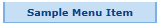
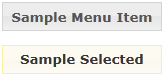
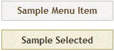
Default |
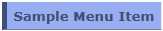
Royal |
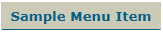
Grass |
If you are using an new Layout with a jQuery UI theme then you can set the menu item to take on the standard theme appearance of a clickable item by setting the useJQueryUITheme property to True.
|
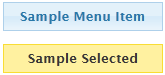
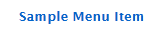
If you have no theme applied, or have useJqueryUITheme set to False, the menu item will display as bold text inside a borderless white box
The basic HTML structure of this is:
<a class="std_menu" id="webletName">
<span class="std_menu_span1">
<span class="std_menu_span2">
Sample Menu Item
</span>
</span>
</a>
When a menu item is selected, the class of the <a> tag is changed to "std_menu_selected".
Basic styling of the menu item can be done by defining some properties for the std_menu and std_menu_selected classes in your style sheet. For example:
a.std_menu, a.std_menu_selected {
color:#01478c;
border-style:solid;
border-color:#7db0e5;
border-width:0px 2px 1px 2px;
background-color:#c7dff4;
}
a.std_menu_selected {
background-color:#7db0e5;
}
A left aligned image could be added with something like this:
a.std_menu, a.std_menu_selected {
background-image:url('icon.png') no-repeat left center;
padding-left:32px;
}
More complex "self sizing" background images can be created by applying the two halves of the image to each of the spans in what is known as the "sliding doors" technique.