Generate Visual Component
Visual Web components can be used to enhance the presentation of your functions.
When you select from the Generate Component option, the Generate Visual Component dialog box is displayed.
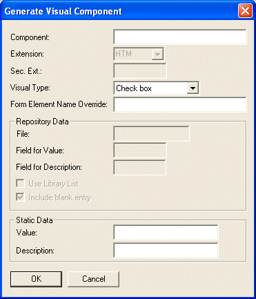
Component
Specify the name of the Web component.
Sec. Ext. (XML mode)
Secondary extension specifies the sub-extension (also called the XML Application) to be used to identify the Component. This value enables you to simplify the search for XML documents.
Visual Type
Select the required Type from the drop down list.
Repository Data
If you have selected a Visual Type of Drop Down, List Box or Radio Button, you will need to provide Repository-based information. LANSA for the Web will build the visual Web component from the data contained in the file you specify.
File
The name of the file. This file must be known to LANSA Repository on the host. The HTML/XML generated is based on the data in this file.
Field for Value
The name of the field you want to use for the VALUE keyword in the resulting HTML/XML. This is the field containing the data that will be returned to your application at the Server.
Field for Description
The description of the entry displayed to the user.
Use Library List
Select this option if you want to use the user profile's library list to locate the source file instead of the library associated with the file in the LANSA Repository.
Include blank entry
By default, a blank entry is generated which is used when evaluating the <RDML CHECKVALUE> tag. This sets the default field value to *BLANK. If you do not want to generate a blank entry for the component, deselect this option.
Static Data
If you are building a check box, you must enter the two values in this area.
Value
The value for the checked state of the check box.
Description
The description of the check box.
Form Element Name Override
This is used for HTML only. If a name is provided it will be used as the name of the HTML form elements.
If not provided, the component name is used to name the form elements.
OK
When you select the button, the Visual Web component will be generated automatically and the Web Component Registry updated to reflect the Web component. The component will be created as an input Visual Web component.
If a Web component of the same name already exists, the new Visual Web component will replace the existing Web component. The HTML/XML associated with the existing Web component will be backed up before the new Web component is created.
Note: Make sure that you enter correct values for the fields in the Repository Data area, otherwise the component will not be generated.
Test Case:
Test Plan Writer: Torkel CronholmDate Written:
LANSA Version: 11.4Date Last Tested:
Purpose: Generate Visual Component from Web Function Editor dialog.
Comments: For all test cases it is assumed that the tester knows how to generate a visual component, and how to ensure that it is created. The test has to be performed on both a RDML and a RDMLX partition on both a Windows and an IBM i backend, ie, on four combinations (RDML Windows, RDML IBM i, RDMLX Windows, RDMLX IBM i). Some tests will not be applicable for RDML partitions, such as tests on LL2 files.
Use the option to provide a Form Element Name Override for some of the tests. Please indicate with an O) which test items this option was used on.
Use the option to provide a Use Library List for some of the tests. Please indicate with an L) which test items this option was used on.
Use the option to provide a Include blank entry for some of the tests. Please indicate with a B) which test items this option was used on.
Some of the tests should generate a web component where there already exists a web component. Please indicate with an R) which test items this test was done for.
For this test, suggested naming convention for components is iiiEVXY#LD, where
Iii stands for the initials of the tester
E stands for Editor (the components can be generated by a BIF as well as from command line)
V is for a Visual component
X is the type of component. Use C for Check box, D for Drop down, L for ListBox and R for Radio button.
Y is for form element name override. Use Y for Yes and N for No.
# is denoting LL1 or LL2 file where applicable. Use 1 for LL1, 2 for LL2 and 0 if not applicable).
L is for data type for Value when creating a Drop down, ListBox or Radio button. Use A for Alpha, P for Packed, S for Signed, C for Char, D for Date, T for Time, Z for DateTime, I for Integer, F for Float, S for String and omit if not applicable.
D is for data type for Description when creating a Drop down, ListBox or Radio button. Use A for Alpha, P for Packed, S for Signed, C for Char, D for Date, T for Time, Z for DateTime, I for Integer, F for Float, S for String and omit if not applicable.
Example: A tester named Douglas Noel Adams creating a Visual component using a Drop down with element override for an LL2 file (using Alpha for Value and Signed for Description) should name the component: DNAEVDY2AS. Always name the form element name override in a consistent manner, ie, add _O to the name to create the override. Form Element Name Override would be DNAEVDY2AS_O for this example.
For Check Box, use any test for Value and Description fields.
In test items 1 - 27 the tester will attempt create a visual component according to above.
The expected result in test items 1 - 27 is that the component is created as per the test.
Tester: ______________________Date Commenced: ________________Date Completed:________________
|
|
Test | Expected Results
|
Pass/ Fail |
|
1 |
Checkbox: |
|
|
|
2 |
Drop down, ListBox and Radio button using LL2 file Value: Alpha, Description: Alpha |
|
|
|
3 |
Drop down, ListBox and Radio button using LL2 file Value: Packed, Description: Alpha |
|
|
|
4 |
Drop down, ListBox and Radio button using LL2 file Value: Signed, Description: Alpha |
|
|
|
5 |
Drop down, ListBox and Radio button using LL2 file Value: Char, Description: Alpha |
|
|
|
6 |
Drop down, ListBox and Radio button using LL2 file Value: Date, Description: Alpha |
|
|
|
7 |
Drop down, ListBox and Radio button using LL2 file Value: Time, Description: Alpha |
|
|
|
8 |
Drop down, ListBox and Radio button using LL2 file Value: DateTime, Description: Alpha |
|
|
|
9 |
Drop down, ListBox and Radio button using LL2 file Value: Integer, Description: Alpha |
|
|
|
10 |
Drop down, ListBox and Radio button using LL2 file Value: Float, Description: Alpha |
|
|
|
11 |
Drop down, ListBox and Radio button using LL2 file Value: String, Description: Alpha |
|
|
|
12 |
Drop down, ListBox and Radio button using LL2 file Value: Alpha, Description: Alpha |
|
|
|
13 |
Drop down, ListBox and Radio button using LL2 file Value: Alpha, Description: Packed |
|
|
|
14 |
Drop down, ListBox and Radio button using LL2 file Value: Alpha, Description: Signed |
|
|
|
15 |
Drop down, ListBox and Radio button using LL2 file Value: Alpha, Description: Char |
|
|
|
16 |
Drop down, ListBox and Radio button using LL2 file Value: Alpha, Description: Date |
|
|
|
17 |
Drop down, ListBox and Radio button using LL2 file Value: Alpha, Description: Time |
|
|
|
18 |
Drop down, ListBox and Radio button using LL2 file Value: Alpha, Description: DateTime |
|
|
|
19 |
Drop down, ListBox and Radio button using LL2 file Value: Alpha, Description: Integer |
|
|
|
20 |
Drop down, ListBox and Radio button using LL2 file Value: Alpha, Description: Float |
|
|
|
21 |
Drop down, ListBox and Radio button using LL2 file Value: Alpha, Description: String |
|
|
|
22 |
Drop down, ListBox and Radio button using LL1 file Value: Alpha, Description: Alpha |
|
|
|
23 |
Drop down, ListBox and Radio button using LL1 file Value: Packed, Description: Alpha |
|
|
|
24 |
Drop down, ListBox and Radio button using LL1 file Value: Signed, Description: Alpha |
|
|
|
25 |
Drop down, ListBox and Radio button using LL1 file Value: Alpha, Description: Alpha |
|
|
|
26 |
Drop down, ListBox and Radio button using LL1 file Value: Alpha, Description: Packed |
|
|
|
27 |
Drop down, ListBox and Radio button using LL1 file Value: Alpha, Description: Signed |
|
|
|
28 |
Drop down, ListBox and Radio button using incorrect LL1 file |
Error message in Web Function Editor |
|
|
29 |
Drop down, ListBox and Radio button using incorrect LL2 file |
Error message in Web Function Editor |
|
|
30 |
Drop down, ListBox and Radio button using correct LL1 file, but incorrect fieldnames |
No message in Web Function Editor, but the components will not be created |
|
|
31 |
Drop down, ListBox and Radio button using correct LL2 file, but incorrect fieldnames |
No message in Web Function Editor, but the components will not be created |
|
|
32 |
Leave some of the required text fields empty when generating a visual component |
Error message in Web Function Editor |
|
|
33 |
Check the tab order in the dialog (Either when in "Check Box" mode or in "Drop down, ListBox and Radio" mode) |
Tab order is from top to bottom, left to right |
|