Detecting & Analysing Events > Plotting X-Y Graphs of Event Analysis Measurements
The X-Y Plot page allows the event analysis measurements for the series of detected events to plotted against each other.
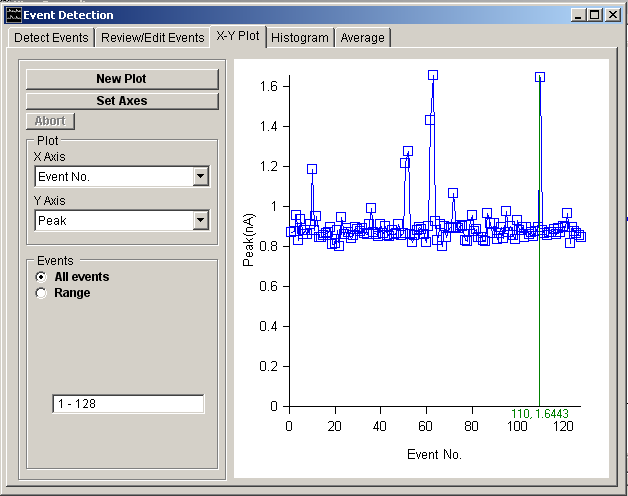
To create an X-Y plot :
1. Select the variable to be plotted on the horizontal axis from the X Axis variable list.
2. Select the variable to be plotted on the vertical axis from the Y Axis variable list. (If Rate has been selected enter the interval over which the event frequency is to be calculated.)
3. Select the All Events option to plot the results from all events in the list or select Range and enter a selected range of events.
4. Click the New Plot button to display the plot.
5. If you want to customise the axes ranges, click the Set Axes button.
The values of the x,y points in the plot can be read out using the blue readout cursor.
Variables that can be plotted include :
· The time at which the event was detected (Detected at).
· The time interval between successive events (Interval)
· The instantaneous event frequency (i.e. the reciprocal of Interval) (Inst. Frequency).
· The average event frequency computed over a defined period of time (Rate).
· The peak amplitude (positive or negative depending upon the setting of the Polarity option) of the event (peak).
· The integral of the event waveform (area).
· The 10%-90% rise time of the event (T(rise)).
· The X% decay time after peak (T(X%))
· The time constant of exponential decay (Tau(decay)).
· Signal baseline level determined just before the onset of the signal (Baseline)