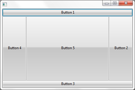
An attachment layout divides the container into five cells. The center cell expands to fill any available space.
When you add components on an attachment layout, the position where you drop them in the layout determines where they will be positioned. So components dropped to the top of a form with attachment layout will be assigned Attachment position Top, components dropped to bottom will be assigned Attachment position Bottom etc. You can change the position using the Layout Helper.
This form contains five push-buttons, each assigned to one of the five Attachment positions.
This is the source for the layout:
Function Options(*DIRECT)
Begin_Com Role(*EXTENDS #PRIM_FORM) Height(304) Layoutmanager(#ATLM_1) Left(303) Top(239) Width(454)
Define_Com Class(#PRIM_ATLM) Name(#ATLM_1)
Define_Com Class(#PRIM_PHBN) Name(#PHBN_1) Caption('Button 1') Displayposition(1) Left(0) Parent(#COM_OWNER) Tabposition(1) Top(0) Width(446)
Define_Com Class(#PRIM_ATLI) Name(#ATLI_1) Attachment(Top) Manage(#PHBN_1) Parent(#ATLM_1)
Define_Com Class(#PRIM_PHBN) Name(#PHBN_2) Caption('Button 2') Displayposition(2) Height(227) Left(366) Parent(#COM_OWNER) Tabposition(2) Top(25)
Define_Com Class(#PRIM_ATLI) Name(#ATLI_2) Attachment(Right) Manage(#PHBN_2) Parent(#ATLM_1)
Define_Com Class(#PRIM_PHBN) Name(#PHBN_3) Caption('Button 3') Displayposition(3) Left(0) Parent(#COM_OWNER) Tabposition(3) Top(252) Width(446)
Define_Com Class(#PRIM_ATLI) Name(#ATLI_3) Attachment(Bottom) Manage(#PHBN_3) Parent(#ATLM_1)
Define_Com Class(#PRIM_PHBN) Name(#PHBN_4) Caption('Button 4') Displayposition(4) Height(227) Left(0) Parent(#COM_OWNER) Tabposition(4) Top(25)
Define_Com Class(#PRIM_ATLI) Name(#ATLI_4) Attachment(Left) Manage(#PHBN_4) Parent(#ATLM_1)
Define_Com Class(#PRIM_PHBN) Name(#PHBN_5) Caption('Button 5') Displayposition(5) Height(227) Left(80) Parent(#COM_OWNER) Tabposition(5) Top(25) Width(286)
Define_Com Class(#PRIM_ATLI) Name(#ATLI_5) Attachment(Center) Manage(#PHBN_5) Parent(#ATLM_1)
End_Com
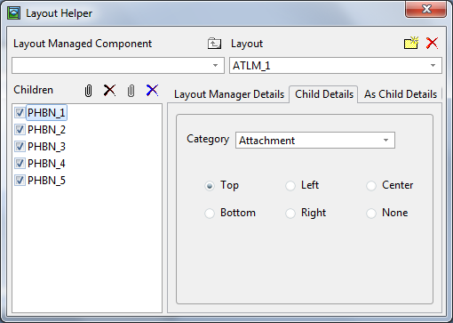
This is what the layout looks like in the Layout Helper (to display it click on the button with ellipses in the LayoutManager property of the Details tab of the container):
The component in the center is always changed to accommodate the space left over from the other components.
You will often place Panel components in the attachment positions and then add other components to the panels.
Note that if more than one component is given the same Attachment position, only the component with the lowest Display position will be displayed, and the other components will be hidden.
A very common use of Attachment layout is one where only the Top, Center and Bottom positions are used:
- The Top position contains a toolbar created from a panel and toolbar buttons
- The Centre position contains a panel with various fields
- The Bottom position contains a status bar