3.6.1 Visualization Types
There are several visualization types you can choose for a field. Which one is most appropriate depends on the type of field and the type of values it can have.
The types available follow:
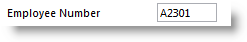
Edit Box
When you add a field to a component, by default it is visualized as an edit box:
You can change the default length, width and other characteristics of the edit box. The same is true for all visualizations.
Edit Box with a Prompter
You can define a prompter component for a field. The prompter is a user-defined reusable part. When the field has a prompter, a button with ellipses is added to the edit box so the user can display the prompter:
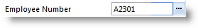
At run-time when the prompter button is clicked, the prompter component is displayed to allow the user to choose a value.
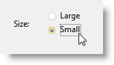
Set of Radio Buttons
When the field can have one of a limited set of values, it can be displayed as radio buttons:
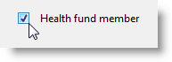
Check Box
When a field's value can be True or False, it can be defined as a check box:
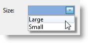
List
When a field can have one of a set of values, it can be visualized as a list or a drop-down:
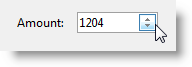
Spin Edit Box
A numeric field can be visualized as a spin edit box:
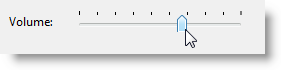
Track Bar
Numeric fields can be visualized as a track bar where appropriate:
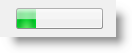
Progress Bar
In some instances you may want to visualize a numeric field as a progress bar:
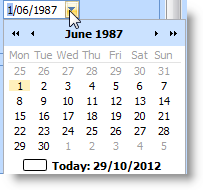
DateTime Picker and Calendar
Datetime fields can be visualized as a drop-down datetime picker or a calendar:
Reusable Part
You can define a reusable part to for visualizing the field.
When Embedded in Lists
Embedded in a list (Grid, ListView, TreeView) fields can be displayed as:
- Check Box
- Image
- ImageAndText
- Edit
- ComboBox
- MultiLineEdit
Embedded in a list (Grid, ListView, TreeView) fields can be edited as:
- Check Box
- Image
- ImageAndText
- Edit
- ComboBox
- MultiLineEdit
- SpinEdit
- ReusablePart