Theme Properties of Controls
ThemeStyle Property
ThemeDrawStyle Property
Sometimes slightly different appearances may be required to get the most out of Visual LANSA themes.
The most obvious case is where group boxes and panels have been used as toolbars. Some themes have a dark control background which interferes with the display of icons (for example the 2007Graphite theme). In such cases use the ThemeDrawStyle to change the display of controls.
|
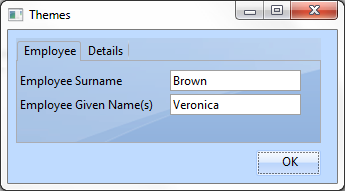
Image
|
The theming of container controls,(for example a tab folder as in this picture, which take up a large portion of the screen can be enhanced by specifying ThemeStyle Image.
Only applicable to the 2007 themes.
|
|
Toolbar
|
For controls used as toolbars, the Toolbar value will result in a better appearance.
|
|
DarkTitle
MediumTitle
LightTitle
|
Used for labels that need to stand out in a form to appear correctly for the application theme.
These values can also be used in places where visual style colors have been used to mimic theme behavior in Visual LANSA applications.
|
|
None
|
|
|
Standard
|
|
|
ThemeStyle Property
The ThemeStyle property of controls allows a control to change its theme appearance.
Note that not all controls have this property.
|
None
|
The control appears without theme on a theme-enabled form.
|
|
Parent
|
Default. All controls follow the theme style of their parent and can only be themed if their parent form uses a theme.
|
|
Themed
|
Only has an effect if the form itself is theme-enabled.
|
|
Application
|
|
|
Ý 6.29.4 Themes