6.14.11 Toolbar Button
Toolbar buttons are used to allow the user to quickly perform an action. There should be a toolbar button for the most commonly used actions in the application.
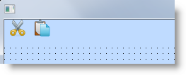
To start creating a toolbar, drag a panel component (PRIM_PANL) to the form and size it. Usually a toolbar panel is placed underneath the form's menu bar. If you want to group toolbar buttons, you can add other panels to the toolbar panel.
To create the toolbar, drag toolbar buttons to the panel. Use the Image property of a button to specify a repository-enrolled bitmap to be displayed on it. Note that you cannot specify text on a toolbar button, but you should use the Hint property to add a ToolTip description for it. The size of a toolbar button is adjusted to the size of the bitmap on it. Typically bitmaps used on toolbar buttons are 16 x 16 pixels.