Add Controls to a Table Layout
When you drop controls from the Controls View or the Repository Browser onto the layout, they adopt default layout behaviour depending on their type:
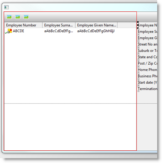
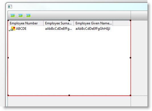
- Composite controls such as a panel, lists, and user designed controls resize themselves to fit the cell:
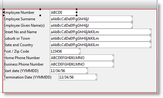
- Labels, spin edits, check boxes and other user input controls are aligned to top left with Flow(Down) ensuring that they stack neatly down the page. The DisplayPosition property determines the order in which the controls are placed:
- Buttons automatically flow left when added and have an Alignment of TopLeft.
- A toolbar will show several buttons. When a toolbar button is added to the layout, it defaults to Flow(Left) so that the buttons line up correctly:
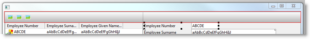
When controls are moved from one cell to another, they take their behaviour with them and simply apply it to the bounds defined by the new cell. If that happens to coincide with other controls, they are not affected.
Once added to the design all of the properties of the layout items can be modified as required, and controls can be moved and resized in the Design view.
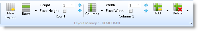
Table layout features can be accessed directly from the ribbon:
Column dividers are automatically added between the first two available divisions:
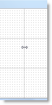
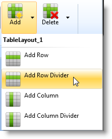
By default they occupy the space available and will always be on top. However, they can be adjusted to start and end on whichever division is required. Divisions can be added and deleted:
Controls can be made to span more than one cell. For example, here the bottom corner of the list has been dragged over the row below so it occupies rows 2 and 3: