Create or Edit a Visual Style
To create a new visual style, use the New option of the File menu.
The editor opens the visual style. If you double-click the visual style in the Outline tab, you can see its components.
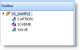
A visual style consists of a schemes and style items. By default every visual style has one Scheme and two visual style items: Caption and Value. The scheme maps Caption and Value objects to the appropriate styles. Normally you do not need to modify the scheme at all.
The Caption style item defines how controls such as labels are displayed. In the VS_Norm style this style item has background color set to the system color ButtonFace which on most workstations is gray, the font to MS Sans Serif 8 points and the text color to Windows text color which is usually black. The border style is set to 3D Left which produces a 3D effect with shadows on the left.
The Caption style item governs these component types:
- check box
- field label
- grid headings
- group box
- list view headings
- push button
- radio button
- label
- status bar
- tab folder
- tab sheet
- track bar
The Value style item defines how controls such as fields are displayed. In the VS_Norm style this style item is similar to the Caption style item except it uses the system color for Window (usually white) as the background color. It also defines an alternate background color for every second line of a list and an error color that can be used in case the value entered is incorrect.
The Value style item governs these component types:
- combo box
- edit box
- field edit box
- grid cells
- list box
- list view
- spin edit
- tree view
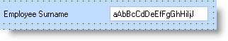
A field is a good example of the different purposes of the two styles. The way the label of the field is displayed is determined by the Caption style item, and the way the text portion of the field is displayed is governed by the Value style item:
The properties of a style item are set using the property sheet:
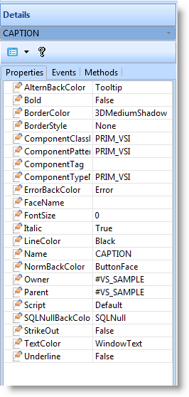
Refer to the Features help text for more information about the properties of visual style items.
Note that the AlternBackColor, BorderColor and ErrorBackColor only have effect on component types (mainly lists and fields) which are governed by the Value style item. This is because AlternBackColor only applies to lists, ErrorBackColor to lists and the edit portion of a field, and BorderColor to grid lines.