Step 2. Add Controls to a Form
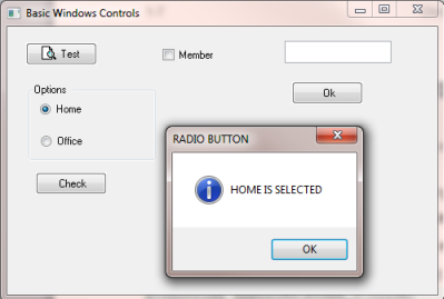
VFW005 – Basic Windows Controls
Push Button
A push button allows a user to perform an action.

A push button can have a bitmap or a text Caption or both.
Push buttons have events such as etc.
1. The tab should currently be visible. This is the default when a new form is created. On the ribbon, select from the menu.
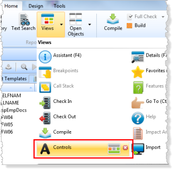
2. Drag and drop a onto the form. Note that the new component is automatically named PHBN_1.
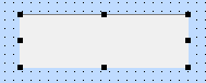
3. With the push button selected, select the tab and change its property to Test.
4. To add a event, ensure that the push button is selected and select on the tab. Double click on the event to create a click event.
Alternatively, right click on the push button and select . In this case the tab will be displayed, and the editor is positioned at the new event routine.
5. In the push button click event, add code to display a message in a .
Your code should look like the following:
Evtroutine Handling(#PHBN_1.Click)
Use Builtin(message_box_show) With_Args(*Default *Default *Default *Default 'My first form')
Endroutine
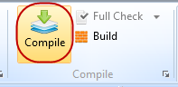
6. Compile the form using the button on the ribbon:
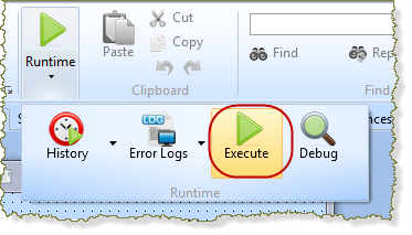
7. Run the form, by selecting the button on the ribbon and select the button:
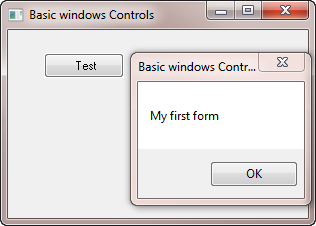
8. A click on the push button should display a message box:
9. Close your form.
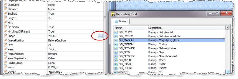
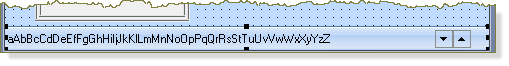
10. In the view, select the push button and use the tab / sheet to add an image to the push button.
11. Select the VB_MAGLAS image using the ellipsis button for the Image property:
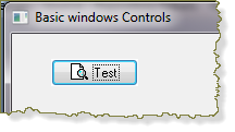
12. Compile and run the form, which should look like the following:
13. Close the form. Leave the form iiiBasicWinCtrls open in the editor.
Check Box
A check box is used to represent a Yes/No choice.
There are three button states: checked, unchecked and grayed. Unchecked is the default. You would normally use the grayed state to indicate that the selections to which this check box applies have conflicting settings.
To gray out the check box, use the enabled property of the check box
#CKBX_1.Enabled := FALSE
You can use check boxes in groups to display multiple choices, from which the user can select one or more.
The ButtonState property indicates whether a check box has been checked
The check box can be set to checked state programmatically, as shown in the following code:
#CKBX_1.buttonstate := checked
1. Select the tab for form iiiBasicWinCtrls.
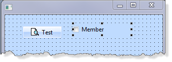
2. From the tab, drag and drop a onto the form.
3. Change the property to Member.
Your form should look like the following:
4. Change the push button click event to test the ButtonState property and display a suitable message in a message box.
Your code should look like the following:
Evtroutine Handling(#PHBN_1.Click)
If Cond(#CKBX_1.BUTTONSTATE *EQ CHECKED)
Use Builtin(MESSAGE_BOX_SHOW) With_Args(*Default *Default *Default Default 'Check box is checked')
Else
Use Builtin(MESSAGE_BOX_SHOW) With_Args(*Default *Default *Default *Default 'Check box is unchecked')
Endif
Endroutine
5. Compile and run the form. Ensure that the correct message box is shown, depending on the Check Box setting.
6. Close the form. Leave form iiiBasicWinCtrls open in the editor.
Edit Box
An edit box is an area where the user can enter text or where text can be displayed. The text can be set or retrieved using the Value property. An edit box is the default visualization style for fields.
1. Select the tab for the form iiiBasicWinCtrls.
2. Select the tab, and drag and drop an onto the form. Note that the will be named EDIT_1.
3. Add a Push Button to the form below the Edit box. Note that your button will be named PHBN_2.
4. Create a Click event for PHBN_2. Change its to OK.
5. Add logic to the new push button's event to change the value of the Edit box to "Hello".
Your code should look like the following:
Evtroutine Handling(#PHBN_2.Click)
#EDIT_1.value := 'Hello'
Endroutine
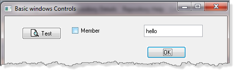
6. Compile the form and execute it to test the new push button and edit box. Your form should look like the following:
7. Close the form. Leave form iiiBasicWinCtrls open in the editor.
Group Box
A provides a way of grouping components.
A can optionally have a . Define a Title, by defining the property of the .
Typically, are used to group together a set of or , or a related group of fields.
has an EnableChildren property. When this property is set to True, all the components contained in this component are Enabled or Disabled, depending on whether the Enabled property of this component is set to True or False.
A will be used in the next part of this exercise.
Radio Button
Radio buttons are used to represent mutually exclusive choices. The convention is to enclose the radio buttons in a .
The ButtonChecked property of the radio button indicates whether it is checked. By default the buttons are not checked.
While radio buttons and check boxes may appear to function similarly, there is an important difference: When a radio button is selected, the other radio buttons in the same group are automatically deselected. By contrast, any number of check boxes can be selected.
Radio Buttons are automatically "grouped" by their container, such as a Group Box, or a Panel.
If the radio buttons are simply placed on the form, then the form is their container.
1. Select the tab for the form iiiBasicWinCtrls.
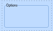
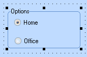
2. Drag and drop a onto the form. Change the property of the group box, to Options.
3. Adjust the size of the group box, so that two radio buttons can be added to it.
4. Drag and drop two radio buttons into the group box.
a. Change their to Home and Office respectively.
b. Change the Home radio button property to True.
c. Adjust the width and height of each radio button if necessary.
5. Add a push button to the form, below the group box. Change its to Check.
6. Create a event for the new push button.
7. Add logic to the new push button's click event to indicate which radio button is checked.
Your code should look like the following:
EVTROUTINE HANDLING(#PHBN_3.Click)
IF COND('#RDBN_1.BUTTONCHECKED *EQ TRUE ')
USE BUILTIN(MESSAGE_BOX_SHOW) WITH_ARGS(OK OK INFORMATION 'RADIO BUTTON' 'Home is selected')
ELSE
USE BUILTIN(MESSAGE_BOX_SHOW) WITH_ARGS(OK OK INFORMATION 'RADIO BUTTON' 'Office is selected')
ENDIF
ENDROUTINE
8. Compile and execute the form.
9. Ensure that the correct message is displayed in a message box, which indicates which radio button is checked.
10. Close the form. Leave iiiBasicWinCtrls open in the editor.
Label
Use a label to add text that the user cannot change.
Labels are usually used for instructions together with an Edit box. You enter the text for the label in its Caption property.
A Label has a click event, initialize event, double click event and so on.
Panel
A Panel provides a visual grouping of items in a similar way to a group box, but without a Title. A panel has properties to control the scroll bar such as , . , and so on.
A Panel has an EnableChildren property. All the components contained in this component are Enabled or Disabled when the Enabled property of this component is set to True or False.
Like the Group Box, the Panel is a container. Radio Buttons could be grouped on a panel.
Static Component
Use the Static component to draw lines, rectangles, triangles and ellipses on forms. The type of the image drawn is specified using the DrawType property.
1. Select the Design tab for form iiiBasicWinCtrls.
2. Drag and drop a Static component onto the form.
3. Change the property to FrameIndentedEdge. The Static component should look like the following:
4. Experiment by changing the property to different values.
Status Bar
A Status bar creates a separate area at the bottom of the window where messages are displayed.
The status area can also contain other components, such as progress bars, (animated) pictures and edit boxes.
If more than one information message is issued, the user can scroll through them
A Status bar will be used in a later step in this exercise.
Track Bar
A Track bar allows the user to select a value with a slider.
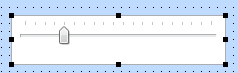
A Track bar is a panel containing a slider and, optionally, tick marks.
Track bars are useful when you want to select a discrete value or a set of consecutive values in a range.
The user can move the slider by dragging it, clicking the mouse to either side of the slider, or using the keyboard.
1. Select the tab for the form iiiBasicWinCtrls.
2. Select the tab, and drag and drop a onto the form.
3. Change the property of the Track bar to 5.
Note:
The has a default value of 1, so that there are now 5 divisions.
The has a default property of 1, so that there is one tick of the Track bar for every increment of the Track bar.
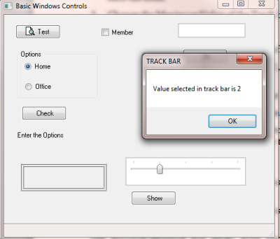
4. Add a push button to the form, next to the Track bar. Change its to Show.
5. Add a event for the new push button.
6. In the event for the Show push button, check for the track bar value and display a message in a EVTROUTINE HANDLING(#PHBN_4.Click)message box.
Your code should look like the following:
CASE OF_FIELD(#TKBR_1.VALUE)
WHEN VALUE_IS(= 1 )
USE BUILTIN(MESSAGE_BOX_SHOW) WITH_ARGS(*Default *Default *Default 'TRACK BAR' 'Value
selected in track bar is 1')
WHEN VALUE_IS(= 2 )
USE BUILTIN(MESSAGE_BOX_SHOW) WITH_ARGS(*Default *Default *Default 'TRACK BAR' 'Value
selected in track bar is 2')
WHEN VALUE_IS(= 3 )
USE BUILTIN(MESSAGE_BOX_SHOW) WITH_ARGS(*Default *Default *Default 'TRACK BAR' 'Value
selected in track bar is 3')
WHEN VALUE_IS(= 4)
USE BUILTIN(MESSAGE_BOX_SHOW) WITH_ARGS(*Default *Default *Default 'TRACK BAR' 'Value
selected in track bar is 4')
WHEN VALUE_IS(= 5 )
USE BUILTIN(MESSAGE_BOX_SHOW) WITH_ARGS(*Default *Default *Default 'TRACK BAR' 'Value
selected in track bar is 5')
ENDCASE
ENDROUTINE
7. Compile and run the form.
8. Move the Track bar to a value and click the button. A message box is shown, indicating the value of the Track bar.
9. Close the form. Leave form iiiBasicWinCtrls open in the editor.
Progress Bar
A Progress bar is used to indicate the progress of a lengthy operation. The progress bar is gradually filled with chunks from left to right as the operation progresses.
Use the MinimumValue and MaximumValue properties to set the range for the duration of the entire process. The property indicates the current value of the progress bar.
1. Select the tab for form iiiBasicWinCtrls.
2. On the tab, select and drag and drop a onto the form. Note that it will be automatically located at the bottom of the form.
3. Drag and drop a onto the right hand side of the .
4. Drag the left hand "handle" of the Progress Bar to the left to expand it. Your design should look like the following:
5. Change the property of the Progress bar to 20,000.0
Note that the property defaults to 1.
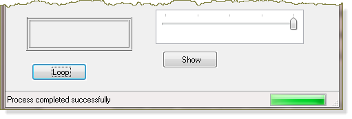
6. Drag and drop a push button onto the form and change its to Loop.
7. Create a event for the Loop push button.
8. Add the following logic to the Loop push button's event
EVTROUTINE HANDLING(#PHBN_5.Click)
#STD_COUNT := 1
#PGBR_1.VALUE := 1
BEGIN_LOOP USING(#STD_COUNT) TO(20000)
#PGBR_1.VALUE := #STD_COUNT
END_LOOP
MESSAGE MSGTXT('Process completed successfully')
ENDROUTINE
Review the code you just added. The value is reset to 1. A loop from 1 to 20000, will update the Progress bar Value for each step and display a message in the Status bar when the loop completes.
9. Compile and run the form. Verify that it works correctly.
10. Close the form.
Note: This example is a simple example which shows how to use properties. In practical applications, to show the progress of a lengthy process, set the value of the Progress bar at different places in the logic to visually display the progress of the operation.
Tab Folders and Tab Sheets
Go to Step 3. Create Tab Folder Form to see how to use a tab folder.