


You may examine the distribution of values in your data and decide that none of the four distribution types: Equal, Quantile, Standard Deviation, and Natural Breaks, is exactly right. In this case, you can create your theme based on any distribution type, and then adjust the ranges individually. For example, with the parcels data, we have already found that most of the values are clustered at the low end of the range. We might therefore decide to make our own set of six ranges to best reflect the fact that most of the land values in our city fall between 0 and 100,000.
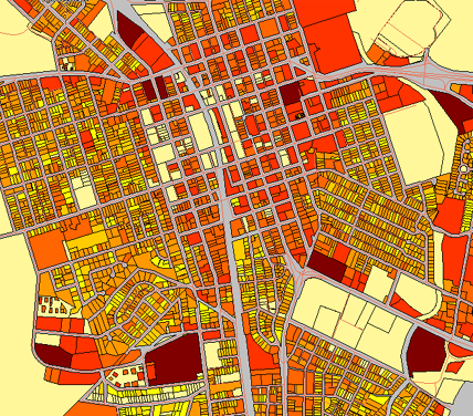
Analysis of the parcels data suggests that the following ranges would give the best results, that is, produce a map that is easy to read and in which the distribution of colors most accurately reflects the actual conditions.
- 1 - 10,000
- 10,000 - 20,000
- 20,000 - 50,000
- 50,000 - 200,000
- 200,000 - 1,000,000
- Greater than 1,000,000
Another characteristic of our data is that there are many parcels with LAND_VALUE = 0. We can exclude these parcels from the theme ranges so that they do not distort the distribution of the color values.
The illustration below shows the map that is produced when we theme the parcels using the new ranges. Compare it with the four maps in Choose the right type of theme to suit your data. The colors in this new map give a much better view of the real distribution of land values.
The first demonstration shows the procedure for manually editing the conditions for each range of values. For example, we change the first range so that it includes the values that are < (less than) 10,000. The second range includes values > (greater than) 10,000 and < 20,000, and so on.
Show me how to manually adjust the ranges of a theme
Manually adjusting the ranges gets us a long way towards a final map, but we forgot one thing—there are still many parcels with LAND-VALUE = 0 included in the first range. The second demonstration shows how to exclude those parcels. Also, the red colors for the two highest ranges seem too similar to one another, so we change one of them to a darker red.
Show me how to exclude zero values and change colors for the ranges