

combit List & Label
Creating a Pie Chart
Let's assume that you want to evaluate the sales per country. The pie chart is the right choice for this. It lets you read off the percentages immediately. Proceed as follows in the List & Label Sample Application:
1. As the data source, select the "Customers > Orders > Order_Details" table.
2. For the diagram type, choose Pie > Pie.
3. You should first specify the coordinate values for the data source, i.e. the values that define the individual pie segments, e.g. Customers.Country.
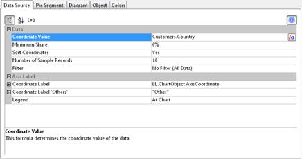
Figure 6.3: Definition of the data source in the pie chart object
4. Switch to the "Pie Segment" tab to specify the coordinate values for size of the pie segment, i.e. the sales. Double-click the "Coordinate Value" property.
Now select the aggregate function that you want for the contents in the "Coordinate Value" dialog that follows. You want to create a sales evaluation so choose the "Sum" function.
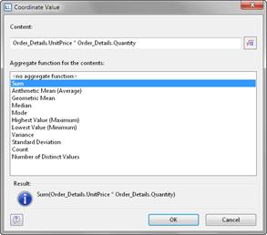
Figure 6.4: Wizard for creating the coordinate value formula
5. In the upper part of the dialog, you can specify the contents by clicking the formula button to start the formula wizard. In the Sample Application, the sales per order value is not supplied directly as a field so you must calculate it using the "Order_Details.Quantity * Order_Details.UnitPrice" formula.
6. The "Label on Object" property is already set to "Yes" so that a label with the percentage value is shown on the pie segments. Define the value as "percent" without decimal places by means of the "Format" property.
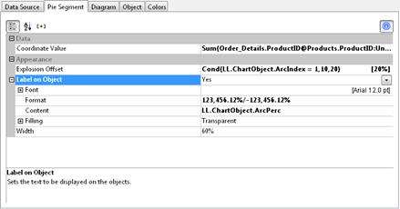
Figure 6.5: Definition of the pie segment in the pie chart object
7. The "Explosion Offset" property lets you specify a distance to the center for the pie segment. With the "ArcIndex" chart field, which numbers the pie segments according to their size, you can even display the largest pie segment with a greater offset. Example:
Cond (LL.ChartObject.ArcIndex=1,50,10)
8. On the "Diagram" tab, select the general diagram options. Various properties are available including:
§ The degree of perspective, e.g. strong.
§ The color mode, e.g. single color
Also see chapter Overview of Properties.
9. On the "Object" tab, select the general layout options for the entire chart object. Various properties are available for this including:
§ Title, e.g. "Customer turnover per country"
§ Position of the title
§ Background including filling, border and shadow, e.g. border = transparent
Also see chapter Overview of Properties.
10. On the "Colors" tab, you can specify the colors for the display:
§ Assigned Colors: You can assign fixed colors to particular axis values. If you click the "New" button, you can create a new assignment e.g. Customers.Country = "Germany".
§ Unassigned Colors: Specifies the colors and color sequences for the data rows that are not specified by the "Assigned Colors".
11. The pie chart now looks like this:
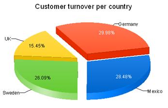
Figure 6.6: Pie chart