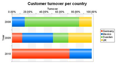
The pie chart in the first example gave you an overview of the percentages for the entire evaluation period. But in order to be able to recognize trends, it would be good to see how the percentages have changed during the course of the evaluation period. The 100% stacked bar chart can be used for precisely these types of applications. The respective percentage of the length of the bars relates directly to the turnover percentage of the respective country.
Proceed as follows in the List & Label Sample Application:
1. As the data source, select the "Customers > Orders > Order_Details" table.
2. Choose Bar/Ribbon > 100% stacked as the diagram type.
3. First specify the coordinate values for the category axis, i.e. the values of the x-axis. In the Sample Application, the order year is not supplied directly as a field so you must calculate it using the "Year$(Orders.OrderDate" formula.
4. Now specify the coordinate values for the series axis, i.e. the values of the y-axis. Select the "Customers.Country" field via the formula wizard.
5. Specify the coordinate values for the value axis (z-axis), i.e. calculate the turnover with the "Order_Details.Quantity * Order_Details.UnitPrice" formula.
6. On the "Diagram" tab, choose "Left to Right" for the "Alignment" to create a horizontal diagram.
7. The multi-row bar chart now looks like this:

Figure 6.13: 100% Stacked bar chart

