

combit List & Label
Creating a Multi-Row Bar Chart
Let's assume that you want to evaluate the sales for various countries over the years, scaled by country. A multi row bar chart is perfect for this. You get a diagram in which you can see the turnover achieved in the respective country for each quarter. Proceed as follows in the List & Label Sample Application:
1. As the data source, select the "Customers > Orders > Order_Details" table.
2. Choose Bar/Ribbon > Multi-Row (3D) as the diagram type.
3. First specify the coordinate values for the category axis, i.e. the values of the x-axis. In the Sample Application, the order year is not supplied directly as a field so you must calculate it using the "Year$(Orders.OrderDate" formula.
If you want to evaluate the data by quarter and year, simply enter "Orders.OrderDate" as the coordinate value and then choose an appropriate date format by means of the "Coordinate Label > Format" property, e.g. "Q%q %y". Then change the "Sort Coordinates" property to "No" so that the values are not sorted by quarter.
4. Type "Year" as the text for the "Axis Label".
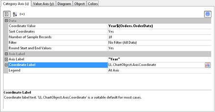
Figure 6.7: Definition of the category axis
5. Now specify the coordinate values for the series axis, i.e. the values of the y-axis. Select the "Customers.Country" field via the formula wizard.
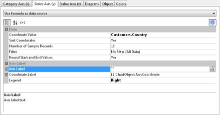
Figure 6.8: Definition of the series axis
6. Now specify the coordinate values for the value axis (z-axis), i.e. the height of the bars representing the turnover. Double-click the "Coordinate Value" property.
Now select the aggregate function that you want for the contents in the "Coordinate Value" dialog that follows. You want to create a sales evaluation so choose the "Sum" function.
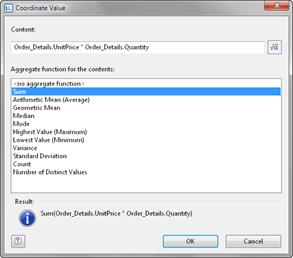
Figure 6.9: Wizard for creating the coordinate value formula
7. In the upper part of the dialog, you can specify the contents by clicking the formula button to invoke the formula wizard. In the Sample Application, the sales per order value is not supplied directly as a field so you must calculate it using the "Order_Details.Quantity * Order_Details.UnitPrice" formula.
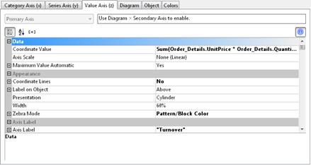
Figure 6.10: Definition of the value axis
8. Various other properties are available on this tab including the following layout options:
§ Maximum Value Automatic: You can limit the height of the displayed area, e.g. to cater for "anomalies".
§ Presentation: The data can be presented in various ways: cylinders, bars, pyramids, ribbons, octahedrons, cones
§ Thickness of the bars
§ Zebra mode for the background
Also see chapter Overview of Properties.
9. On the "Diagram" tab, select the general diagram options. Various properties are available including:
§ The degree of perspective, e.g. strong.
§ Color Mode: Specifies which axis determines the color, e.g. the y-axis values.
Also see chapter Overview of Properties.
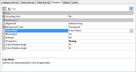
Figure 6.11: Definition of the diagram options
10. On the "Object" tab, select the general layout options for the entire diagram. Various properties are available for this including:
§ Title, e.g. "Customer turnover per country"
§ Background including filling, border and shadow, e.g. border = transparent
Also see chapter Overview of Properties.
11. On the "Colors" tab, you can specify the colors for the display:
§ Assigned Colors: You can assign fixed colors to particular axis values as a condition, e.g. Customers.Country = "Germany".
§ Unassigned Colors: Specifies the colors and color sequences for the data rows that are not specified by the "Assigned Colors".
12. The multi-row bar chart now looks like this:
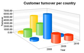
Figure 6.12: Multi row bar chart