Curve Fitting > Plotting Histograms of Best Fit Equation Parameters
The Histogram page can be used to create frequency histograms of waveform measurements, representing the frequency of occurrence of different values within the total set of measurements. It is compiled by splitting up the range of possible values into sets of adjacent bins, counting the number of individual measurements falling within each bin, then plotting the bins as rectangular bars, whose height indicates the number of measurements, and position on the X axis indicates the range of values in the bin.
To plot a histogram:
1) Select the Histogram page by clicking on its page tab.
2) Select the waveform variable from which the histogram is to be generated from the variable and channel list boxes.
3) Enter the number of histogram bins in the No. of bins box (max. 1024).
4) Enter the range of variable values which are to be included in the histogram, from the lower limit in Lower box to the upper limit in the Upper box.
5) If you want the histogram bar height expressed as a percentage of the total number of records tick the Percentage option.
6) If you want a cumulative histogram tick the Cumulative option.
7) Click the New Histogram button to compile and plot the histogram.
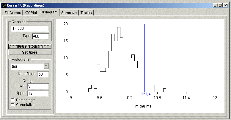
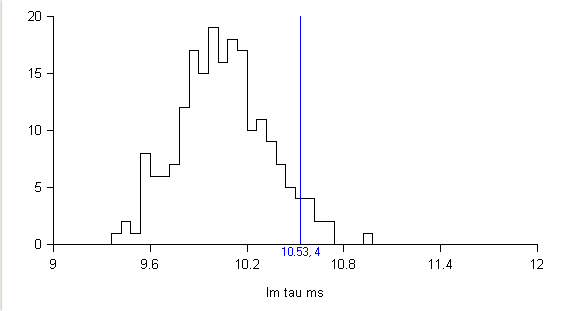
For example, the histogram, below, shows the distribution of fitted decay time constants for a series of 200 simulated endplate currents It consists of 50 equal-sized bins over the range 9 to 12 ms (i.e. a bin width of 0.6 ms). The height of each bin represents the number of records containing a signal with a peak amplitude falling within that bin range.
Customising histograms
If you want to alter the X or Y axis range, scaling or labels, click the
Set Axes
button to open the Set Axes Range / Labels dialog box.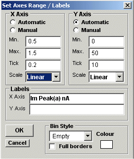
Axis limits and tick spacing are initially set to default values based upon the min.-max. range of the data. You can change the axis limits by entering new values for into Min, Max. and Tick (spacing) boxes for the X and Y axes. An axis can be made Linear or Logarithmic by selecting the option from its Scale list. Labels for the X and Y axes and a title for the plot can be entered into the Labels boxes.
The style of rectangle used to plot the histogram bins can be changed using the Bin Style options. Select No Fill to display bins as rectangular outlines, Solid Fill to fill the bins in with a solid colour, and Hatched Fill for bins filled with a diagonal lines. You can define the colour used for the solid fill, by clicking the Colour box, and selecting a colour from the palette. The Full Borders check box determines whether the outline is drawn completely around each bar, or just where bars do not overlap.
Printing the histogram
To print the displayed histogram, select
File
Print
To open the Print dialog box.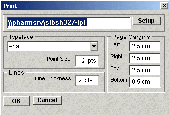
Click the Print button to plot the graph.
Copying the histogram data points to the Windows clipboard
The numerical values of the X,Y data points which generate the histogram can be copied to the clipboard by selecting
Edit
Copy Data
The data is placed on the clipboard as a table of data values, in tab text format, defining the histogram. There are 4 values per row, and one row for every bin in the histogram. Each row has the format
<Bin Lower Limit> <tab> <Bin Mid-point> <Bin Upper Limit> <tab> <Bin Count> <cr> <lf>
Copying an image of the histogram to the Windows clipboard
An image of the histogram plot can be copied to the clipboard by selecting
Edit
Copy Image
to open the copy image dialog box.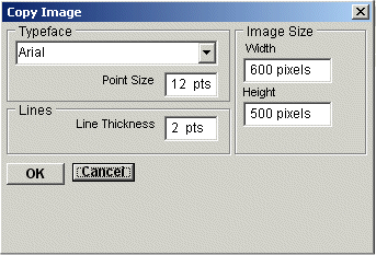
The dimensions (pixels) of the bit map, which will hold the image, can be set using the Width and Height image size boxes. The size and style of the typeface can be set using the Typeface and Size boxes.
When the image parameters have been set, click the OK button to copy the image to the clipboard.