| Spectrum Options |


|
From the Settings menu, select Options....
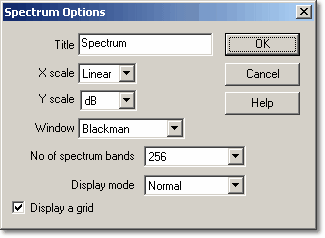
This dialog box controls a number of optional features of the active spectrum analyser window.
Note: These functions are not available on the spectrum analyser toolbar.
X scale
The X axis represents frequency. You can display the frequency either in linear or in logarithmic form.
Y scale
On the spectrum analyser display, the Y axis represents the power at a specified frequency. The power can be expressed either as volts (RMS), or as dB.
Window
PicoScope performs an analysis on a short block of samples. The 'cutting' of this block from the data stream can introduce distortion which produces side-lobes on spectrum peaks. This effect can be reduced by multiplying the block of data by a set of factors which 'rounds off' the ends of the data. This technique is known as windowing.
PicoScope supports several different windowing methods. No windowing algorithm is guaranteed to eliminate all end-effects but switching between two methods can give a clue to whether a particular peak is a side-lobe or a genuine peak. A rectangular window is generally best for estimating an exact frequency, whereas a Blackman window is often best for minimising side-lobes.
No of spectrum bands
A fast fourier transform divides up a signal into a number of frequency bands. More bands gives higher resolution, but it is necessary to collect and process more data. This reduces the display update rate, and reduces effectiveness when dealing with impulse-type signals. You can select between 128 and 4096 frequency bands, in powers of two.
Display mode
You can display the following traces:
 Current
| The spectrum for the current cycle;
|
Average
| A moving average of successive cycles (useful for removing random noise); and
|
Peak
| Displays the maximum of all cycles since the start (reset by stop/restart). Useful for plots of swept-sine.
|
Display a grid
The computer normally shows a grid corresponding to the scale points of the power and frequency axes. You can turn this grid off if it obscures important features of the data.
 Related Topics