: list_box {
action alignment allow_accept fixed_height
fixed_width height is_enabled is_tab_stop
key label list mnemonic multiple_select tabs
value width
}

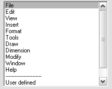
A list box contains a list of text strings, arranged in rows. Usually the list is of variable length, but list boxes can be used for fixed-length lists when a different kind of tile, such as a set of radio buttons, takes up too much space in the dialog box. When users select a row, it is highlighted. A list box can contain more rows than can fit in the box, so a scroll bar always appears to the right of the list box. (The scroll bar is enabled only if the list has more items than can appear at once.) By dragging the scroll bar cursor or clicking on its arrows, users can scroll through the list box items. Some applications may allow users to select multiple rows.
See List Boxes and Pop-Up Lists for instructions on how to manage lists for list boxes and pop-up lists.
- label
- value
-
A quoted string containing zero ("") or more integers, separated by spaces (no default). Each integer is a zero-based index that indicates a list item that is initially selected. If multiple_select is false, value cannot contain more than one integer.
If the value string is empty (""), then no items in the list are initially selected. In this case, you don't need to specify the value attribute at all.


