: popup_list {
action alignment edit_width fixed_height
fixed_width height is_enabled is_tab_stop
key label list mnemonic tabs value width
}

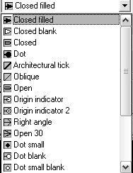
A pop-up list, or simply pop-up, is functionally equivalent to a list box. When a dialog box is first displayed, the pop-up is in a collapsed state and looks like a button except for the downward-pointing arrow on the right. When the user selects the text or the arrow, the list pops up and displays more selections. A pop-up list has a scroll bar on the right that works like the scroll bar of a list box. When a pop-up list is collapsed, the current selection appears in its display field. Pop-up lists do not allow multiple selection.
See List Boxes and Pop-Up Lists for instructions on how to manage lists for list boxes and pop-up lists.
- label
- edit_width
-
Specifies the width of the text portion of the list in character-width units. It doesn't include the optional label on the left or the pop-up arrow (or scroll bar) on the right. If edit_width isn't specified or is zero, and the width of the tile isn't fixed, the box expands to fill the available space. Possible value is an integer or a real number. If edit_width is nonzero, then the box is right-justified within the space occupied by the tile. If it is necessary to stretch the tile for layout purposes, the PDB feature inserts white space between the label and the edit portion of the box.
- value


