The GUI Module
Introduction
Since the introduction of the Macintosh, graphical user interfaces (GUI) have been becoming more and more common. Most commercial programs written for either the Macintosh or Microsoft Windows make use of GUI elements to make their program easier to use.For some time, students have been requesting methods of putting GUI elements such as buttons, check boxes, radio buttons, etc, into their Turing programs. Turing now includes a new set of predefined subprograms that allow students to add numerous GUI elements to their programs quickly and easily. These subprograms allow students to create: buttons, check boxes, radio buttons, sliders, scroll bars, picture buttons, radio picture buttons, text fields, lines, text labels, and frames.
The entire GUI Library is written in Turing and the source is included with the Turing distribution. The GUI library is completely procedure-oriented. This means that it is not necessary to know object-oriented programming or concepts in order to be able to use the library. Advanced students are welcome (in fact, encouraged) to look at the programs as an example of a large project written in Turing. We hope that there will be enterprising students who will be inspired to add new widgets to the library and encourage those who do so to submit them to Holt Software for possible inclusion into the next version of the library.
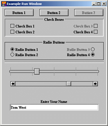
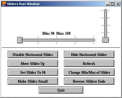
Here is a window with a few widgets.
The GUI library is usable by students who understand the concept of subprograms. In order to use the GUI library, students must write procedures (although they may be as simple as the student desires). We therefore suggest that teachers introduce students to the GUI library in a Grade 11 computer science course.
Note:Turing has not changed. It is not a visual building language. Students wishing to use the GUI library will be writing programs to create and use these GUI element, not spending their time visually building user interfaces (which may be fun, but teaches very little). In keeping with the tradition of Turing, the more the students learn about computer science, the more interesting their programs will be, GUI or no GUI!
Terminology
The term "Widget" means any graphical user interface element. A button, a check box or radio button are all examples of widgets.The term "Event" means either a keystroke or a mouse button being pressed in a window.
Example Programs
All example programs shown here are located in the [Turing Directory]/Examples/GUI directory. (In other words, start in the same directory as the Turing executable, move to the Examples folder and then the GUI folder.) All the available GUI widgets have example programs to demonstrate their use.General Principles of the GUI Library
Here are some general instructions for the use of the GUI library. Read this section before looking at the specifics of various routines.- All the subprograms for the GUI library are placed in a module called GUI. To call any of the subprograms, preface the name of the subprogram with GUI.. For example, the CreateLabel subprogram would be called using GUI.CreateLabel.
- In general, most widgets have a Create subprogram. For example, buttons have a CreateButton subprogram, radio buttons have a CreateRadioButton subprogram, and so on. The Create subprogram takes as parameters things such as the location, the size of the GUI element, and the name of a procedure to be called when the widget is clicked. This procedure must be declared before the call to the Create subprogram.
- For most widgets, there are two forms of the Create subprogram. The Create subprogram and the CreateFull subprogram. The difference between the two is that the CreateFull subprogram allows the user to define more parameters that are otherwise set to default values. For example, the GUI.CreateButton procedure allows the user to specify the x and y location of the button, the width of the button, the text that appears in the button, and the procedure to call when the button is clicked. The GUI.CreateButtonFull routine specifies those and also allows the user to specify the height of the button (otherwise set to a height that will fit the label), a short cut keyboard character that allows the user to "press" the button using a keyboard and a parameter to allow the user to specify if this button is the "default" button (the one "pressed" if the user presses the Enter key).
- All Create subprograms return an integer. This number is the ID of the widget that has been created. You need to use this ID if you want to do anything to the widget later, such as move it, change its size, hide it, and so on. Most simple programs can safely ignore the widget ID, although they will need to handle the return value from the function.
- After all the widgets have been created, the program must repeatedly
call GUI.ProcessEvent until the function returns true.
% Now process events until the user aborts the program.
loop
exit when GUI.ProcessEvent
end loopGUI.ProcessEvent checks for user input from the mouse or the keyboard and then checks to see if the user has clicked on a widget. If the user has, then it responds appropriately (toggling the check box, pressing the button, etc.) and then if appropriate, calls the procedure the user supplied in the Create subprogram. GUI.ProcessEvent returns true when the GUI.Quit has been called, otherwise it returns false.
- When a program is finished execution (for example if the user selected "Quit" or "Exit" from the file menu), it should call the GUI.Quit procedure. This will cause the GUI.ProcessEvent loop to exit. The program should have any clean up code placed after the end loop.
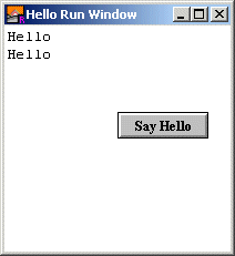
% The "Hello" program.
import GUI

View.Set ("graphics:200;200") % Shrink the run window

% The procedure called when the button is pushed.
procedure PutHello
    put "Hello"
end PutHello

% Create the button. The number returned is the ID number of the button.
var b : int := GUI.CreateButton (100, 100, 0, "Say Hello", PutHello)

% Now process events until the user aborts the program.
loop
    exit when GUI.ProcessEvent
end loop
Here is the output window after the user has pressed the button twice.
Active and Passive Widgets
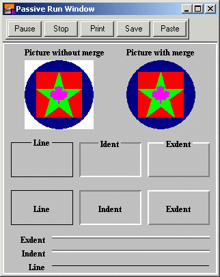
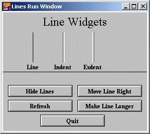
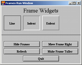
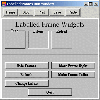
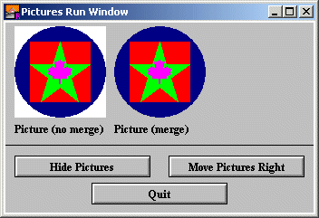
Widgets come in two forms. Active widgets are ones that respond to keystrokes and button clicks. Passive widgets do not respond to anything. Examples of passive widgets are lines, frames, labels, labelled frames and pictures. Passive widgets are generally used to organize the output window.Here is an example of a small program that show some passive widgets.
% The "Passive" program
% This demonstrates some of the passive widgets such as:
% Lines, Frames, Labelled Frames, Labels and Pictures.
import GUI

% We'll need a picture for our Picture widget.  Most likely
% you would normally have it saved in an external file and
% use Pic.FileNew to read it into a picture.  For the example
% program we'll construct it by hand.
Draw.FillOval (50, 50, 50, 50, blue)
Draw.FillBox (17, 17, 83, 83, brightred)
Draw.FillStar (17, 17, 83, 83, brightgreen)
Draw.FillMapleLeaf (37, 37, 63, 63, brightpurple)
var pic := Pic.New (0, 0, 100, 100)

View.Set ("graphics:310;335")

% The background must be gray for indented and exdented
% items to be visible.
GUI.SetBackgroundColor (gray)

% Now place the widgets.
% Three lines of the different types with labels
var line1 := GUI.CreateLine (70, 10, maxx - 10, 10, GUI.LINE)
var label1 := GUI.CreateLabelFull (60, 10, "Line", 0, 0,
    GUI.RIGHT + GUI.MIDDLE, 0)
var line2 := GUI.CreateLine (70, 30, maxx - 10, 30, GUI.INDENT)
var label2 := GUI.CreateLabelFull (60, 30, "Indent", 0, 0,
    GUI.RIGHT + GUI.MIDDLE, 0)
var line3 := GUI.CreateLine (70, 50, maxx - 10, 50, GUI.EXDENT)
var label3 := GUI.CreateLabelFull (60, 50, "Exdent", 0, 0,
    GUI.RIGHT + GUI.MIDDLE, 0)

% Now place the frames
var frame1 := GUI.CreateFrame (10, 70, 100, 120, GUI.LINE)
var label4 := GUI.CreateLabelFull (10, 70, "Line", 90, 50,
    GUI.CENTER + GUI.MIDDLE, 0)
var frame2 := GUI.CreateFrame (110, 70, 200, 120, GUI.INDENT)
var label5 := GUI.CreateLabelFull (110, 70, "Indent", 90, 50,
    GUI.CENTER + GUI.MIDDLE, 0)
var frame3 := GUI.CreateFrame (210, 70, 300, 120, GUI.EXDENT)
var label6 := GUI.CreateLabelFull (210, 70, "Exdent", 90, 50,
    GUI.CENTER + GUI.MIDDLE, 0)

% Now place the labelled frames
var frame4 := GUI.CreateLabelledFrame (10, 140, 100, 190, GUI.LINE, "Line")
var frame5 := GUI.CreateLabelledFrame (110, 140, 200, 190, GUI.INDENT,
    "Indent")
var frame6 := GUI.CreateLabelledFrame (210, 140, 300, 190, GUI.EXDENT,
    "Exdent")

% Place the picture
var label7 := GUI.CreateLabel (30, 315, "Picture without merge")
var pic1 := GUI.CreatePicture (30, 210, pic, false)

var label8 := GUI.CreateLabel (maxx - 130, 315, "Picture with merge")
var pic2 := GUI.CreatePicture (maxx - 130, 210, pic, true)

% This loop doesn't do much since none of the widgets have any actions.
loop
    exit when GUI.ProcessEvent
end loop
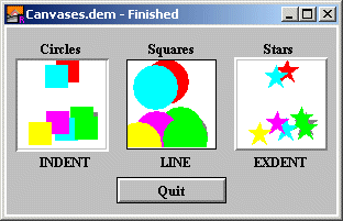
Here is the output window from the program with some labels, a line, a picture, and a labelled frame.
When an active widget is initialized, usually an action procedure must be specified. This is the name of a procedure that will be called when the widget is selected. For example, in the Hello program, the PutHello procedure was specified as the action procedure of the button. Whenever the button was pressed, the PutHello procedure was called.
Some action procedures have arguments. For example, the action procedure for a slider has a parameter of the current value. This allows the procedure to use the current value without having to call a GUI subprogram to get the current slider value.
Keyboard Shortcuts
Several types of widgets can have "shortcuts". A shortcut is simply a keystroke that has the same effect as clicking on the widget. When you specify a shortcut to a widget in the CreateFull procedure for the widget, you must specify a single character. The easiest way to do this is to use the chr function with the ASCII value of the character to be used as the shortcut. You can also specify control characters using the "^" notation. For example, the character Ctrl+F can be expressed as "^F" in Turing.The following characters cannot be used as shortcuts because the Turing environment uses them for various purposes (stopping or rerunning programs, and so on.): Ctrl+C, Ctrl+D, Ctrl+Z, F1, F11 and F12.
Background Color
It is common for windows to have a different background color from the standard white. To change the background color of a window, use the GUI.SetBackgroundColor procedure. This procedure takes one parameter, the new background color. It redraws the window in the background color and then redraws all the widgets. It also notifies the widgets about the new background color so that when the widget is erased or moved, the location of the widget is filled with the new background color instead of white.Note that Microsoft Windows dialog boxes often have a background color of gray. In order to simulate that, you should give the command GUI.SetBackgroundColor (gray) before creating widgets.
Several widgets (Canvas, Frame, Labelled Frame, Text Field and Text Box) can have borders of either type INDENT or EXDENT. These borders give a sort of 3-D appearance to the widget. However, they require that the background be set to gray.
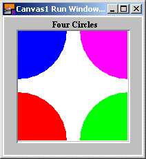
Here is an example of a small program that creates a Canvas with a 3-D appearance and then draws circles in the corner.
% The "Canvas1" program.
% Create a canvas and draw four circles on it.
import GUI

View.Set ("graphics:200;200")

% Necessary for a 3-D look for the canvas
GUI.SetBackgroundColor (gray)

% This procedure is needed as an argument to CreateCanvasFull.
procedure DoNothing (mx, my : int)
end DoNothing

% Create a label for the canvas.  We could use CreateLabelFull for more
% precise alignment.
var label1 := GUI.CreateLabel (70, 182, "Four Circles")

% Create the canvas.  We need to use CreateCanvasFull in order to
% specify the type of border.
var canvas := GUI.CreateCanvasFull (20, 20, 160, 160, GUI.INDENT,
    DoNothing, DoNothing, DoNothing)

% Draw the four ovals.  Notice that they don't extend off the canvas
% and the co-ordinates they use are relative to the canvas, not the window.
const radius := 70 % Half the width - 10
GUI.DrawFillOval (canvas, 0, 0, radius, radius, brightred)
GUI.DrawFillOval (canvas, 160, 0, radius, radius, brightgreen)
GUI.DrawFillOval (canvas, 0, 160, radius, radius, brightblue)
GUI.DrawFillOval (canvas, 160, 160, radius, radius, brightpurple)
Here is the output window.
Widget Sizes
The size that you specify a widget to be is not necessarily the actual size that the widget will appear. In fact for many widgets, you can specify a width and height of 0 for the widget and lets the initializer decide how large the widget should be. Another example is with check boxes, where if you specify the check box to be right justified, the x and y coordinates indicate the lower-right corner instead of the lower-left corner as usual. This means that you may have to do some experimentation to determine where you want the widgets to be placed. Read the page on each subprogram that you use to find out exactly what you are specifying with the x, y, width and height parameters.If you are trying to align widgets together (for example aligning scroll bars with a canvas), use the GUI.GetX, GUI.GetY, GUI.GetWidth, and GUI.GetHeight functions to determine the size of the object.
Positioning Text Labels (Aligning Labels with Widgets)
It is very common to want to align text labels with widgets on the screen. There are a few tips and tricks to doing so successfully. To align a text label with a widget, it is simply a matter of using the GUI.CreateLabelFull function with the appropriate x, y, width, height and alignment arguments.If you are left or right aligning a label, then generally you will want the x coordinate to specify the edge to be aligned from and the width parameter should be set to 0. Similarly, if you are top or bottom aligning a label, then the y coordinate should specify the edge to be aligned from and the height parameter should be set to 0.
To align a widget horizontally with a widget, choose GUI.CENTER for the horizontal alignment and the use the x coordinate and width of the widget as the label's x coordinate and width. You can get the x coordinate and width of a widget using GUI.GetX and GUI.GetWidth.
Likewise, to align a widget vertically with a widget, choose GUI.MIDDLE for the vertical alignment and the use the y coordinate and height of the widget as the label's y coordinate and height. You can get the y coordinate and height of a widget using GUI.GetY and GUI.GetHeight.
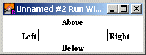
Here is an example illustrating the placement of a label at the center of each of four sides of a widget called w:
import GUI
View.Set ("graphics:200;50,nobuttonbar")
procedure DoNothing (text : string)
end DoNothing

var w : int := GUI.CreateTextField (50, 15, 100, "", DoNothing)

% These following lines are the important part of the program.
var left := GUI.CreateLabelFull (GUI.GetX (w) - 2, GUI.GetY (w),
    "Left", 0, GUI.GetHeight (w), GUI.RIGHT + GUI.MIDDLE, 0)
var above := GUI.CreateLabelFull (GUI.GetX (w),
    GUI.GetY (w) + GUI.GetHeight (w) + 2, "Above", GUI.GetWidth (w), 0,
    GUI.CENTER + GUI.BOTTOM, 0)
var right := GUI.CreateLabelFull (GUI.GetX (w) + GUI.GetWidth (w) + 2,
    GUI.GetY (w), "Right", 0, GUI.GetHeight (w), GUI.LEFT + GUI.MIDDLE, 0)
var below := GUI.CreateLabelFull (GUI.GetX (w), GUI.GetY (w) - 2,
    "Below", GUI.GetWidth (w), 0, GUI.CENTER + GUI.TOP, 0)
Here's the result. Note that the formula for aligning a label with a widget is the same for any type of widget.
Here's an example illustrating aligning a widget with the top of the window. Notice that the label is center aligned with x of 0 and width of maxx, and top aligned with a y of maxy and a height of 0.
var title := GUI.CreateLabelFull (0, maxy, "Title", maxx, 0, GUI.CENTER + GUI.TOP, 0)
Finally, here's an example illustrating the placement of a label in the center of the screen. Notice that the label is center aligned with x of 0 and width of maxx, and middle aligned with a y of 0 and a height of maxy.
var title := GUI.CreateLabelFull (0, 0, "Title", maxx, maxy, GUI.CENTER + GUI.MIDDLE, 0)
Note that if a label's position or size is changed with GUI.SetPosition, GUI.SetSize or GUI.SetPositionAndSize, it still retains its alignment with respect to its new x, y, width, and height values.
Canvases
The canvas is a rather unique widget. It is essentially a drawing surface that you place in the window. There are calls using a canvas widget that essentially duplicate all the standard Draw module calls, along with calls corresponding to Font.Draw and various Pic module calls.The difference is that the calls using the Canvas widget use (0, 0) to mean the bottom left corner of the canvas (not the window) and all drawing is clipped to the canvas (meaning that if you accidentally draw off the canvas, the part of the picture outside the bounds of the canvas will not appear). One of the most common bugs is to accidentally use the actual Draw module routines instead of the GUI.Draw routines when drawing in a canvas. If the drawing is goes outside the bounds of the Canvas, you have made this mistake.
Another feature of the Canvas widget is that you can specify a procedures to be called whenever a user clicks in the Canvas widget, drags the mouse with the mouse button down and then lets go of the mouse button. These procedures allow your program to respond to mouse activity taking place in the canvas widget.
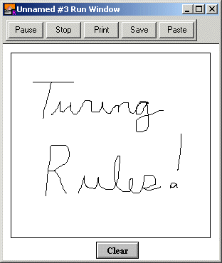
Here is a program that uses a Canvas to allow the user to draw and a button to allow the user to erase the drawing.
% The "Draw" program
import GUI

View.Set ("graphics:300;300")

var oldx, oldy : int
var canvas : int % The drawing canvas.
var clear : int % The clear button.

% Called when the user presses the mouse button in the canvas.
% Sets the initial mouse position.
procedure MouseDown (mx, my : int)
    oldx := mx
    oldy := my
end MouseDown

% Called as the user drags the mouse with the button down in the canvas.
% Draws a line from the previous mouse position to the current position.
procedure MouseDrag (mx, my : int)
    GUI.DrawLine (canvas, oldx, oldy, mx, my, colorfg)
    oldx := mx
    oldy := my
end MouseDrag

% Called when the mouse button is released.
procedure DoNothing (mx, my : int)
end DoNothing

% Called when the clear button is pressed.
procedure Clear
    GUI.DrawCls (canvas)
end Clear

% Create the canvas
canvas := GUI.CreateCanvasFull (10, 30, maxx - 20, maxy - 40, 0,
    MouseDown, MouseDrag, DoNothing)

% Create the clear button
clear := GUI.CreateButton (maxx div 2 - 20, 0, 40, "Clear", Clear)

loop
    exit when GUI.ProcessEvent
end loop
Here is the output window after the user has drawn some lines.
Multiple Windows
Turing allows for multiple run windows. This can be used to add extra functionality to programs, however there are a few issues that must be understood before multiple windows can be successfully used.Turing uses the concept of selected windows and active windows. A selected window is determined by the program and is changed by Window.Select. The selected window is the window in which all output appears. When a widget is created, it is automatically created in the selected window.
An active window is last window on which the user clicked. The active window is shown by having its title bar highlighted. When a user types, all keystrokes are sent to the active window.
It is entirely possible to have the selected window and the active window be to different windows.
When you call getch, Mouse.ButtonWait, or any other input routine, Turing checks only the selected window. The GUI Library works around this by selecting all the windows that have widgets in them (one at a time, starting with the active window) and checking each for events.
If you are processing an event from one of several windows, make certain that the correct window is selected before you output your results. Note that the widgets automatically select the correct window, so there is no need to change the selected window before making any calls to the GUI module.
If you close a window with widgets in it, use GUI.CloseWindow to close the window. This removes all the widgets in the window before closing it. If you have several windows with widgets and want some windows to be hidden and then shown later, use the GUI.ShowWindow and GUI.HideWindow to show and hide the windows with widgets in them.
The GUI Library Internals
While it is not necessary to know the internals of the GUI Library to use it, we provide this brief overview for those who wish to understand the inner workings of the library.The GUI Library consists of four parts. The only part visible to the user is the GUI module. This is located in "%oot/lib/GUI", where %oot is the directory in which the OOT executable is located. The GUI module is essentially a series of procedures that provide a front end to the Widget Module and the Widget Class Library.
The Widget Module is a module called WidgetModule that consists of a series of subprograms that cover all the aspects of GUI's that do not pertain to a particular widget. For example, the procedure to change the background color is here, as well as the procedure to process an event. It is located in "%oot/lib/GuiClass/wdgtmod.tu"
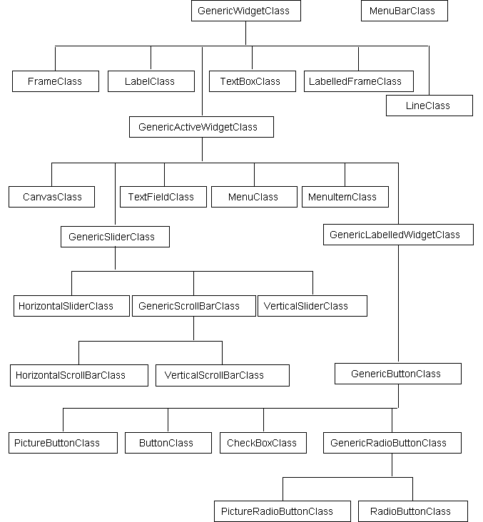
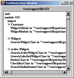
The GUI Class Library consists of a series of classes arranged in a hierarchy illustrated in the following figure. Most of the actual Turing code for the GUI Library is located in the Widget Class Library. Each different type of widget has its own class. Widgets that share common behavior have the same parent. For example, both the vertical and horizontal slider have a slider class as a parent. Those classes whose names start with Generic are abstract classes. They should not be instantiated themselves. They are used to define common behavior among their subclasses. The Turing source for the classes can be found in the directory "%oot/lib/GuiClass"
The fourth part is the WidgetGlobals module. This module that consists mostly of global variables used by the GUI Class Library and the Widget module. It is located in "%oot/lib/GuiClass/wdgtglob.tu"
Here is an example of how the GUI module works: when you create a button using GUI.CreateButton, the CreateButton function in the GUI module creates an object of type ButtonClass. (ButtonClass is found in the Widget Class Library discussed further down). It then calls the Initialize procedure of the ButtonClass to initialize the button with the specified parameters. Finally it assigns an ID number to the widget and arranges it in a table for future reference. Here is another example: when you call a procedure like GUI.Show, the Show procedure takes the widget ID, looks up the object that it represents, and then calls the Show procedure of the object.
Students who wish to add new widgets to the GUI library will have to understand the principles of object oriented programming, as they will be adding a new class to the GUI Class Library and then adding new subprograms in the GUI module that will call their new classes. (At the very least, a Create subprogram will be required for the new widget.)
A suggested project would be to create new versions of the ButtonClass, CheckBoxClass and RadioButtonClass classes that are buttons, check boxes and radio buttons with the new Windows 95/NT appearance. They could be called the Button95Class, CheckBox95Class and RadioButton95Class. Properly written, these new classes should inherit from ButtonClass, etc. and contain only those procedures that differ from the base class (presumably the procedures that display the widget).
GUI Module Routines Summary
The routines in the GUI module are divided into several different types. There are the routines to create various widgets, the routines to create menus and menu items, the routines to do general activities (such as processing an event, changing the background color, etc.) and the routines that act on various types of widgets.Here is the list of the routines that create widgets:
Here is the list of routines that create menus and menu items:
| GUI.CreateMenu | Create a menu. |
| GUI.CreateMenuItem, GUI.CreateMenuItemFull | Create a menu item. |
Here is the list of general routines:
| GUI.ProcessEvent | Process a single keyboard or mouse down event. |
| GUI.Quit | Tell the program to exit the event loop. |
| GUI.ResetQuit | Reset the "quit" flag so a program can reenter the event loop. |
| GUI.Refresh | Redraw all the widgets on the screen. |
| GUI.SetBackgroundColor | Change the window's background colour. |
| GUI.SetNullEventHandler | Set the null event handler. |
| GUI.SetKeyEventHandler | Set the keystroke event handler. |
| GUI.SetMouseEventHandler | Set the mouse event handler. |
| GUI.HideMenuBar | Hide the menu bar in the window. |
| GUI.ShowMenuBar | Show the menu bar in the window. |
| GUI.GetEventWidgetID | Get the selected widget's ID (used in a widget's action procedure). |
| GUI.GetEventWindow | Get the window that the event took place in (used in a widget's action procedure). |
| GUI.GetEventTime | Get the time (in milliseconds) that the event took place (used in a widget's action procedure). |
| GUI.GetScrollBarWidth | Return the width of a scroll bar. |
| GUI.GetMenuBarHeight | Return the height of a menu bar. |
| GUI.GetVersion | Return the current version number of the GUI module. |
Here is a list of routines that act on the widgets and the sort of widgets they act on.
| GUI.Show | Display the widget. | All |
| GUI.Hide | Hide the widget. | All |
| GUI.GetX | Return the x coordinate of the widget's left edge. | All |
| GUI.GetY | Return the y coordinate of the widget's bottom edge. | All |
| GUI.GetWidth | Return the widget's actual width. | All |
| GUI.GetHeight | Return the widget's actual height. | All |
| GUI.Dispose | Dispose of the widget. | All |
| GUI.SetPosition | Set the widget's position. | All |
| GUI.SetSize | Set the widget's size. | All |
| GUI.SetPositionAndSize | Set the widget's position and size. | All |
| GUI.Enable | Enable the widget to respond to events. | Active Widgets |
| GUI.Disable | Disable the widget from responding to events. | Active Widgets |
| GUI.SetLabel | Set the widget's text label. | Button, Check Box, Radio Button, Label, Labelled Frame |
| GUI.SetColor | Set the button's color. | Button |
| GUI.SetDefault | Make the button the default button. | Button |
| GUI.GetCheckBox | Get whether a check box is filled. | Check Box |
| GUI.SetCheckBox | Set a check box to be filled or not. | Check Box |
| GUI.SelectRadio | Select a radio button. | Radio Button, Picture Radio Button |
| GUI.GetSliderValue | Return the current value of the slider. | Slider, Scroll Bar |
| GUI.SetSliderValue | Set the value of the slider. | Slider, Scroll Bar |
| GUI.SetSliderMinMax | Set the slider's minimum and maximum. | Slider, Scroll Bar |
| GUI.SetSliderSize | Set the slider's length (or height). | Slider, Scroll Bar |
| GUI.SetSliderReverse | Reverse the direction of the slider. | Slider, Scroll Bar |
| GUI.SetScrollAmount | Set the scroll bar's thumb size and the scroll amount for arrows/page up and down. | Scroll Bar |
| DrawArc, DrawBox, DrawCls, DrawDot, DrawFill, DrawFillArc, DrawFillBox, DrawFillMapleLeaf, DrawFillOval, DrawFillPolygon, DrawFillStar, DrawLine, DrawMapleLeaf, DrawOval, DrawPolygon, DrawStar, DrawText | Routines that perform the same function as the Draw module for the Canvas widget. | Canvas |
| GUI.FontDraw | "Font.Draw" for the Canvas widget. | Canvas |
| PicDraw, PicNew, PicScreenLoad, PicScreenSave | Routines that perform the same function as the Pic module for the Canvas widget. | Canvas |
| GUI.SetXOR | Performs View.Set ("xor") for the Canvas Widget. | Canvas |
| GUI.SetText | Set the text of a text field. | Text Field |
| GUI.SetEchoChar | Set the character that appears when user enters a keystroke. | Text Field |
| GUI.SetSelection | Set the selection in the text field. | Text Field |
| GUI.SetActive | Make the text field the active one (where keystrokes will go and where the cursor blinks). | Text Field |
| GUI.ClearText | Clear a text box. | Text Box |
| GUI.AddText | Add text to a text box. | Text Box |
| GUI.AddLine | Add a line of text to a text box. | Text Box |
| GUI.SetTopLine | Scrolls text box to make line appear at top. | Text Box |
| GUI.SetScrollOnAdd | Sets whether text box scrolls when text added. | Text Box |
Widgets - Common Routines
All of the procedures in this section can be used with any widget, although some may have no effect (for example GUI.GetX on a menu item is meaningless).
| GUI.Show | Displays a widget. Used in conjunction with Hide to hide and show widgets. Hidden widgets cannot get events (i.e. respond to keystrokes or mouse clicks). |
| GUI.Hide | Hides a widget. Used in conjunction with Show to hide and show widgets. Hidden widgets cannot get events (i.e. respond to keystrokes or mouse clicks). If an active text field (see text field) is hidden, then any keystrokes in the window will be ignored. |
| GUI.GetX GUI.GetY | Returns the x (y) coordinate of the left edge of a widget. Note that this may be different from the x coordinate specified in the widget's Create call. For example, if a radio button is created with right justification, the x coordinate in the Create method specifies the right edge. Here is a small subprogram that should draw a rectangle entirely around a widget (i.e. no part of the widget should stick out). procedure WidgetRect (widgetID : int)
const x : int := GUI.GetX (widgetID)
const y : int := GUI.GetY (widgetID)
const width : int := GUI.GetWidth (widgetID)
const height : int := GUI.GetHeight (widgetID)
Draw.Box (x, y, x + width - 1, y + height - 1, black)
end WidgetRect
|
| GUI.GetWidth GUI.GetHeight | Returns the actual width (height) of a widget. Note that this may be different from the width specified in the Create call (especially since many widgets allow you to specify 0 for the width and let the GUI module determine the necessary width). |
| GUI.Dispose | Eliminates a widget. It should be called in order to free up any memory that the widget might have allocated. Note that you cannot use the widget after it has been disposed of. If you wish to temporarily get rid of a widget, consider using the Hide method and then the Show method when you want to use it again. |
| GUI.SetPosition | Moves a widget to the specified location. If the widget is visible, it is moved immediately to the new location. If the widget is hidden, it will appear at the new location when the Show procedure is called. Note that the location specified in GUI.SetPosition are the same as in the Create method. For example, if you had specified a check box to be right justified in the CreateCheckBoxFull function, then the location in a call to SetPosition would specify the lower-right corner as opposed to the lower-left corner. |
| GUI.SetSize | Changes the size of a widget. If the widget is visible, its size is changed immediately, otherwise the widget will appear in its new size when the widget is next made visible. Note that the width and height parameters are not necessarily the actual width and height of the widget. For example, the TextField widget ignores the height parameter, calculating the widget's actual height from the height of the text in the TextField. |
| GUI.SetPositionAndSize | Changes the position and size of the widget simultaneously. It works the same way as the SetPosition and SetSize procedures. |
Widgets - Buttons
The button widget is used to implement a textual button. When you click on a button, the button's action procedure is called. If a button is given a short cut, then entering the keystroke will cause the action procedure to be called. It will not visibly cause the button to depress.
If a button's width or height is set to zero (or not specified at all), then the button is shaped to fit the text.
A button can be the default button for a window. If that is the case, then the button will be drawn with a ticker border around it and if the user presses ENTER, then the button's action procedure will be called.
When a button is not enabled, the text in the button is grayed out and the button no longer responds to any mouse clicks or keystrokes until the button is enabled again.
| GUI.CreateButton | Creates and displays a button. GUI.CreateButton specifies the location, width, text and action procedure of the button. |
| GUI.CreateButtonFull | Creates and displays a button. GUI.CreateButtonFull also specifies the height, keyboard shortcut and default status of the button. |
| GUI.Enable GUI.Disable | Enables (disables) a button. Disabled buttons have their text grayed out and cannot get events (i.e. respond to keystrokes or mouse clicks). |
| GUI.SetLabel | Changes the text of a button. |
| GUI.SetDefault | Sets the "default status" of a button. If a button is the default button, then it is drawn with a heavy outline and it is activated when the user presses ENTER (RETURN on a Macintosh). |
Widgets - Check Boxes
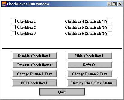
The check box widget is used to implement a check box that can be set or unset. When you click on a check box, the status of the check box flips from set to unset and back again and the check box's action procedure is called with the new status as a parameter. If a check box is given a short cut, then entering the keystroke will cause the check box to change status and the action procedure to be called. The new status will be displayed immediately.
A check box's size is not specified during creation. It is determined based on the size of the text. Instead the user specifies the lower-left corner of the check box (or the lower-right if the check box is right justified).
When a check box is not enabled, the label beside the check box is grayed out and the check box no longer responds to any mouse clicks or keystrokes until the check box is enabled again.
| GUI.CreateCheckBox | Creates and displays a left aligned (check box to the left of the label) check box. GUI.CreateCheckBox specifies the location, text and action procedure of the check box. |
| GUI.CreateCheckBoxFull | Creates and displays a check box. GUI.CreateCheckBoxFull also specifies the alignment of the check box (whether the checkbox is the right or left of the text) and the check box's keyboard shortcut. |
| GUI.Enable GUI.Disable | Enables (disables) a check box. Disabled check boxes have their text grayed out and cannot get events (i.e. respond to keystrokes or mouse clicks). |
| GUI.SetLabel | Changes the text of a check box. |
| GUI.GetCheckBox | Returns a check box's status. If the check box is set (has an X in it), GUI.GetCheckBox returns true, otherwise it returns false. |
| GUI.SetCheckBox | Sets the status of a check box. It calls the check box's action procedure with the new status and redraws the widget with the new status. |
Widgets - Radio Buttons
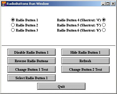
The radio button widget is used to implement a set of buttons of which one and only one button must be selected at all times. (Think old-style radio station button. Selecting one "deselects" the previously-selected station.) When you click on a radio button, any other radio button that is part of the set is deselected and the radio button's action procedure is called. If a radio button is given a short cut, then entering the keystroke will cause the radio button to be selected (and any other radio button in the group to be de-selected) and the action procedure to be called. The newly-selected or deselected radio buttons will be displayed immediately.
When a radio button is created, the widget ID of another radio button must be supplied. A value of zero for the widget ID indicates that this radio button is part of a new group. The widget ID must be the ID of the last radio button added to the group. Because radio buttons are almost always placed in groups you can specify -1 for the x and y coordinates and the radio button will be placed just below the previous radio button and retain the same alignment. When a group of radio buttons is selected, the first radio button created in the group will be the selected one. You can change this by using the GUI.SelectRadio procedure to select a different one.
A radio button's size is not specified during creation. It is determined based on the size of the text. The user specifies the lower-left corner of the radio button (or the lower-right if the radio button is right justified).
When a radio button is not enabled, the label beside the radio button is grayed out and the radio button no longer responds to any mouse clicks or keystrokes until the radio button is enabled again.
| GUI.CreateRadioButton | Creates and displays a left aligned (circle to the left of the label) radio button. GUI.CreateRadioButton specifies the location, text, the radio button to be joined to and the action procedure of the radio button. |
| GUI.CreateRadioButtonFull | Creates and displays a radio button. GUI.CreateRadioButtonFull also specifies the alignment of the radio button (whether the circle is the right or left of the text) and the radio button's keyboard shortcut. |
| GUI.Enable GUI.Disable | Enables (disables) a radio button. Disabled radio buttons have their text grayed out and cannot get events (i.e. respond to keystrokes or mouse clicks). |
| GUI.SetLabel | Changes the text of a radio button. |
| GUI.SelectRadio | Selects a radio button. The previously-selected radio button is "de-selected". The action procedure of the radio button is called. |
Widgets - Picture Buttons
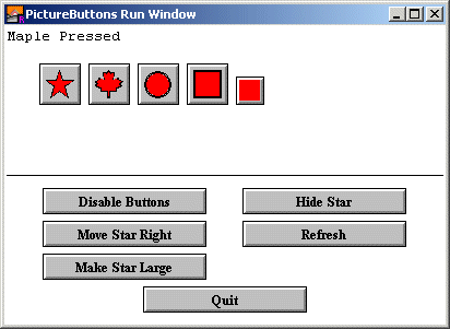
The picture button widget (hereafter simply called a button) is simply a button with a picture on it instead of text. The picture must be created by the program beforehand using Pic.New or Pic.FileNew. The resulting picture can then be used as a parameter to GUI.CreatePictureButton. In general, pictures should be a maximum of about 30 pixels high and wide, although there is no built in limit in the GUI library.
When you click on a picture button, the picture button's action procedure is called. If a picture button is given a short cut, then entering the keystroke will cause the action procedure to be called. It will not visibly cause the button to depress.
If a button's width or height is set to zero (or not specified at all), then the button is shaped to fit the picture.
When a picture button is not enabled, the picture button is grayed out and the picture button no longer responds to any mouse clicks or keystrokes until the button is enabled again.
| GUI.CreatePictureButton | Creates and displays a picture button. The button is automatically sized to fit the picture. If you need to know the precise size of the button, use the GUI.GetWidth and GUI.GetHeight functions. GUI.CreatePictureButton specifies the location, picture id and action procedure of the button. |
| GUI.CreatePictureButtonFull | Creates and displays a picture button. GUI.CreatePictureButtonFull also specifies the width, height and keyboard shortcut of the button. It also specifies whether the button picture should be merged with the background color or not. |
| GUI.Enable GUI.Disable | Enables (disables) a picture button. Disabled picture buttons are grayed out and cannot get events (i.e. respond to keystrokes or mouse clicks). |
Widgets - Picture Radio Buttons
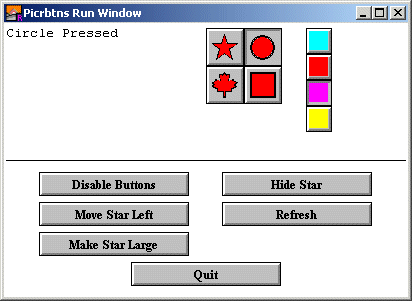
The picture radio button widget (hereafter simply called a button) is simply a picture button (see Widget - Picture Button) that has the behavior of a radio button. This means that one and only one picture radio button of a group is selected at any time. A selected picture radio button is displayed as being pressed.
When you click on a picture button, the previously-selected picture radio button will be de-selected and the new picture button's action procedure is called. If a picture button is given a short cut, then entering the keystroke will cause the action procedure to be called and the picture radio button will be drawn selected.
| GUI.CreatePictureRadioButton | Creates and displays a picture radio button. The button is automatically sized to fit the picture. If you need to know the precise size of the button, use the GUI.GetWidth and GUI.GetHeight functions. GUI.CreatePictureRadioButton specifies the location, picture id and action procedure of the button as well as the radio picture button to be joined to. |
| GUI.CreatePictureRadioButtonFull | Creates and displays a picture radio button. GUI.CreatePictureRadioButtonFull also specifies the width, height and keyboard shortcut of the button. It also specifies whether the button picture should be merged with the background color or not. |
| GUI.Enable GUI.Disable | Enables (disables) a picture radio button. Disabled picture buttons are grayed out and cannot get events (i.e. respond to keystrokes or mouse clicks). |
Widgets - Sliders
Sliders are the equivalent of a volume control on a stereo. To control a slider, the user simply clicks on the control knob and slides the control left and right (up and down for a vertical slider). Whenever the user slides the control knob, the action procedure of the widget is called with the current value as a parameter.
The range of values that the slider will give is determined by the min and max parameters in the Create call. The left side of the slider (bottom for vertical sliders) represents the minimum value, while the right (top) represents the maximum value.
In some instances, you will want the reverse to be true (right/top is minimum). In that case, call the GUI.SetSliderReverse procedure to flip the values of the slider.
Sliders always have a fixed height (for horizontal sliders) or width (for vertical sliders). The length parameter in the Create call specifies how long the slider should be.
| GUI.CreateHorizontalSlider | Creates and displays a horizontal (left-right) slider. GUI.CreateHorizontalSlider specifies the location, length, minimum and maximum values for the slider, the initial value of the slider, and the action procedure of the slider. |
| GUI.CreateVerticalSlider | Creates and displays a vertical (up-down) slider. GUI.CreateVerticalSlider specifies the location, length, minimum and maximum values for the slider, the initial value of the slider, and the action procedure of the slider. |
| GUI.Enable GUI.Disable | Enables (disables) a slider. Disabled sliders cannot get events (i.e. respond to mouse clicks). |
| GUI.GetSliderValue | Returns the current value of a slider. |
| GUI.SetSliderValue | Sets the value of a slider. It moves the control knob on the slider to the appropriate location and calls the slider's action procedure with the new value. |
| GUI.SetSliderMinMax | Sets the minimum and maximum values of a slider. It redraws the control knob to take into account the new minimum and maximum. If the current value of the slider is outside the new min/max, then the value is adjusted appropriately. |
| GUI.SetSliderSize | Changes the length of a slider. Redraws the slider and changes the position of the control knob to take into account the new size of the slider. |
| GUI.SetSliderReverse | Sets a slider into (or out of, if already into) "reverse mode". Normally, a slider is at its minimum value when the control knob is on the left side (bottom for a vertical slider). This reverses it, so the minimum value is when the slider is at the right side (top for vertical sliders) of the track. Calling this routine a second time reverses it back to normal. This procedure redraws the slider to move the control knob to its new location. |
Widgets - Scroll Bars
Scroll bars are usually used to allow a user to see a piece of a document that cannot be displayed on the screen in its entirety. The picture above shows the scroll bars appearance. To control a scroll bar, there are a few choices: the user can click on the thumb (the box in the scroll bar) and slide it up and down, or the user can click in the scroll bar itself above or below the thumb (in which case the thumb is moved up or down one "page"), or the user can click on the up or down arrows at the ends of the scroll bar (in which case the thumb is moved up one "line"). The programmer defines a page or a line. When the value of the scroll bar changes, the action procedure of the scroll bar is called with the new value as a parameter.
The range of values that the scroll bar will give is determined by the min and max parameters in the Create call. The left side of the scroll bar (bottom for vertical scroll bars) represents the minimum value, while the right (top) represents the maximum value. There is also the "thumb size". This represents the range of values that can be seen at once on the screen.
For example, if you have a window that can display 20 lines of text at once and there are 100 lines of text, you would set min to 1, max to 100, and thumbSize to 20. The value returned by the scroll bar would then be the line number of the first line on the screen to be displayed. When the scroll bar was at its maximum value, it would return 81, since by doing so, lines 81-100 would be displayed.
When a scroll bar is disabled or the scroll bar's thumb size is greater than the difference between the minimum and maximum values (i.e. the item being scrolled fits in the window), the scroll bar is deactivated. The bar is drawn in white rather than gray and the arrows are grayed out. The scroll bar does not respond to mouse clicks.
In some instances, you will want the minimum and maximum values of the scroll bar to be reversed (right/top is minimum). In that case, call the GUI.SetSliderReverse procedure to flip the values of the scroll bar.
Scroll bars always have a fixed height (for horizontal scroll bars) or width (for vertical scroll bars). To get the scroll bar's width, use the GUI.GetScrollBarWidth function. The length parameter in the Create call specifies how long the scroll bar should be.
| GUI.CreateHorizontalScrollBar | Creates and displays a horizontal (left-right) scroll bar. GUI.CreateHorizontalScrollBar specifies the location, length, minimum and maximum values for the scroll bar, the initial value of the scroll bar, and the scroll bar's action procedure. By default, the arrow increment (the amount the value is changed when the scrolling arrows are pressed) is set to one. The page up/down increment (the amount the value is changed when the user clicks in the bar to the right or left of the thumb) is set to one quarter the difference between the minimum and the maximum. The "thumb size" is set to zero (see the description of scroll bars for an explanation of the thumb size). |
| GUI.CreateVerticalScrollBar | Creates and displays a vertical (up-down) scroll bar. GUI.CreateVerticalScrollBar specifies the location, length, minimum and maximum values for the scroll bar, the initial value of the scroll bar, and the scroll bar's action procedure. By default, the arrow increment (the amount the value is changed when the scrolling arrows are pressed) is set to one. The page up/down increment (the amount the value is changed when the user clicks in the bar to the right or left of the thumb) is set to one quarter the difference between the minimum and the maximum. The "thumb size" is set to zero (see the description of scroll bars for an explanation of the thumb size). |
| GUI.CreateHorizontalScrollBarFull | Creates and displays a horizontal (left-right) scroll bar. GUI.CreateHorizontalScrollBarFull also specifies the arrow increment, page increment, and thumb size for the scroll bar. |
| GUI.CreateVerticalScrollBarFull | Creates and displays a horizontal (left-right) scroll bar. GUI.CreateVerticalScrollBarFull also specifies the arrow increment, page increment and thumb size for the scroll bar. |
| GUI.Enable GUI.Disable | Enables (disables) a scroll bar. Disabled scroll bars cannot get events (i.e. respond to mouse clicks). |
| GUI.GetSliderValue | Returns the current value of a scroll bar. |
| GUI.SetSliderValue | Sets the value of a scroll bar. It moves the control knob on the scroll bar to the appropriate location and calls the scroll bar's action procedure with the new value. |
| GUI.SetSliderMinMax | Sets the minimum and maximum values of a scroll bar. It redraws the control knob to take into account the new minimum and maximum. If the current value of the scroll bar is outside the new min/max, then the value is adjusted appropriately. |
| GUI.SetSliderSize | Changes the length of a scroll bar. Redraws the scroll bar and changes the position of the control knob to take into account the new size of the scroll bar. |
| GUI.SetSliderReverse | Sets a scroll bar into (or out of, if already into) "reverse mode". Normally, a scroll bar is at its minimum value when the control knob is on the left side (bottom for a vertical scroll bar). This reverses it, so the minimum value is when the scroll bar is at the right side (top for vertical scroll bars) of the track. Calling this routine a second time reverses it back to normal. This procedure redraws the scroll bar to move the control knob to its new location. |
| GUI.SetScrollAmount | Sets a scroll bar's arrow increment, page increment, and thumb size. Redraws the scroll bar to take into account the new thumb size. |
Widgets - Canvases
A canvas is a drawing surface for use by the program. It differs from just using the window surface to draw on in that (0, 0) represents the lower-left corner of the canvas and all drawing is clipped to the canvas. (This means that if you accidentally attempt to draw outside of the canvas, it will not actually draw beyond the border of the canvas.)
Canvases have procedures that emulate all the procedures in the Draw module as well as a procedure to emulate Font.Draw, Pic.Draw, Pic.New, Pic.ScreenLoad, and Pic.ScreenSave.
You can get mouse feedback from a canvas. Using the GUI.CreateCanvasFull method, you can specify three routines that are called when the mouse button is depressed while pointing in a canvas. One routine will be called when the user presses the mouse button down in a canvas. Another routine will be called while the user drags the mouse with the mouse button down. This routine is repeatedly called whenever the mouse changes position while the mouse button is down. The last routine is called when the mouse button is released. All three routines take an x and y parameter, which is the location of the mouse with respect to the canvas (i.e. (0, 0) is the lower-left corner of the canvas).
| GUI.CreateCanvas | Creates and displays a canvas. GUI.CreateCanvas specifies the location and size of the canvas. The canvas will have a line border around it. |
| GUI.CreateCanvasFull | Creates and displays a canvas. GUI.CreateCanvasFull also specifies the type of border and three procedures to be called when a mouse is pressed, dragged or released on the canvas. |
| GUI.Enable GUI.Disable | Enables (disables) a canvas. Disabled canvases cannot get events (i.e. respond to mouse clicks). If no mouse routines were specified (i.e. the canvas was created with GUI.CreateCanvas and not GUI.CreateCanvasFull) this routine essentially does nothing. |
| GUI.DrawArc GUI.DrawBox GUI.DrawCls GUI.DrawDot GUI.DrawFill GUI.DrawFillArc GUI.DrawFillBox GUI.DrawFillMapleLeaf GUI.DrawFillOval GUI.DrawFillPolygon GUI.DrawFillStar GUI.DrawLine GUI.DrawBox GUI.DrawMapleLeaf GUI.DrawOval GUI.DrawPolygon GUI.DrawStar GUI.DrawText GUI.FontDraw GUI.PicDraw GUI.PicNew GUI.PicScreenLoad GUI.PicScreenSave | All these routines draw to a canvas in the same
manner as the similarly named Draw�, Pic� and
Font.Draw subprograms. All coordinates are based on the canvas and all drawing is clipped to the canvas drawing surface. If the canvas is in "xor mode", all the drawing will be done with "xor" set. (See View.Set for more information about "xor".) |
| GUI.SetXOR | Sets the "xor mode" of a canvas. When in "xor mode", all the Draw... procedures of a canvas are treated as if the View.Set ("xor") statement had been executed before the Draw procedure. |
Widgets - Text Fields
A text field is a box for entering one line of text. When the user presses ENTER, the text field's action procedure is called.
Only one text field is active at a time. The active text field has a blinking cursor (or its selection highlighted). If a keystroke occurs when a window has an active text field in it, the keystroke will be directed to the active text field. You can change which text field is active with the GUI.SetActive procedure or by simply clicking on another text field with the mouse.
When multiple text fields are created in a window, the first text field created is active when the program begins.
The current version of the text field does not support cut and paste or keyboard commands to extend the selection.
Because strings are a maximum of 255 characters, this is the maximum number of characters in a text field.
The TAB character cycles between different text fields in a window. It cycles through the text fields in the order in which they were created. BACK TAB (shift+TAB) cycles through the fields in reverse order.
| GUI.CreateTextField | Creates and displays a text field. GUI.CreateTextField specifies the location, width, initial text string, and action procedure of the text field. The height of the text field is determined by the height of the font used by the text field. The text field will have a line border around it. |
| GUI.CreateTextFieldFull | Creates and displays a text field. GUI.CreateTextFieldFull also specifies the type of border, font for entered text, and kind of input restriction (integer only, etc.) |
| GUI.Enable GUI.Disable | Enables (disables) a text field. Disabled picture buttons are grayed out and cannot get events (i.e. respond to keystrokes or mouse clicks). |
| GUI.SetText | Sets the text of a text field. The cursor is set the beginning of the text. |
| GUI.GetText | Returns the current text of a text field. |
| GUI.SetSelection | Sets the selection (the selected text) in a text field. |
| GUI.SetActive | Makes a text field active. |
Widgets - Text Boxes
A text box is a box used for displaying larger quantities of text. It has both vertical and horizontal scroll bars to allow the user to scroll through all the text in the box.
| GUI.CreateTextBox | Creates and displays a text box. GUI.CreateTextBox specifies the location and size of the text box. The text box will have a line border around it. |
| GUI.CreateTextBoxFull | Creates and displays a text box. GUI.CreateTextBoxFull also specifies the type of border and the font for displayed text. |
| GUI.ClearText | Clears all the text in a text box. |
| GUI.AddText | Adds text to the current line of the text box. Does not add a newline after the text. Equivalent to put text ... This scrolls the text box (if necessary) so that the added text is now visible. To move the cursor to the end of the text without adding any extra text, call GUI.AddText with "" for the text parameter. |
| GUI.AddLine | Adds text to the current line of the text box followed by a newline. Equivalent to put text. This scrolls the text box (if necessary) so that the added text is now visible. |
Widgets - Lines
Lines are organizational elements that make the window look better and help organize the GUI elements.
| GUI.CreateLine | Creates and displays a line. GUI.CreateLine specifies the end points of the line (which must be either vertical or horizontal) and the type of line. |
Widgets - Frames
Frames are organizational elements that make the window look better and help organize the GUI elements. Frames and labelled frames are the only widgets in which other widgets can be placed.
| GUI.CreateFrame | Creates and displays a frame. GUI.CreateFrame specifies the coordinates of the lower-left and upper-right corner of the frame and the type of border of the frame. |
Widgets - Labelled Frames
Labelled frames are organizational elements that make the window look better and help organize the GUI elements. Frames and labelled frames are the only widgets in which other widgets can be placed.
| GUI.CreateLabelledFrame | Creates and displays a labelled frame. GUI.CreateLabelledFrame specifies the coordinates of the lower-left and upper-right corner of the frame, the type of border of the frame, and the text of the frame's label. |
| GUI.SetLabel | Changes the text of a labelled frame. |
Widgets - Labels
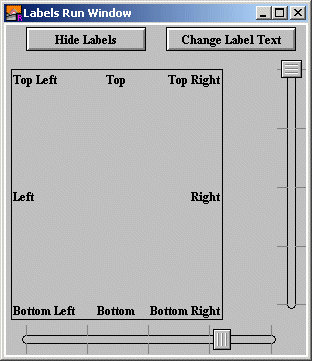
Labels are organizational elements that make the window look better and help organize the GUI elements. They are simply text placed in a window. To aid in aligning text with various widgets, it is possible to align text in a larger region (as shown in the figure).
| GUI.CreateLabel | Creates and displays a label. GUI.CreateLabel specifies the lower-left corner of the text and the text itself. The system font is used to display the label. |
| GUI.CreateLabelFull | Creates and displays a label. GUI.CreateLabelFull also specifies the width, height, alignment, and font for the label. The width and height are specified for alignment purposes. |
| GUI.SetLabel | Changes the text of a label. |
Widgets - Pictures
Pictures are organizational elements that make the window look better and help organize the GUI elements. They are simply a picture placed in a window. The pictures are specified using a picture ID from any of the Pic� subprograms.
| GUI.CreatePicture | Creates and displays a picture. GUI.CreatePicture specifies the location, picture ID, and whether the picture should be merged with the background. |
Widgets - Menus
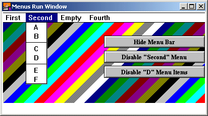
Menus are used in most modern interfaces. In order to create a full set of menus, you must create the menu and then create the menu items in that menu. The menus are automatically added to the menu bar of the selected menu.
Menu items are the individual entries of a menu. To create menus for a window, you must create a menu, then create the menu items for that menu, then create the next menu, then the items for that menu, etc. All menu items are automatically added to the last menu and after the last menu item of the currently selected (not active!) window.
When you select an item in a menu, the action procedure of the item is called. The action procedure has no parameters.
As of the v1.0 release of the GUI Library, it is an error to create a menu item without having created a menu first. In future releases it will be possible to create menus and attach and remove them from menu bars when desired.
Menus and menu items can be enabled and disabled. A disabled menu item is grayed out. When the user selects the menu, all items in the menu appear disabled and cannot be selected. A disabled menu item is grayed out when the menu is displayed. The user cannot select the menu item.
Separators in a menu appear as a solid line across the menu. These are created by creating a menu item whose text is three dashes "---".
| GUI.CreateMenu | Creates and displays a menu. The menu will be added after the other menus in the menu bar. If there are no previous menus, then a menu bar is automatically created and the menu added. GUI.CreateMenu specifies the text that will appear in the menu bar. It is suggested that the text not have any spaces in it. |
| GUI.Enable GUI.Disable | Enables (disables) a menu. Disabled menus are grayed out in the menu bar. If selected, all the menu items in the menu bar appear disabled and cannot be selected. |
| GUI.CreateMenuItem | Creates a menu item. GUI.CreateMenuItem specifies the text of the menu item and the action procedure to be called when the menu item is selected. The menu item will be added to the last menu after the other menu items in the menu. If there are no menus defined, an error results. |
| GUI.CreateMenuItemFull | Creates a menu item. GUI.CreateMenuItemFull also specifies a shortcut keystroke. |
| GUI.Enable GUI.Disable | Enables (disables) a menu item. Disabled menu items are grayed out when the menu is displayed and cannot be selected by the user. |
Widgets - General Routines
The following procedures are included in the GUI module but do not relate to a specific widget.| GUI.ProcessEvent | This function processes a single event (a mouse button press or a keystroke). If the event activates a widget, then the action procedure of the widget is called. To find out which widget was activated and called the action procedure (necessary if several widgets have the same action procedure), you can call GUI.GetEventWidgetID. To get the exact time that the event occurred, you can call GUI.GetEventTime. To get the window in which the event took place, you can call GUI.GetEventWindow. If a mouse click occurred, but did not activate any widget, then the default mouse event handler is called. By default, this does nothing. However, if you want your program to respond to mouse events that do not affect a widget, call GUI.SetMouseEventHandler to specify your own default mouse event handler. If a keystroke occurred, but did not activate any widget (i.e. it wasn't a short cut for a widget and there are no text fields in the window) then the default keystroke handler is called. By default, this does nothing. However, if you want your program to respond to keystroke events that do not affect a widget, call GUI.SetKeyEventHandler to specify your own default key event handler. If no event occurred, then the null event handler is called. By default, this does nothing. However, if you want your program to perform some action repetitively when it is not doing anything else, then call GUI.SetNullEventHandler to specify your own null event handler. The null event handler is often used for such things as updating a clock and making certain that music is playing in the background. |
| GUI.Quit | This procedure causes GUI.ProcessEvent to return true. If the program is structured properly with a
loop
	exit when GUI.ProcessEvent
end loop
at the end of the program, then the program will exit the loop after finishing the current action procedure. This procedure is usually called from the action procedure of a Quit button or Exit menu item. |
| GUI.Refresh | This routine redraws all the widgets in the currently-selected window. This is used when some form of drawing may have overwritten the widgets in a window. It is used by the GUI Library to redraw all the widgets when the background color of a window has changed. |
| GUI.SetBackgroundColor GUI.SetBackgroundColour | Changes the background color of the currently-selected window. (Both spellings of color are acceptable.) This does not change the value of color 0 in the window. Instead it fills the entire window with the new background color and then redraws all the widgets. The usual background color outside of white is gray. |
| GUI.SetNullEventHandler | Sets the new null event handler. The specified procedure will be called every time GUI.ProcessEvent is called and there is no keystroke or mouse button pressed. |
| GUI.SetMouseEventHandler | Sets the new default mouse event handler. The specified procedure will be called every time GUI.ProcessEvent is called and there is a mouse button pressed which is not handled by any widget. |
| GUI.SetKeyEventHandler | Sets the new default keystroke event handler. The specified procedure will be called every time GUI.ProcessEvent is called and there is a keystroke which is not handled by any widget. |
| GUI.HideMenuBar | Hides the menu bar in the selected window. No menu items can be selected when the menu bar is hidden. (Menu item shortcuts will be ignored when the menu bar is hidden.) |
| GUI.ShowMenuBar | Shows the menu bar in the selected window. |
| GUI.GetEventWidgetID | Returns the widget ID of the widget that was activated by the mouse button press or the keystroke. This function should only be called in an action procedure, as it will return -1 when there is no event that activated a widget being processed. |
| GUI.GetEventWindow | Returns the window ID of the window in which the event (mouse button or keystroke) took place. This function should only be called in an action procedure or in a default mouse or keystroke event handler, as it will return -1 when there is no event being processed. |
| GUI.GetEventTime | Returns the time in milliseconds when the event (mouse button or keystroke) took place. This value is the same value that Time.Elapsed returns if called when the event was processed. This function should only be called in an action procedure or in a default mouse or keystroke or null event handler, as it will return -1 when there is no event being processed. |
| GUI.SetDisplayWhenCreated | Sets whether widgets are automatically displayed when created, or whether GUI.Show must be called first. By default, this is set to true (widgets are displayed when created). However, there may be times when you want to create a widget and then make several additional calls before displaying the widget. |
| GUI.CloseWindow | Closes a window with widgets in it. This procedure automatically disposes of any widgets in the window and makes certain that the GUI Library recognizes that the window no longer exists. This procedure will call Window.Close, so there is no need for the user to do so. |
| GUI.ShowWindow | Shows a hidden window with widgets in it. This procedure makes certain that the GUI Library recognizes that the window is visible. This procedure will call Window.Show, so there is no need for the user to do so. |
| GUI.HideWindow | Hides a visible window with widgets in it. This procedure makes certain that the GUI Library recognizes that the window is no longer visible. This procedure will call Window.Hide, so there is no need for the user to do so. |
| GUI.GetScrollBarWidth | Returns the width of a scroll bar. Useful when placing a scroll bar widget beneath another object. |
| GUI.GetMenuBarHeight | Returns the height of the menu bar. Useful when placing widgets to make certain that they do not overlap the menu. |
| GUI.GetVersion | Returns the current version of the GUI module. Because the GUI module is expected to grow, new versions will probably be made available at Holt Software's web site located at http://www.holtsoft.com/turing. If you wish to use features that do not appear in earlier versions of the library, you can have your program check that the current available version meets the programs needs. GUI.GetVersion returns an integer from 100 - 999 and is read as 1.00 to 9.99. |