Analysis > Time Course Analysis > Changing Plot Axes & Labels
The X and Y axis range and labels of the graphs can be modified by clicking the
Set Axes
button to open the Customise Graph dialog box.
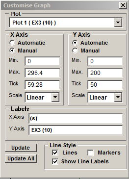
Select the graph (when more than one exists in the plot) to be modified from the Plot list.
Axis limits and tick spacing are initially set to default values based upon the range of the data. The axis limits can be changed by entering new values for into Min, Max. and Tick (spacing) boxes for the X and Y axes. An axis can be made Linear or Logarithmic by selecting the option from its Scale list.
The X and Y axis labels can be changed by editing the entries in the X Axis and Y Axis labels boxes.
X-Y graphs can be plotted as a line, unconnected markers, or both, by ticking the Lines, and/or Markers tick boxes.
Ticking the Show Line Labels check box displays a label at the beginning of each line displaying the ROI or channel number associated with the line.
Click the Update button to update the graph after changes have been made or Update All to update all graphs (when more than one exists within the plot).