
About controls
When filling out forms, users enter information by typing in text boxes, choosing items in a list, selecting check boxes, and so forth. The objects users interact with are called controls. A control is a graphical object, such as a text box, check box, or button, that appears on a form. Information entered into a control is stored in the form’s data source. When you design a form, you use the Controls task pane to insert controls.
You can customize a control’s appearance, including font, color, and alignment, its default value and data type, and other properties, such as the ScreenTip that appears when a user rests the mouse pointer on the control and a keyboard shortcut to manipulate the control without a mouse. To view the properties for a control, double-click the control on the form.
Controls and the data source
Almost all controls on an InfoPath form are associated with, or bound to, the data source. Most controls, including text boxes, check boxes, and list boxes, are bound to fields. A field is where the information entered into the control is saved. If a control is not bound, or if it is bound incorrectly, the information entered into the control cannot be saved. When you design forms in Microsoft Office InfoPath 2003, you can choose to have the fields in the data source created automatically each time you insert a control, or you can bind controls to existing fields.
The following example illustrates the relationship between two drop-down list boxes and the fields that store their data.
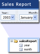
Together, a control and its field determine the type of information users can enter, as well as how they enter it. For example, a date picker control makes it easy for users to enter dates, and the field to which the date picker is bound saves only values that are dates (in other words, the field has a date data type).
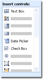
Inserting controls in your form
When designing a form, you can use the Controls task pane to insert controls. You can choose to create the data source automatically when you insert a control, in which case a field or group will be automatically created for each control you add, or to bind the control to an existing field or group. If you choose to bind to an existing field or group, you are prompted to select a field or group from the data source when you insert the control. To switch between automatically creating the data source and binding controls to an existing field or group, use the Automatically create the data source check box in the Controls task pane.
You can also insert controls by dragging fields and groups from the Data Source task pane onto the form. Each time you drag a field or group, InfoPath suggests the control that best matches the field or group. If the field has a date data type, for example, InfoPath suggests a date picker.
Types of controls
- Text box Text boxes are the most commonly used controls on forms. Users can enter any type of unformatted text into a text box, such as sentences, names, numbers, dates, and times. Text boxes cannot contain formatted text or text with paragraph breaks.
- Rich text box Rich text boxes can contain formatted text, including bold and italic, and a variety of fonts, font sizes, and font colors. In addition, users can insert images, lists, and tables into a rich text box.
- List box and drop-down list box List boxes present a list of choices in a box from which users select the appropriate item. The choices can come from a static list that you enter when you design the form, a list from an XML document, or a list from a database or Web service.
- Date picker Date pickers contain a box for users to type dates and a calendar button that allows users to select a date.
- Check box Check boxes allow users to easily indicate yes/no or true/false values without typing.
- Option button Option buttons let users select from a set of mutually exclusive choices. When one option button in a group is selected, the other option buttons are cleared. A group of option buttons is bound to one field, and each option button saves a different value in that field.
- Section Sections work like containers for other controls. Sections can include any of the other controls listed in the Controls task pane.
 Repeating and optional controls
Along with standard controls, InfoPath has list controls, repeating tables, repeating sections, and optional sections, which allow users to insert list items, rows, record sets, or optional information when filling out a form. List controls are the simplest type of repeating control, and they are useful when you want users to enter plain text lists. Repeating sections and repeating tables contain other controls
Repeating sections and repeating tables are usually bound to groups in the data source. Groups contain fields in the same way that sections and repeating tables contain controls. When you insert a section, repeating section, optional section, or repeating table, the structure of the data source must match the layout of the control. If a text box is inside a repeating table, for example, the field that the text box is bound to must be part of the group that the repeating table is bound to.
- Optional section Optional sections contain other controls and are useful for including extra information that is not necessary for all the users filling out the form. When filling out a form, users can choose whether to include an optional section in the form.
- Repeating section Repeating sections contain other controls and are useful for presenting record-based data, such as employee database records. When filling out the form, users can add additional occurrences of a repeating section.
- Repeating table A repeating table displays repeating information in a tabular structure. Each item appears in a new row in the repeating table. When filling out the form, users can add or delete rows as necessary. Repeating tables contain other controls.
- List Bulleted, numbered, and plain list controls are a good way to include simple text that repeats, such as a list of agenda items. When filling out a form, users can add or delete list items as necessary.
Hyperlink and picture controls
- Hyperlink Hyperlink controls can be used to link to different addresses depending on the data. For example, a form showing information about a list of products might include hyperlinks to product information Web pages. Hyperlink controls can point to any Web server, on either an intranet or the Internet.
- Picture Pictures may be included in a form as static elements, just like titles or backgrounds. Adding a picture control to a form lets users insert a new picture as part of the form. Picture controls can store the image in the form itself, or store an address (URL) of the picture.
- Ink picture Ink picture controls allow users with a Tablet PC to create and save ink drawings.
- Button Buttons can be used to execute a number of actions, including submitting a form, running a query on a database or Web service, and executing script.
- Expression box Expression boxes are read-only text controls. You can use expression boxes to perform basic calculations by entering an XPath expression. For example, expression boxes can be used to combine the text from other fields, calculate a sum, or average a set of fields.
Testing controls
To test controls, you can preview the form and enter information into the controls, add and remove rows and sections from repeating controls, and add and delete optional sections. In addition, you can select any control to display an icon that indicates whether the control is correctly bound to its field. There are three possible icons:
 The binding is correct.
 The control may not function as expected because of a potential binding problem. To identify the potential problem, right-click the control, and then click More Details
on the shortcut menu.
The control may not function as expected because of a potential binding problem. To identify the potential problem, right-click the control, and then click More Details
on the shortcut menu. The control will not function correctly because of a binding problem. To identify the problem, right-click the control, and then click More Details
on the shortcut menu.
The control will not function correctly because of a binding problem. To identify the problem, right-click the control, and then click More Details
on the shortcut menu.