|
Microchip Graphics Library
|
All the GOL objects that will be shown in the display have a corresponding data structure that keeps and maintains its parameters.
Each object type has a set of functions that enables the user to change the state of the object. The Microchip graphics library supports the following set of GOL objects.
|
Object |
Type Definition |
|
OBJ_BUTTON | |
|
OBJ_CHART | |
|
OBJ_CHECKBOX | |
|
OBJ_ROUNDDIAL | |
|
OBJ_DIGITALMETER | |
|
OBJ_EDITBOX | |
|
OBJ_GRID | |
|
OBJ_GROUPBOX | |
|
OBJ_LISTBOX | |
|
OBJ_METER | |
|
OBJ_PICTURE | |
|
OBJ_PROGRESSBAR | |
|
OBJ_RADIOBUTTON | |
|
OBJ_SLIDER | |
|
OBJ_STATICTEXT | |
|
OBJ_TEXTENTRY | |
|
OBJ_WINDOW |
Each GOL object type uses a style scheme. The style scheme defines the font and color settings. User can create new style schemes and assign it to objects. Multiple style schemes can be used for different objects.
To efficiently manage the different objects the first 9 fields of the structure for each object are defined the same. Collectively they are referred to as the object header structure (OBJ_HEADER). Defining the OBJ_HEADER enables the common APIs to manage the objects of different types in the same manner.
The GOL operation is centered on two major processes. First is the rendering process and second is the messaging process. These processes make use of linked list objects. The field pNxtObj in OBJ_HEADER makes this possible. To manage the list a global pointer _pGolObjects is utilized. It defines the current active linked list. Newly created objects are automatically added to the end of this list. The active linked list is the list that the messaging and rendering operation parses to evaluate if the messages received affect the objects and if objects need to be redrawn.
The use of the _pGolObjects pointer also provides a way to easily manage objects. In applications where multiple pages are displayed on the screen, objects can be grouped according to pages. The pointer can be manipulated to switch from one page to another depending on the page currently shown on the screen.
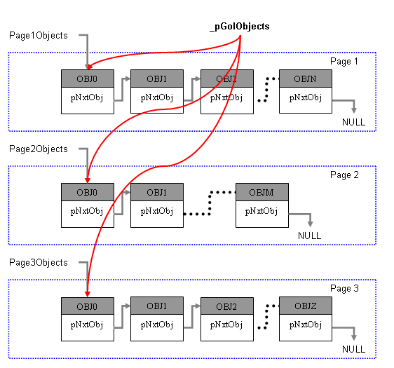
Implementation of Multi-Page Objects
User can remove an object from a list by pointer manipulation. Objects that are removed from the list are not accessible by the rendering and messaging processes.
|
Name |
Description |
|
This structure defines the Object types used in the library. |
|
Name |
Description |
|
Analog Clock is an Object that emulates an analog clock with moving hands. It can be used with or without a bitmap image as the background source. | |
|
Button is an Object that emulates a press and release effect when operated upon. | |
|
Chart is an Object that draws a bar chart or a pie chart representation of a single data or series of data. | |
|
Check Box is an Object that simulates a check box on paper. Usually it is used as an option setting where the checked or filled state means the option is enabled and the unfilled or unchecked state means the option is disabled. | |
|
Dial is an Object that can be used to display emulate a turn dial that can both go in clockwise or counterclockwise. | |
|
DigitalMeter is an Object that can be used to display a value of a sampled variable. This Object is ideal when fast refresh of the value is needed. The Object refreshes only the digits that needs to change. A limitation of this Object is that the font used should have equal character widths. | |
|
Edit Box is is an Object that emulates a cell or a text area that can be edited dynamically. | |
|
Grid is an Object that draws a grid on the screen with each cell capable of displaying an image or a string. | |
|
Group Box is an Object that can be used to group Objects together in the screen. | |
|
List Box is an Object that defines a scrollable area where items are listed. User can select a single item or set of items. | |
|
Meter is an Object that can be used to graphically display a sampled input. | |
|
Picture is an Object that can be used to transform a bitmap to be an Object in the screen and have control on the bitmap rendering. This object can be used to create animation using a series of bitmaps. | |
|
Progress Bar is an Object that can be used to display the progress of a task such as a file download or transfer. | |
|
Radio Button is an Object that can be used to offer set of choices to the user. Only one of the choices is selectable. Changing selection automatically removes the selection on the previous option. | |
|
Slider or Scrollbar is an Object that can be used to display a value or scrolling location in a predefined area. | |
|
Static Text is an Object that can be used to display a single or multi-line string of text in a predefined location. | |
|
Text Entry is an Object that can be used to emulate a key pad entry with a display area for the entered characters. The Object has a feature where you can define a key to reply with a translated message that signifies a command key was pressed. A command key example can be your enter or carriage return key or an escape key. Multiple keys can be assigned command keys. Application can utilize the command key to define the behavior of the program based on a command key press. | |
|
Name |
Description |
|
This structure defines the first nine fields of the Objects structure. This allows generic operations on library Objects. |
|
Name |
Description |
|
object draw function pointer typedef | |
|
object free function pointer typedef | |
|
object default message function pointer typedef | |
|
object message function pointer typedef |