Button supports Keyboard and Touchscreen inputs, replying to their events with the following messages:
1. BTN_MSG_PRESSED
2. BTN_MSG_RELEASED
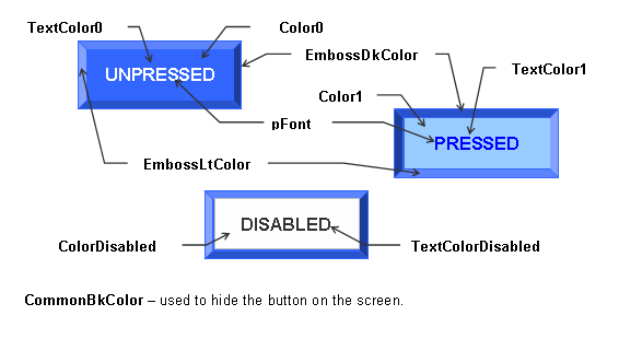
The button object is rendered using the assigned style scheme. The following figure illustrates the color assignments for the button.

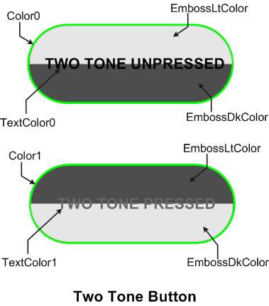
A variant of the button widget, is to implement it as a two tone button. The button object is rendered using the modified color assignments in the style scheme. The two tone button is rendered when the BTN_TWOTONE object state bit is set.

When using images on the button widget, the image is drawn on the center of the widget. If the image size is larger than the widget dimension, the image will cover the widget. When this happens, it is recommended to disable the rendering of the button panel so no time is spent rendering the panel which will be covered by the image. To do this enable the BTN_NOPANEL object state bit.
The text or string used with the button widget is always rendered last. Even with images, the string will always be rendered on top of the image. Text rendering on the button widget is not affected by BTN_NOPANEL object state bit. Text will only be affected by the following object state bits BTN_TEXTRIGHT, BTN_TEXTLEFT, BTN_TEXTBOTTOM, and BTN_TEXTTOP.
To enable multiple lines of text on the button widget, enable the USE_BUTTON_MULTI_LINE in the GraphicsConfig.h. Enabling the USE_BUTTON will only enable single lines of text.
|
|
Name |
Description |
 |
This function creates a BUTTON object with the parameters given. It automatically attaches the new object into a global linked list of objects and returns the address of the object. | |
 |
This function renders the object on the screen using the current parameter settings. Location of the object is determined by the left, top, right and bottom parameters. The colors used are dependent on the state of the object. The font used is determined by the style scheme set. The text on the face of the button is drawn on top of the bitmap. Text is always rendered centered on the face of the button. When rendering objects of the same type, each object must be rendered completely before the rendering of the next object is started. This is to avoid... more | |
 |
This function sets the string used for the object. | |
 |
This function performs the actual state change based on the translated message given. The following state changes are supported: | |
 |
This function evaluates the message from a user if the message will affect the object or not. The table below enumerates the translated messages for each event of the touch screen and keyboard inputs. |
|
Name |
Description |
|
This macro returns the address of the current text string used for the object. | |
|
This macro returns the location of the currently used bitmap for the object. | |
|
This macro sets the bitmap used in the object. The size of the bitmap must match the face of the button. |
|
Name |
Description |
|
Defines the parameters required for a button Object. The following relationships of the parameters determines the general shape of the button:
|
|
Name |
Description |
|
List of Button bit states. |