Check Box supports Keyboard and Touchscreen inputs, replying to their events with the following messages:
1. CB_MSG_UNCHECKED - When the check box is unchecked.
2. CB_MSG_CHECKED - When check box is unchecked.
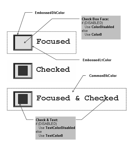
The Check Box Object is rendered using the assigned style scheme. The following figure illustrates the color assignments.
Functions
|
|
Name |
Description |
 |
This function creates a CHECKBOX object with the parameters given. It automatically attaches the new object into a global linked list of objects and returns the address of the object. | |
|
|
This function renders the object on the screen using the current parameter settings. Location of the object is determined by the left, top, right and bottom parameters. The colors used are dependent on the state of the object. The font used is determined by the style scheme set. When rendering objects of the same type, each object must be rendered completely before the rendering of the next object is started. This is to avoid incomplete object rendering. | |
|
|
This function sets the text that will be used. | |
|
|
This function performs the actual state change based on the translated message given. The following state changes are supported: | |
|
|
This function evaluates the message from a user if the message will affect the object or not. The table below enumerates the translated messages for each event of the touch screen and keyboard inputs. |
Macros
|
Name |
Description |
|
This macro returns the location of the text used for the check box. |
Structures
|
Name |
Description |
|
The structure contains check box data |
Topics
|
Name |
Description |
|
List of Checkbox bit states. |
Links