Analysis > Pixel Intensity Histogram > Pixel Intensity Histogram
The pixel intensity histogram window displays the distribution of pixel intensity values within the image or a region of interest within the image. Intensity histograms can be plotted both from live images and those recorded on file. The mean, minimum, maximum and standard deviation of the image intensity values is also displayed.
Select
AnalysisPixel Intensity Histogram
to open the Pixel Intensity Histogram display window.
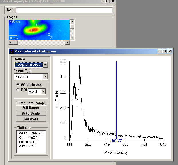
Select the source of the images to be plotted in the histogram from the Source list which contains a list of currently active image display windows. Images Window selects images stored on the currently open data file. Record Window selects the live image.
If the image source is a multi-wavelength sequence, select the wavelength frame to be displayed from the Frame Type list.
Select the Whole Image option to display the intensity histogram for all pixels within the the image. To restrict the histogram to a region of interest within the image, select the ROI option, and choose an ROI number from the list. (Note. The ROI option is not available when the image source is live images.)
Click the Full Range button to set the range of intensities plotted in the histogram to full intensity range of the camera. Click the Auto-Scale button to restrict the intensity range to the min. – max. range of values actually within the image. The histogram can also be set to a user-defined range by entering values into the Low and High histogram range boxes, then pressing the <Enter> key.
Customising graph axes and labels
The X and Y axis range and labels of the histogram graph can be customised by clicking the
Set Axes
button to open the Customise Histogram dialog box.
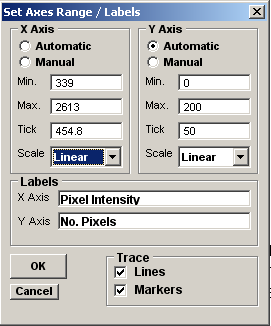
Axis limits and tick spacing are initially set to default values based upon the range of the data. The axis limits can be changed by entering new values for into Min, Max. and Tick (spacing) boxes for the X and Y axes. An axis can be made Linear or Logarithmic by selecting the option from its Scale list. The X and Y axis labels can be changed by editing the entries in the X Axis and Y Axis labels boxes. The histogram Bin Style can be set to empty, solid or hatched boxes in a variety of colours. When Full Borders option is ticked a solid rectangular border is drawn round each bin.
Click the Update button to update the graph after changes have been made or Update All to update all graphs (when more than one exists within the plot).