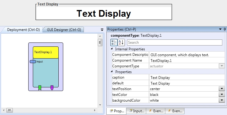
Text Display
Component Type: Actuator (Subcategory: Graphical User Interface)
The Text Display is the GUI component, which displays the text information.
 TextDisplay plugin
Input Port Description
- input [string]: The text which will be displayed. This input port supports synchronization
Event Listener Description
- clear: Removes the text from the component.
Event Trigger Description
- clicked: The event is trigger when the user
click on the component.
Properties
- caption [string]: Caption of the component.
- default [string]: The text, which is in the box after start.
- textPosition [integer]: Position of the text
in the component: left, center or right.
- textColor [integer]: Defines color of the text.
- backgroundColor [integer]: Defines background color.
- displayGUI [boolean]: If selected, the GUI of this component will be displayed - if not, the GUI will be hidden and disabled.