Dot Meter
Component Type: Actuator (Subcategory: Graphical User Interface)
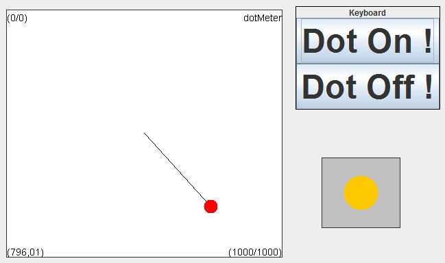
The Dot Meter generates a graphical representation of a 2-dimensional signal (for example x/y-coordinates) using a colored dot.
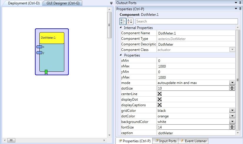
 DotMeter plugin
DotMeter example
Requirements
Computer Monitor or LC-Display available for graphics output.Input Port Description
- x [double]: The x-input port for the signal to be displayed. This input port supports synchronization
- y [double]: The y-input port for the signal to be displayed. This input port supports synchronization
Event Listener Description:
- dotOn: fill the dot with color.
- dotOff: show only outline of the dot (can be used to create a led indicator).
Properties
- xMin [double]: The default x-minimum of the signal range at model start (this value is automatically updated as lower values come in).
- xMax [double]: The default x-maximum of the signal range at model start (this value is automatically updated as higher values come in).
- yMin [double]: The default y-minimum of the signal range at model start (this value is automatically updated as lower values come in).
- yMax [double]: The default y-maximum of the signal range at model start (this value is automatically updated as higher values come in).
- mode [integer]: Via this property the way how values which exceed the current min/max range of the bar graph component are handled: "clip to min and max" crops incoming values to the min/max range, "autoupdate min and max" scales the bar graph window and updates the min/max values to cover the incoming value.
- dotSize [integer]: The radius of the dot.
- centerLine [boolean]: defines if a line to the window center is shown or not.
- displayDot [boolean]: defines if the dot is filled or not.
- displayCaptions [boolean]: defines if the value / captions are shown or not.
- gridColor [integer]: The colour of the graph grid and descriptions.
- dotColor [integer]: The colour of the dot.
- backgroundColour [integer]: The colour of the window background.
- fontSize [integer]: The font size of the display's caption.
- caption [string]: The text of the display's caption.
- displayGUI [boolean]: if selected, the GUI of this component will be displayed - if not, the GUI will be hidden and disabled.