HoverPanel
Component Type: Sensor (Subcategory: Graphical User Interface)
This component creates a panel window with selectable opacity which can be placed anywhere on the screen/desktop. No window decoration is used. The plugin provides x/y input port for coordinates and the panel reacts if these coordinates are located within the panel. Via a selectable hover time, events can be triggered if the coordinates stay within the panel for a given time. Note that the hoverPanel represents a seperate window and is not a child window of the ARE window.
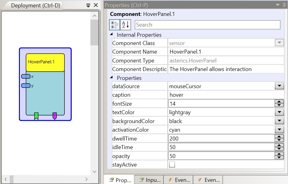
 HoverPanel plugin
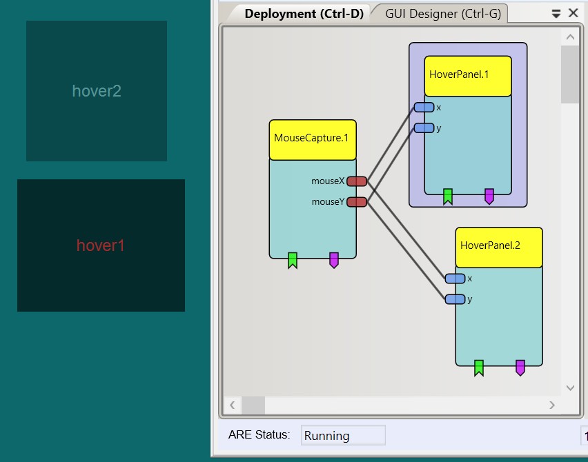
2 HoverPanels on screen
Input Port Description
- x [integer]: x coordinate
- y [integer]: y coordinate
Event Listener Description
- activate: activates the hover panel.
- deactivate: deactivates the hover panel.
Event Trigger Description
- selected: triggered if coordinates are in range of the panel position for the hover time period.
- enter: triggered if coordinates enter the range/location of the panel.
- exit: triggered if coordinates exit the range/location of the panel.
Properties
- dataSource [integer, combobox selection]: If "mouse coursor" is selected, the coordinates are grabbed from the current position of the mouse cursor. If "coordinateInputs" is selected, the input ports (x/y) are used.
- caption [string]: The caption of the hover panel.
- fontSize [integer]: The size of the caption text.
- textColor [integer]: Defines color of the caption text.
- backgroundColor [integer]: Defines background color.
- activationColor [integer]: Defines color for the hover selection process.
- dwellTime [integer]: The hover time for a selection.
- idleTime [integer]: The time how long the panel will stay inactive after a selection.
- opacity [integer]: the opacity of the hver panel (0-100%).
- stayActive [boolean]: If selected, the hover panel will remain in active state after a selection (deactivation via event).