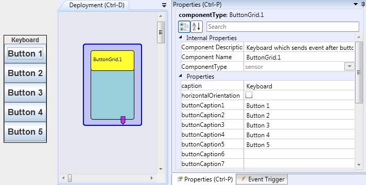
Button Grid
Component Type: Sensor (Subcategory: Graphical User Interface)
The Button Grid component is a simple GUI on-screen keyboard. It sends events after buttons have been pressed.
 ButtonGrid plugin
Event Trigger Description
- button1...button20: These events are fired as the corresponding buttons are pressed.
Properties
- caption [string]: The text shown on the component caption.
- horizontalOrientation [boolean]: If selected, the keyboard will be placed horizontally, otherwise the keyboard will be placed vertically.
- textColor [integer, combobox selection]: The color of the caption text ("default" keeps the standard setting)
- backgroundColor [integer, combobox selection]: The color of the button background ("default" keeps the standard setting)
- borderColor [integer, combobox selection]: The color of the button frame ("default" keeps the standard setting)
- borderThickness [integer]: The size of the button frame
- selectionFrameColor [integer, combobox selection]: The color of the selection frame (active button, "default" keeps the standard setting)
- selectionFrameThickness [integer]: The size of the selection frame
- displayGUI [boolean]: if selected, the GUI of this component will be displayed - if not, the GUI will be hidden and disabled.
- buttonCaption1...buttonCaption20 [string]: The text shown on the buttons:1...20. If the text is empty, the button will not be displayed at all.
- toolTip1...toolTip20 [string]: The text shown as tooltip when the mouse hovers over a corresponding button. If the text is empty, no tooltip will be displayed.