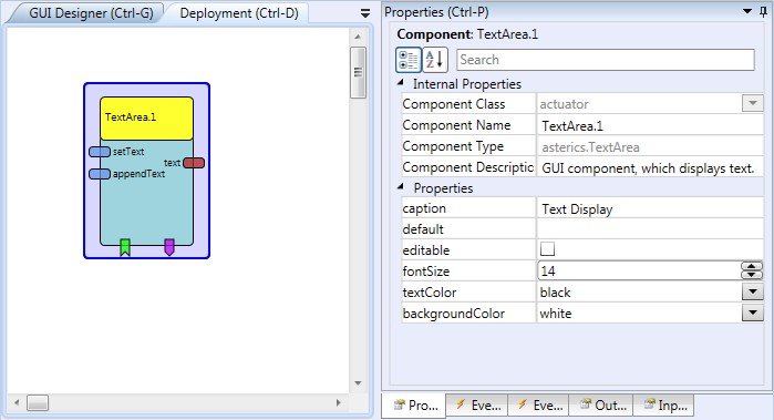
TextArea
Component Type: Actuator (Subcategory: Graphical User Interface)
The TextArea is a GUI component which displays (optionally user-editable) text information. It features multiple rows and a scrollbar, and event for appending string text, deleting characters or sending the text content
 TextArea plugin
Input Port Description
- setText [string]: The text which will be displayed. It replaces the prior content of the Text Area.
- appendText [string]: This string input will be appended to te current content of the Text Area.
Output Port Description
- text [string]: The current content of the text area. Sent on incoming events at the "send" or "sendAndClear" event listener ports
Event Listener Description
- delete: Removes the last charater from the text area content.
- clear: Clears the text area content.
- send: Sends the text area content to te output port.
- sendAndClear: Sends the text area content to te output port and clears the text area.
Event Trigger Description
- clicked: The event is trigger when the user
click on the component.
Properties
- caption [string]: Caption of the component.
- default [string]: Default content of the text area.
- editable [bolean]: Defines if the text area can be edited by the user.
- fontSize [integer]: The font size in pixels.
- textColor [integer]: Defines color of the text.
- backgroundColor [integer]: Defines background color.
- displayGUI [boolean]: If selected, the GUI of this component will be displayed - if not, the GUI will be hidden and disabled.