Custom User Interface Controls
See Also: Class Interface, Class ICustomControl, Class ICustEdit, Class ISpinnerControl, Class ISliderControl, Class ICustImage, Class ICustStatus, Class IColorSwatch, Class ICustButton, Class ICurveCtl, Class ICustToolbar, Class IRollupWindow, Class IOffScreenBuf, Class TCBGraphParams, Class IDADWindow.
Overview
A set of custom controls are available for use in the user interface design of 3ds max plug-ins. The 3ds max program itself makes extensive use of these custom controls. These controls provide an important element of consistency between the plug-in and the system, making new plug-ins appear fully integrated with MAX. The use of these controls by the majority of developers will provide a level of familiarity for users who often work with many different plug-ins.
This section takes a quick look at all the control types. It then discusses two major aspects of using MAX's custom controls. The first is how the controls are added to a rollup page in the command panel and presented to the user. The second is how the user's operation of these controls is processed by the plug-in.
The sample program CUSTCTRL.CPP demonstrates each of the custom controls which may be used in the command column. To run this program, copy the file \MAXSDK\PLUGIN\CUSTCTRL.DLU into your stdplugs directory. The program is implemented as a utility plug-in. You can run the program by choosing the Custom Control selection in the Utility branch under How To. This section makes reference to portions of this plug-in.
You can also look at the custom controls' header file in \MAXSDK\INCLUDE\CUSTCONT.H.
Available Custom Controls
Custom Edit Controls

This control is a simple text input control. The user may type any string into the field and the plug-in is notified when the user presses the ENTER key. There are also methods to parse and return integer and floating point values entered in the control. If the edit control is to be used with numeric values, it is typically used in conjunction with a custom spinner control.
Spinner Controls
 (Spinner control)
 (Edit control and Spinner control)
The spinner control is used (usually in conjunction with the custom edit control) to provide input of values limited to a fixed type. For example, the control may be limited to the input of only positive integers. The input options are integer, float, universe (world space units), positive integer, positive float, positive universe, and time. This control allows the user to increment or decrement a value by clicking on the up or down arrows. The user may also click and drag on the arrows to interactively adjust the value. The Ctrl key may be held to accelerate the value changing speed, while the Alt key may be held to decrease the value changing speed. The user may also right click on the arrows to reset the value its default.
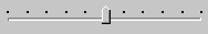
Slider Controls
This control is available in release 3.0 and later only.
The custom slider control is functionality similar to the custom spinner control with some additional functionality. The slider control is used (sometimes in conjunction with the custom edit control) to provide input of values limited to a fixed type.
 (Slider Control)
 ('Bracketed' Slider Control)
Custom Button Controls
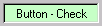
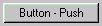
Custom Buttons allow the developer to have extra control of the way buttons appear and behave in the dialog box. These custom buttons have the following features:
 The button can be either a check button (which stays pressed in until the user selects it again), or a push button (which pops back out immediately).
The highlight color of the check button may be specified.
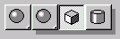
A button may function as a fly-off. Any number of additional buttons may be specified to fly off. The direction of the fly off may be specified or computed automatically.
The buttons may be labeled with text or images. Four images may be specified allowing precise control over how the button appears when enabled or disabled and pressed in or released.
Custom Status Control

This control provides a recessed area of the dialog which the developer may use as a status prompt area.
Custom Toolbar Control

This control allows the creation of toolbars containing buttons (push, check, and fly-offs), status fields, separators (spacers), and other Windows or user defined controls. Note: The standard size for 3ds max toolbar button icons is 16x15.
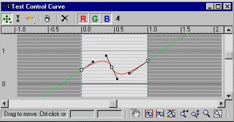
Custom Curve Control
This is a spline based control which returns output values from a user adjustable curve. An example of this control in the 3ds max user interface can be seen in the Color Map section of the Output rollup of a 2D Texture map. Sample code using these APIs is available in \MAXSDK\SAMPLES\UTILITIES\CCUTIL\CCUTIL.CPP.
Custom Image Control
The custom image control provides a recessed area in the dialog to display a bitmap image.
Color Swatch Control

The Color Swatch control presents the user with the standard 3ds max modeless color selector when the user clicks on the control. The color swatch control displays the currently-selected color and may be continuously updated as the user interactively selects new colors. Color Swatches also handle drag and drop between color swatches.
Rollup Window Control
This control is used if you are creating a dialog box which will not be used in the command panel. This control adds a container area for rollup pages to be added to the dialog, and provides a scroll bar just like the command panel itself.
Note that this is a special case. Normally, adding rollup pages to the command panel is done using the simple AddRollupPage() method of the Interface class. This control is only used when you want to have a scrolling region for rollup pages in a dialog box.
Window Thumb Tack Control
This control installs a thumb tack into a window title bar which allows the user to make the window 'Always On Top'.
Off Screen Buffer Control
This control provides an off-screen buffer which the developer may draw into, then quickly blit onto the actual display for flicker-free image updates.
TCB Graph
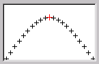
This control displays a tension / continuity / bias graph.
Drag and Drop Window Control
This is a new type of custom control available in 3ds max 2.0 and later. It is used to provide drag and drop to and from things other than Custom Buttons.
How to a Create a Rollup Page using the Custom Controls
The tool for creating the rollup page portion the user interface of your plug-in is the dialog editor of Visual C++ Developers Studio. You use the dialog editor to create the rollup page, and place and arrange the controls.
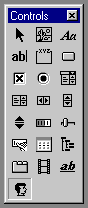
The custom controls are positioned in a rollup page like any other control. Each one is created using the Custom Control button. The Custom Control button is the one shown highlighted below.
The control is identified as being custom by filling in the Class field of the Custom Control Properties dialog box with an appropriate string indicating the type of control. To bring up this dialog, double click on the control in the dialog editor window.
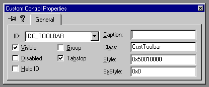
These are the values to be used in the Class field of the Custom Control Properties dialog for those custom controls which may appear in a rollup page:
Custom Edit control - CustEdit
Custom Spinner Control - SpinnerControl
Custom Button control - CustButton
Custom Toolbar control - CustToolbar
Custom Image control - CustImage
Custom Status control - CustStatus
Color Swatch control - ColorSwatch
Custom Rollup Window - RollupWindow
Custom DragAndDrop Window control - DragDropWindow
Custom TCB Graph - TCBGraph
The other fields in the user control properties dialog are these:
ID - This is the resource's identifier. The resource ID is usually a symbol supplied by Visual C++ and defined in the .H file that Visual C++ creates as part of your project. This is where you define the symbolic name for the resource.
Caption - This is the text that appears as part of the control to label it. This field is used for Custom Buttons and Status controls.
Visible - This determines whether or not the control is visible when the application is first run.
Disabled - This determines if the resource is displayed as disabled when the dialog box is created.
Group - This specifies the first control of a group of controls in which the user can move from one control to the next by using the arrow keys. All controls in the tab order after the first control with the Group property set to False belong to the same group. The next control in the tab order with Group set to True ends the first group of controls and starts the next group.
Tabstop - This specifies that the user can move to this control with the TAB key. This is only appropriate for the edit and button controls.
Class - The name of the control's Windows class. This class must be registered before the dialog box containing the control is created. See the class list above.
Help ID - Assigns a help ID to the control. The help ID is based on the resource ID. Type: Bool. Default: False.
Style - A 32-bit hexadecimal value specifying the control's style, primarily used to edit the lower 16 bits that make up a user control's sub-style.
ExStyle - A 32-bit hexadecimal value specifying the control's extended style.
When the rollup page dialog is created, it must be compiled and the resource file it generates must be included in the CPP source file. The default name for this file is RESOURCE.H. This may be changed by right clicking on the resource file name from the Resource View list (the top line) and choosing the Resource Includes... option. From this dialog, change the entry under Symbol header file.
Once you create a rollup page layout, there are several ways to present it to the user. The standard way is using a rollup page in the command panel. Typically, this is called from within BeginEditParams() when the user is in the position of editing an items parameters.
There is a method of the interface class to handle adding the rollup. Its called AddRollupPage(). The syntax looks like this:
hParams = interfacePtr->AddRollupPage(
hInstance, // DLL instance handle.
MAKEINTRESOURCE(IDD_CUSTCTRL), // ID of the dialog box.
DialogProc, // Dialog procedure to process user input.
ROLLUP_PAGE_TITLE, // Rollup title text.
(LPARAM)this); // Saves the this ptr of the item.
The standard width for rollup pages in the command column in the United States is 108 units. When you create dialogs for use in the command panel, always use 108 as the overall width (for use in the United States). Note the width and height are visible in the lower right hand corner of the IDE.
In summary, the custom controls are added to a rollup page layout using the resource editor window of VC++. The Class field of the resource indicates which type of control you are creating. The finished rollup page layout is displayed to the user using the AddRollupPage() function.
How to Process User Input from the Custom Controls
Windows uses a 'Dialog Procedure' created by the developer to handle the users manipulation of the controls in the dialog,. As the user works with the controls, Windows sends messages to the dialog procedure. The developer is responsible for responding to these messages and implementing the logic to process the user input. A full description of this messaging system is beyond the scope of this documentation, but below is a brief overview. If you need more information, see the Recommended Reading section in the Orientation module.
When you create a dialog box or add a rollup page, you specify the dialog procedure to process the input. The basic structure of this dialog proc is listed below:
BOOL CALLBACK DialogProc(HWND hDlg, UINT message,
WPARAM wParam, LPARAM lParam)
{
switch (message) { // Respond to the message ...
case WM_INITDIALOG: // Initialize the Controls here.
return TRUE;
case WM_DESTROY: // Release the Controls here.
return FALSE;
case WM_COMMAND: // Various messages come in this way.
break;
case WM_NOTIFY: // Others this way...
break;
// Other cases...
default:
break;
}
return FALSE;
}
Windows passes in four parameters to the dialog procedure. These are the handle of dialog box, the message, and two parameters which hold message-specific information. Except in response to the WM_INITDIALOG message, the dialog box procedure should return TRUE if it processes the message, and FALSE if it does not.
When the dialog box is initialized, the WM_INITDIALOG message is sent. At this time the custom controls should be initialized. Each control has methods to initialize it. The methods used to initialize the control are discussed in the next section, or you may see the sample program CUSTCTRL.CPP for how this is done for each control.
When the user is finished with the dialog box, the WM_DESTROY message is sent. This is where you release the controls. Again, the next section discusses this, or you may take a look at the sample program to see how this is done.
When the user works with any of the custom controls, Windows sends in specific messages to the dialog procedure. For example, when the user changes a spinner control, Windows sends in a CC_SPINNER_CHANGE message. The developer would add this case to the dialog proc code above and handle the processing required when the spinner changed. The dialog box may have several spinner controls: how does the developer know which spinner changed? The lParam and wParam arguments to the dialog procedure contain message-specific information. It is here that the ID of the control is provided. (This is the ID entered in the ID field of the user control properties dialog when the control was created). For example, the developer could add a case such as the one below to handle spinner change messages:
case CC_SPINNER_CHANGE:
switch (LOWORD(wParam)) { // Switch on ID
case IDC_ANGLE_SPINNER: // A specific spinner ID.
angle = ((ISpinnerControl *)lParam)->GetFVal();
break;
case IDC_RADIUS_SPINNER: // A specific spinner ID.
// Code to handle the Radius spinner...
break;
};
break;
This code fragment presents several important concepts. The LOWORD macro used above retrieves the low-order word from the given 32-bit value. The spinner control provides the ID of the spinner which changed in the low order word of wParam. (Another macro, HIWORD, retrieves the high-order word from the given 32-bit value). Splitting the argument into low and high order words allows more information to be packed into the parameter.
A pointer to the spinner control is provided in the lParam parameter. This pointer is used to call a method of the spinner to get the new floating point value ((ISpinnerControl *)lParam >GetFVal()).
As another example, let's look at the color change message sent in from the Color Swatch control. When the user is changing the colors in the dialog box, and the developer has asked to be notified on each change, Windows sends the CC_COLOR_CHANGE message. Again, the developer would add a case to the switch to handle this message. The LOWORD of wParam contains the ID of the color swatch control. The HIWORD of wParam contains 0 if the mouse button is down as the user is changing colors, and 1 if the mouse is up.
Sometimes, the message sent to the dialog proc is WM_COMMAND, and the programmer must look at both the high and low words of wParam to determine the nature of the message and the ID of the control which sent the message. For example, the code below demonstrates how custom button messages may be handled.
case WM_COMMAND:
switch(LOWORD(wParam)) { // Switch on ID
case IDC_BUTTON: // A specific button's ID.
switch (HIWORD(wParam)) { // Notification codes
case BN_BUTTONDOWN: // Button is pressed.
break;
case BN_BUTTONUP: // Button is released.
break;
case BN_RIGHTCLICK: // User right clicked.
break;
};
break;
case IDC_FLYOFF: // A specific fly off control ID
switch (HIWORD(wParam)) { // Notification codes
case BN_FLYOFF:
// This notification code is sent when the
// user chooses a new fly off.
break;
};
break;
};
In summary, when the user works with controls in a dialog, Windows sends messages to the plug-in's dialog proc. The developer responds to these messages to process the user input.
Overview of Methods of the Custom Control Classes
Before you call any custom control methods, you must initialize the controls by calling the InitCustomControls() function (usually from the DLLMain() function of the plug-in).
Call InitCustomControls( hInst ) where hInst is the HINSTANCE passed into DLLMain().
For each control, there are two functions that you'll always use:
1 A function to initialize the pointer to the control so you may call its methods (usually when the dialog is initialized).
2 A function to release the control when you are done with it (when the dialog is destroyed).
The sample code below demonstrates this for a spinner control (the other controls are similar):
First, declare a pointer to the control:
static ISpinnerControl *radSpin;
To initialize the pointer call:
radSpin=GetISpinner(GetDlgItem(hDlg,IDC_RAD_SPIN));
Each custom control has a Get function to return a handle to the control.
In the example above, two functions are called from a single statement. The GetDlgItem function retrieves the handle of a control in the specified dialog box. The parameter hDlg is the dialog handle. The IDC_RAD_SPIN parameter is the ID for the control. This is the name entered in the ID field of the Custom Control Properties dialog box when the control was created.
When you are finished using the control, call:
ReleaseISpinner(radSpin);
Each control has a Release function to release it.
See Class ICustomControl for a list of the methods that are available for all the custom controls.
The following functions are not a part of class ICustomControl but may also be used in conjunction with the custom controls and UI design in MAX:
This is a bitmap brush where the bitmap is a gray and white checker board.
HBRUSH GetLTGrayBrush();
HBRUSH GetDKGrayBrush();
This returns the standard font.
HFONT GetFixedFont();
This returns the handle of the hand cursor used for panning.
HCURSOR GetPanCursor();
The following section provides links to the custom control classes that document how to use the specific methods of each control.
Using the Custom Edit Control
See Class ICustEdit.
Using the Spinner Control
Using the Custom Image Control
See Class ICustImage.
Using the Custom Status Control
See Class ICustStatus.
Using the Color Swatch Control:
See Class IColorSwatch.
Using the Custom Button Control
See Class ICustButton.
Using the Custom Toolbar Control
See Class ICustToolbar.
Using the Rollup Window Control
See Class IRollupWindow.
Using the Off Screen Buffer Control
See Class IOffScreenBuf.
Using the TCB Graph Control
See Class TCBGraphParams.
Using the Thumb Tack Control
This control installs a thumb tack into a window title bar which allows the user to make the window 'Always On Top'. This control has two functions.
void InstallThumbTack(HWND hwnd)
This function installs a thumb tack in the title bar of a window. NOTE: The window class for the window should have 4 extra bytes in the window structure for SetWindowLong().
void RemoveThumbTack(HWND hwnd)
This function is used to remove the thumb tack from the window title bar.