Class ICustButton
See Also: Class ICustomControl, Custom Controls, Class ICustToolbar, Class FlyOffData, Class DADMgr, Class MAXBmpFileIcon.
class ICustButton : public ICustomControl
Description:
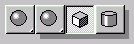
Custom buttons may be one of two different forms. A Check button (which stays pressed in until the user clicks on it again), or a Pick button (which pops back out as soon as it is released). Buttons may be implemented as a Fly offs. A fly off offers several alternative buttons which fly out from the button after it is press and held briefly.
The buttons may contain text or graphic images. Fly off buttons only use graphic images. The plug-in developer has control over the appearance of the button in each of its four states (Enabled&Out, Enabled&In, Disabled&Out, Disabled&In).
Note: When the user presses a button a WM_MENUSELECT message is sent so that the client can display a status prompt describing the function of the tool. The fuFlags parameter is set to this value: CMF_TOOLBUTTON.
In 3dsmax version 4.0 you can remove borders from an ICustButton;
ICustButton *cb = ();
cb->Execute(I_EXE_CB_NO_BORDER);
To initialize the pointer to the control call:
Prototype:
ICustButton *GetICustButton(HWND hCtrl);
To release the control call:
Prototype:
ReleaseICustButton(ICustButton *ics);
The value to use in the Class field of the Custom Control Properties dialog is: CustButton
Methods:
Prototype:
virtual void GetText(TCHAR *text, int ct)=0;
Remarks:
This retrieves the text displayed by the button.
Parameters:
TCHAR *text
Storage for the text to retrieve.
int ct
Specifies the maximum length of the string returned.
Prototype:
virtual void SetText(TCHAR *text)=0;
Remarks:
This specifies the text displayed by the button.
Parameters:
TCHAR *text
The text to be displayed by the button.
Prototype:
virtual void SetImage(HIMAGELIST hImage, int iOutEn, int iInEn, int iOutDis, int iInDis, int w, int h)=0;
Remarks:
This method is used to establish the images used for the buttons.
Parameters:
HIMAGELIST hImage
The image list. An image list is a collection of same-sized images, each of which can be referred to by an index. Image lists are used to efficiently manage large sets of icons or bitmaps in Windows. All images in an image list are contained in a single, wide bitmap in screen device format. An image list may also include a monochrome bitmap that contains masks used to draw images transparently (icon style). The Windows API provides image list functions, which enable you to draw images, create and destroy image lists, add and remove images, replace images, and merge images.
The next four parameters (iOutEn, iInEn, iOutDis, iInDis) are indices into the image list. They indicate which images to use for each of the four possible button states. You may specify a unique image for each one of these states by passing a different index for each state. Or you may supply a single image to be used for all the states by specifying the same index four times.
int iOutEn
Out&Enabled.
int iInEn
In&Enabled.
int iOutDis
Out&Disabled.
int iInDis
In&Disabled.
int w
The width of the button image.
int h
The height of the button image.
Prototype:
virtual void SetIcon(MaxBmpFileIcon* pIcon, int w, int h) = 0;
Remarks:
This method is available in release 4.0 and later only.
This sets the icon image used for a button.
Parameters:
MaxBmpFileIcon* pIcon
Points to the icon.
int w
The width of the button image.
int h
The height of the button image.
Prototype:
virtual void SetInIcon(MaxBmpFileIcon* pInIcon, int w, int h) = 0;
Remarks:
This method is available in release 4.0 and later only.
This sets the icon image used when a button is pressed.
Parameters:
MaxBmpFileIcon* pInIcon
Points to the icon.
int w
The width of the button image.
int h
The height of the button image.
Prototype:
virtual void SetType(CustButType type)=0;
Remarks:
This method sets the button type.
Parameters:
CustButType type
One of the following values:
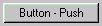
CBT_PUSH
A Push button pops back out as soon as it is released.
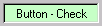
CBT_CHECK.
A Check button stays pressed in until the user clicks on it again.
Prototype:
virtual void SetFlyOff(int count,FlyOffData *data,int timeOut,int init,int dir=FLY_VARIABLE)=0;
Remarks:
This method sets the button to work as a fly off control.
Parameters:
int count
The number of buttons in the fly off.
FlyOffData *data
An array of instances of the class FlyOffData . This class uses four indices into the image list to describe the button in each of the possible states: Out&Enabled, In&Enabled, Out&Disabled and In&Disabled.
In the simple case, where all the buttons have the same image, you can do the following:
FlyOffData fod[3] = { // A three button flyoff
{ 0,0,0,0 }, // The first button uses a single image.
{ 1,1,1,1 }, // So does the second button...
{ 2,2,2,2 }, // So does the third...
};
Each button will use the same images regardless of its pressed in / disabled state. Note the button is automatically drawn pushed in (i.e. shaded lighter) when the user is dragging the cursor over the button, but the actual image on the button is not changed.
If you require different images for these states, supply different indices into the image list for each. See the sample program \MAXSDK\SAMPLES\HOWTO\CUSTCTRL\CUSTCTRL.CPP for an example of how this is done.
int timeOut
This is the time in milliseconds the button must be held pressed before the fly off appears. You may specify 0 if you want the buttons to fly off immediately. To retrieve the value that 3ds max uses internally for its flyoffs use a method of Class Interface called GetFlyOffTime(). This returns a value in milliseconds.
int init
This is the initial button displayed.
int dir=FLY_VARIABLE
This parameter is optional. It is used to indicate which direction the buttons should fly off. The choices for direction are:
FLY_VARIABLE
The default. The system will determine the direction of the fly off.
FLY_UP
The buttons fly off above.
FLY_DOWN
The buttons fly off beneath.
FLY_HVARIABLE
The buttons will fly off either left or right with the system determining the direction.
FLY_LEFT
The buttons fly off to the left.
FLY_RIGHT
The buttons fly off to the right.
Prototype:
virtual void SetCurFlyOff(int f,BOOL notify=FALSE)=0;
Remarks:
This method establishes which button is displayed by passing its index.
Parameters:
int f
The index of the flyoff button to display.
BOOL notify=FALSE
This indicates if the call to this method should notify the dialog proc. If TRUE it is notified; otherwise it isn't.
Prototype:
virtual int GetCurFlyOff()=0;
Remarks:
Returns the index of the button which is currently displayed.
Prototype:
virtual BOOL IsChecked()=0;
Remarks:
Determines if the button is checked. This method returns TRUE if the check button is currently in the In state (i.e. checked) and FALSE otherwise.
Prototype:
virtual void SetCheck( BOOL checked )=0;
Remarks:
Passing TRUE to this method sets the button to the In or checked state.
Parameters:
BOOL checked
If TRUE the button is set to the checked state; if FALSE the button is unchecked.
Prototype:
virtual void SetCheckHighlight( BOOL highlight )=0;
Remarks:
This method controls if the check button is displayed in the highlight color when pressed in.
Parameters:
BOOL highlight
TRUE if you want the button to use the highlight color; otherwise pass FALSE.
Prototype:
virtual void SetButtonDownNotify(BOOL notify)=0;
Remarks:
Specifies if messages are sent when the user clicks or releases the button. If this method is called with TRUE, a message is sent immediately whenever the button is pressed down or released. The message BN_BUTTONDOWN is sent on button down and BN_BUTTONUP is sent when the button is released. The BN_BUTTONUP message is sent even if the button is released outside the button rectangle.
Parameters:
BOOL notify
TRUE if notification should be send by the button; FALSE if notifications should not be sent.
Prototype:
virtual void SetRightClickNotify(BOOL notify)=0;
Remarks:
Specifies if messages are sent when the user right clicks the button.
Parameters:
BOOL notify
If TRUE, the BN_RIGHTCLICK message is sent whenever the users right clicks on the button. If FALSE no message are sent on right clicks.
Prototype:
virtual void SetHighlightColor(COLORREF clr)=0;
Remarks:
This methods sets the highlight color for the check button.
Parameters:
COLORREF clr
The color for the button. It may be specified using the RGB macro, for example: SetHighlightColor(RGB(0,0,255));
There are several pre-defined colors which may be used. These are: RED_WASH, BLUE_WASH and GREEN_WASH. GREEN_WASH is the standard color used for check buttons in 3ds max that instigate a command mode. While the command mode is active the button should be displayed in GREEN_WASH. When the mode is finished the button should be returned to normal.
Prototype:
virtual COLORREF GetHighLightColor()=0;
Remarks:
This methods returns the highlight color for the check button.
Prototype:
virtual void SetTooltip(BOOL onOff, LPSTR text)=0;
Remarks:
This method allows a developer to add tooltip text to single custom buttons.
Parameters:
BOOL onOff
TRUE to turn the tooltip on; FALSE to turn it off.
LPSTR text
This may be one of two things:
The tooltip text (as a TCHAR *)
This is simply the text to show up in the tooltip.
The symbol LPSTR_TEXTCALLBACK
This indicates a callback will be used. If this is specified, the parent window of the button will get the usual tooltip "need text" notify message (TTN_NEEDTEXT).
Prototype:
virtual void SetDADMgr(DADMgr *dad)=0;
Remarks:
This method is available in release 2.0 and later only.
Sets the drag and drop manager for this button control.
Parameters:
DADMgr *dad
A pointer to the drag and drop manager to set.
Prototype:
virtual DADMgr *GetDADMgr()=0;
Remarks:
This method is available in release 2.0 and later only.
Returns a pointer to the drag and drop manager for this button control.
Prototype:
virtual void SetMacroButtonData(MacroButtonData *md)=0;
Remarks:
This method is available in release 3.0 and later only.
Sets the macro data for this button.
Parameters:
MacroButtonData *md
The data to set. See Class MacroButtonData.
Prototype:
virtual MacroButtonData *GetMacroButtonData()=0;
Remarks:
This method is available in release 3.0 and later only.
Returns a pointer to any macro button data for this button. See Class MacroButtonData.
Prototype:
virtual void SetDisplayProc(PaintProc *proc)=0;
Remarks:
This method is available in release 3.0 and later only.
Sets the callback object used to display the button.
Note: This method is only available in 3D Studio VIZ (not MAX).
Parameters:
PaintProc *proc
Points to the callback object for displaying the button.
Note: typedef LRESULT CALLBACK PaintProc(
HDC hdc, Rect rect, BOOL in, BOOL checked, BOOL enabled);