Using dates in charts
When you create a chart from worksheet data that uses dates, and the dates make up the category (x) axis in the chart, Microsoft Graph automatically uses a time-scale category axis.
Display of dates The time-scale category axis displays dates in chronological order at specific intervals, or "base units," even if the dates on the worksheet are not in order or in the same base units.
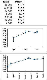
Graph initially sets the time-scale base units (days, months, or years) according to the smallest difference between any two dates in the data. You can change the base unit setting, and Graph will redraw the chart. For example, if you have data for stock prices where the smallest difference between dates is seven days, Graph presets the time-scale base unit to days.
You can change the base unit to months to see the performance of the stock over a longer period, as in the first chart in the example. To change the base unit, click the axis, click Selected Axis on the Format menu, and then click the options you want on the Scale tab.
Time-scale charts and times You can't create time-scale charts from data that is measured at intervals of hours, minutes, or seconds. Only days, months, and years are considered base units in time-scale charts.
Chart types that can use a time-scale axis Time-scale axes are available on stock charts and on 2-D and 3-D line, column, bar, and area charts.
Tip You cannot have a time-scale axis if the dates in your chart appear in the legend. You can change the way data is plotted in the chart so that the dates appear on the category axis instead.