IupLabel
Creates a label interface element, which displays a separator, a text or an image.
Creation
Ihandle* IupLabel(const char *title); [in C]
iup.label{[title = title: string]} -> (elem: ihandle) [in Lua]
label(title) [in LED]
title: Text to be shown on the label. It can be NULL. It will set the TITLE attribute.
Returns: the identifier of the created element, or NULL if an error occurs.
Attributes
ACTIVE: Activates or deactivates the label. The only difference between an active label and an inactive one is its visual feedback. Possible values: "YES, "NO". Default: "YES".
ALIGNMENT (non inheritable): Label's horizontal and vertical alignment. Possible values: "ALEFT", "ACENTER" and "ARIGHT", combined to "ATOP", "ACENTER" and "ABOTTOM". Default: "ALEFT:ACENTER". Partial values are also accepted, like "ARIGHT" or "xATOP", the other value will be used from the current alignment. In Motif, vertical alignment is restricted to "ACENTER". (vertical alignment since 3.0)
BGCOLOR: Background color.
ELLIPSIS [Windows and GTK only]: add an ellipsis: "..." to the text if there is not enough space to render the entire string. Can be "YES" or "NO". Default: "NO". (since 3.0)
FGCOLOR: Text color.
IMAGE (non inheritable): Label image. If set before map defines the behavior of the label to contain an image. The natural size will be size of the image in pixels.
IMINACTIVE (non inheritable) [Windows and Motif only]: Image name of the label when the inactive. If it is not defined then the IMAGE is used and the non transparent colors will be replaced by a darker version of the background color creating the disabled effect. Since GTK use an internal algorithm to build an inactive image that can not be avoided, so this attributes will not work in GTK, then it is simply ignored. In fact it is recommended that you always do NOT use this attribute and let all the drivers build the inactive images.
MARKUP [GTK only]: allows the title string to contains pango markup commands. Can be "YES" or "NO". Default: "NO".
MNEMONIC: enables or disable the use of a code to underline the character relative to a mnemonic (a key that when pressed activates a control). This will not associate any key, it will just underline the character in the title string. Can be "YES" or "NO". Default: "YES". Use "&" to mark the next character of the text as the character to be underlined. In the GTK driver it is also accepted the GTK key mark using "_" instead of "&". (since 3.0)
PADDING: internal margin. Works just like the MARGIN attribute of the IupHbox and IupVbox containers, but uses a different name to avoid inheritance problems. Not used when SEPARATOR is used. Default value: "0x0". (since 3.0)
SEPARATOR (creation only) (non inheritable): Turns the label into a line separator. Possible values: "HORIZONTAL" or "VERTICAL". When changed before mapping the EXPAND attribute is set to "HORIZONTAL" or "VERTICAL" accordingly.
TITLE (non inheritable): Label's text. If SEPARATOR or IMAGE are not defined before map, then the default behavior is to contain a text. The label behavior can not be changed after map. The '\n' character is accepted for line change. The natural size will be larger enough to include all the text in the selected font, even using multiple lines.
WORDWRAP [Windows and GTK only]: enables or disable the wrapping of lines that does not fits in the label. Can be "YES" or "NO". Default: "NO". Can only set WORDWRAP=YES if ALIGNMENT=ALEFT. (since 3.0)
FONT, EXPAND, X, Y, POSITION, WID, TIP, SIZE, RASTERSIZE, ZORDER, VISIBLE: also accepted.
Callbacks
ENTERWINDOW_CB, LEAVEWINDOW_CB, MAP_CB: common callbacks are supported.
Notes
Labels with images, texts or line separator can not change its behavior after mapped. But after map the image can be changed for another image, and the text for another text.
Examples
| Defaul Text Label - |
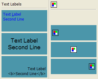 |
- Default Image Label |
| Horizontal Separator - | - Horizontal Separator | |
| FGCOLOR = "0 0 255"... ALIGNMENT="ALEFT:ATOP" - BGCOLOR = "75 150 170"... |
- BGCOLOR = "75 150 170" (8bpp Image) |
|
| FONT = "Helvetica, 14" ALIGNMENT = "ACENTER:ACENTER"- BGCOLOR = "75 150 170" |
- ALIGNMENT = "ACENTER" BGCOLOR = "75 150 170" (24 bpp Image) |
|
| MARKUP = "YES" (GTK Only) ALIGNMENT = "ARIGHT:ABOTTOM"- BGCOLOR = "75 150 170" |
- ALIGNMENT = "ARIGHT" BGCOLOR = "75 150 170" (32 bpp Image) |