Creating a custom theme with ThemeRoller
Theming Overview
jQuery Mobile has a robust theme framework that supports up to 26 sets of toolbar, content and button colors, called a "swatch". The framework comes with five defined themes (swatches 'a' to 'e') which can be used readily, removed or overwritten.
Default theme swatch mapping for components
If no theme swatch letter is set at all, the framework uses the 'a' swatch (black in the default theme) for headers and footers and the 'c' swatch (light gray in the default theme) for the page content to maximize contrast between the both.
All items in containers inherit the swatch from their parent. Exceptions to this rule are the listdivider in listviews, the header of nested list pages, and the button of split button lists, which all default to 'b' (blue in the default theme). Count bubbles default to 'c' (silver in the default theme).
Note that there is also a swatch named "active" (bright blue in the default theme) which is used to indicate an active selected item. See the Global "Active" state further down this page for further information on the active swatch.
The page loading dialog and error message don't inherit a swatch theme. The loading dialog defaults to swatch 'a' (black in the default theme) and the error message to swatch 'e' (yellow in the default theme). You can configure those defaults globally.
Themes and swatches
The theme system separates color and texture from structural styles that define things like padding and dimensions. This allows theme colors and textures to be defined once in the stylesheet and to be mixed, matched, and combined to achieve a wide range of visual effects.
Each theme includes several global settings, including font family, drop shadows for overlays, and corner radius values for buttons and boxes. In addition, the theme can include multiple color swatches, each with color values for bars, content blocks, buttons and list items, and font text-shadow.
The default theme includes 5 swatches that are given letters (a, b, c, d, e) for quick reference. To make mapping of color swatches consistent across our widgets, we have followed the convention that swatch 'a' is the highest level of visual priority (black in our default theme), 'b' is secondary level (blue) and 'c' is the baseline level (gray) that we use by default in many situations, 'd' for an alternate secondary level and 'e' as an accent swatch. Themes may have additional swatches for accent colors or specific situations. For example, you could add a new theme swatch 'f' that has a red bar and button for use in error situations.
Most theme changes can be done using ThemeRoller, but it is also fairly simple to manually edit the base swatches in the default theme and/or add additional swatches by editing the theme CSS file. Just copy a block of swatch styles, rename the classes with the new swatch letter name, and tweak colors as you see fit.
Creating a Custom Theme with ThemeRoller

The easiest way to create custom themes is with the ThemeRoller tool. It allows you to build a theme composed of up to 26 swatches, download a the newly created CSS file, and use it in your project.
Creating the Theme swatches
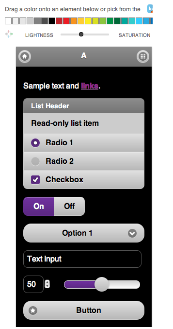
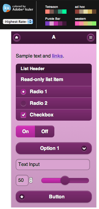
The ThemeRoller allows users to create their own theme through an easy to use drag and drop interface. By default, ThemeRoller offers three swatches (a, b and c). You can use the offered default colors, the Adobe kuler colors, or create your own. You will create your theme by dragging the chosen color onto the chosen element in the swatch of your choice. You can add more swatches by pressing the '+' sign near the 'A', 'B', and 'C' tabs, in the left hand-side menu.
You can further edit your swatch from the menu. For example, you can expand the various element parts and carry out detailed editing. For example, this will allow you to text color, text shadow size, position and color, etc. You can also edit the gradient used on each element.
Here are two examples of theme swatches created, the first one with the default colors and with the kuler colors:


Downloading the created Theme
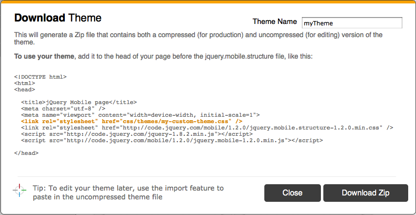
Once you are satisfied with the various swatches that you have created in your theme, you can download this theme to be able to start using it in your project. You will simply need to press the 'Download theme zip file button', and enter the name of your theme in the popup window. Then, press the 'Download Zip' button on the download popup window, see below:

Using the downloaded Theme
The theme gets downloaded on your local machine as a zip file. This contains an index.html file, and a themes folder. The index.html file is an example of how you can now se your theme. The themes folder contains your theme CSS files, and the icons that are used by jQuery Mobile.
To start using your theme, you can either start from the provided index.html or start from scratch. As explained in the theme download popup window, all you need is to add your theme to the head of your page before the jquery.mobile.structure file, like this:
|
1
2
3
4
5
6
7
8
9
10
11
12
13
|
|
Final Note
You need to be aware that jQuery Mobile will default to certain swatches when none are specified. For example, page content will default to swatch 'c', list dividers to swatch 'b', etc. As the full jQuery Mobile CSS is replaced by your custom theme CSS and the jQuery Mobile structure CSS, the only swatches available are the ones that you have provided as part of your custom theme. Therefore, you need to either always specify a swatch letter for all your elements or their parent using for example the data-theme attribute, or you will need to provide a swatch in your custom theme for the possible defaults. Additionally, the error messages use the swatch 'e', so this should also be specified in your theme.