Map chart colors to distinguish ranges of data
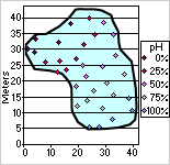
You can format data markers so that graduated or solid colors represent values or ranges of data. For example, the following chart shows locations of water samples and corresponding pH measurements distinguished by graduated colors, where higher percentages of pH levels are represented by increasingly lighter colors.
- In the design window, make sure the chart is activated. For instructions, see Help for your design program.
- Click the data series you want to format.
- On the toolbar, click Commands and Options
 , and then click the Conditional Format tab.
 - Select the Conditionally color data points check box.
- In the Style list, click the style of conditional formatting you want.
- Three Point Gradient Uses three graduated colors to distinguish between the smallest value and zero (or the value you indicate) and between zero (or the value you indicate) and the largest value.
- Two Point Gradient Uses two graduated colors to distinguish between smallest and largest values.
- Two Segment Solid Uses two solid colors to distinguish between values smaller than zero (or the value you indicate) and larger than zero (or the value you indicate).
- Bottom Values Uses a solid color to distinguish the smallest values in a range.
- Top Values Uses a solid color to distinguish the largest values in a range.
- Next to Colors, choose the Beginning Color, Middle Color, or End Color (where applicable) to represent value ranges.
- If you want to indicate a value on which to base your conditional format, type that value in the Value box and select the % check box if appropriate. For example, to format the top 90% of values, type 90 in the value box and then select the % check box.
- If your chart is based on data from a database or a PivotTable list, you can specify additional values on which to base conditional formatting. For example, if you plot sales data for products in different regions, you can format the data markers based on an additional data set such as profit amount. To do this, clear the Conditional format based on data value field check box, and then add the data field you want to use to the Format Data drop area that appears on the chart.