
Trendlines in charts
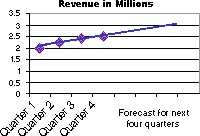
Trendlines are used to graphically display trends in data and to analyze problems of prediction. Such analysis is also called regression analysis. By using regression analysis, you can extend a trendline in a chart beyond the actual data to predict future values. For example, the following chart uses a simple linear trendline that is forecast ahead four quarters to clearly show a trend toward rising revenue:
Moving Average You can also create a moving average, which smoothes out fluctuations in data and shows the pattern or trend more clearly.
Chart types that support trendlines You can add trendlines to data series in unstacked 2-D area, bar, column, line, stock, xy (scatter), and bubble charts. You cannot add trendlines to data series in 3-D, stacked, radar, pie, surface, or doughnut charts. If you change a chart or data series so that it can no longer support the associated trendline
More information
Choosing the best trendline for your data