About using dates in charts
When you create a chart from data that uses dates, and the dates make up the category (x) axis in the chart, you can use a timescale category axis to represent the period of time between the dates.
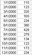
Display of dates The timescale category axis displays dates in chronological order at specific intervals, even if the dates are not arranged in those intervals in your data.
The timescale group size (days, weeks, months, quarters, or years) is initially set by the chart according to the range of dates in your data. If the group size is initially set at months, for example, you can change the group size to quarters for a different perspective. When you do this, the chart automatically totals the points in each group so it can plot one point per group, like in the following example where the points in each quarter are summed, and the summed value is plotted. You can change the summary function used to create group totals.
Timescale charts and times You can't create timescale charts from data that is measured at intervals of hours, minutes, or seconds. Only days, weeks, months, quarters, and years are considered dates in timescale charts.
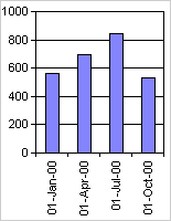
Chart types that can use a timescale axis Timescale axes are available on stock charts and on 2-D and 3-D line, column, bar, and area charts, except when these charts have multiple-level category labels or in charts that use fields.
Note You cannot have a timescale axis if the dates in your chart appear in the legend. You can change the way data is plotted in the chart so that the dates appear on the category axis instead.