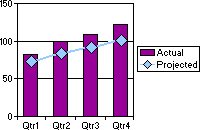
A combination chart uses two or more chart types to emphasize that the chart contains different kinds of information. The chart in the following example shows one data series (Actual) as a column chart type and the other (Projected) as a line chart.

-
In the design window, make sure the chart is activated. For instructions, see Help for your design program.
-
Determine which series you want to be a different chart type.
-
Do one of the following:
 Change the chart type for a series
-
Click the series for which you want to change the chart type.
- On the toolbar, click Chart Type
 .
. - In the list, click the chart type you want, and then click the subtype you want.
 Change the chart type for a series group and add axes
-
On the chart toolbar, click Commands and Options
 , and then click the General tab.
 -
Under General commands, select Chart Workspace in the Select list.
-
Click the Series Groups tab.
-
Under Series groups, in the Select one or more series box, select the series for which you want to change the chart type.
-
In the Operation list, click New group.
-
If you want to display a secondary axis to reflect a different scale for a series group, click the group in the Groups box under Add axis, and then select a position for the second axis in the Axis position box. For example, if your primary axis is on the left side of the chart and you want a second axis on the right side of the chart, click Right in the Axis position box and then click Add.
-
In the chart, select the series you grouped so that you can change it to a different chart type.
-
Click the Type tab.
-
Click the type of chart you want to use in the list, and then click the subtype in the box to the left.
-
Note Not all chart types can be combined. For example, you cannot combine 2-D and 3-D chart types, nor can you combine bar and column charts, or column and pie charts.