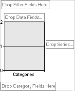
You change the layout of a chart by moving the fields to predefined drop areas within the chart workspace. To do this, drop areas must be shown in the chart.
Drop areas are displayed differently depending on the chart type. For example, a series drop area is not displayed for a pie chart because pie charts consist of only one series. If you plot multiple charts, you will see a drop area for multi-chart fields. This type of drop area is not displayed for single charts.

After you move fields to the drop areas so that the drop-area captions are covered up, you can still drag additional fields to the areas.
 Moving fields to the category and series areas
When you move a field to the series area, the unique items of data within the field are displayed as data series in the chart. These series are represented by colored data markers, and their names appear in the chart legend.
When you move a field to the category area, the unique items of data are displayed as categories, or related groups of data. Each category consists of one point from each data series. Category labels usually appear across the x axis of the chart, although this can vary depending on the type of chart you are using.
 Moving fields to the data area
Data fields provide the values to be summarized in the chart. When you move a field to the data area, the values from the field are used as the data being measured in the chart.
 Moving fields to the filter area
A filter field is similar to a page field in a Microsoft Excel PivotTable report. Filter fields allow you to confine the view to a particular part of the available data. For example, when you move a Product field to the filter area, you can have the chart display category and series values for one product at a time.
 Moving fields to the MultiChart area
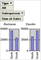
When your chart is based on data from a PivotTable list or from a database table or query, you can plot multiple charts. When you move a field to the MultiChart area, items in that field become separate charts. For example, if you move the Salesperson field to the MultiChart area, a chart is created based on data for each salesperson in that field. In the following example, the Salesperson field is in the MultiChart area, but it's filtered so it displays individual charts for Buchanan and Davolio.

 Moving the category or series fields to inner or outer levels
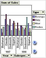
When a chart contains multiple series or category fields, the fields that are closest to the data are referred to as inner fields. The other fields are outer fields. In the following example, Year is the outer field and Salesperson is the inner field. The inner field items are displayed as salespeople's names, and the outer field items are displayed as the years 1997 and 1998.

 Inner field items
 Outer field items
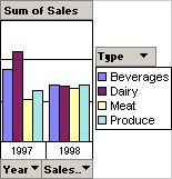
You can expand and collapse multiple fields to show more or less information in a particular field. For example, you can collapse the outer field (Year) in the example so that the inner field items are no longer displayed.

The layout of a chart does not have to include all fields that are available from the source data. If more data is available, you can add fields to the chart. For example, if the chart summarizes sales revenue, and the source data also includes sales quantities, you might add the Quantity field as a data field to summarize both revenue and quantity of products sold. You can also remove fields from the chart layout that you no longer want to see.
 Restrictions on moving and adding fields
If you work with a chart that is based on source data from an OLAP database, such as one created with Microsoft SQL Server OLAP Services, you'll notice that some fields can be moved only to the series, category, and filter areas, and that fields in the data area cannot be moved to other areas.
 Impact of changing layout on filtering
Filter settings are retained when you move or remove a field. This means that when you move a series or category field to the filter area and back, previously hidden items are again hidden. If you remove a field and later add the field back to the layout, the same items are again hidden.
 Restricting use of a chart in the browser
You can restrict the user's ability to change the layout of the chart by preventing fields from being added and moved at run time.